Graph Sizing
When a graph is initially imaged, it is drawn using the WebFOCUS default size (760, 400).
In this section: |
|
Unless otherwise specified, an internal set of default properties determines how graphs are initially imaged. This section describes the default graph size and how the basic graph types are drawn using the default properties.
For more information see:
When a graph is initially imaged, it is drawn using the WebFOCUS default size (760, 400).
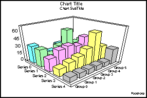
A 3D graph, is imaged using the standard Viewing3DAnglePreset(1). This images the graph with the labels for the ordinal axes (O1 (groups) and O2 (series)) on the bottom of the graph and labels for the numeric (Y1) axis on the left side.
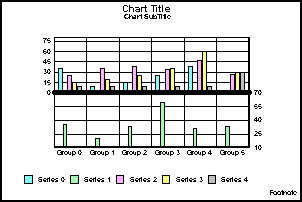
A single axis, vertical graph, is imaged with the ordinal (O1) axis on the bottom of the graph and numeric (Y1) axis on the left side of the graph. The series labels are drawn in the legend area at the bottom of the graph.
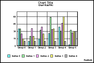
For all vertical and horizontal graphs, the default is simple 2-D rendering, which produces a flat image.
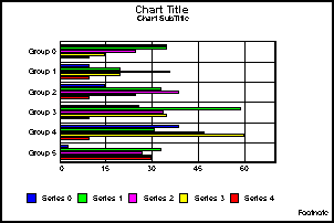
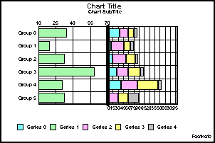
A single axis, horizontal graph is imaged with the ordinal (O1) axis on the left side of the graph and numeric (Y1) axis on the bottom side of the graph.
In dual axes and bi-polar vertical graphs, the Y1 axis is imaged on the left side of the graph and the Y2 axis is drawn on the right side.
In dual axes and bi-polar horizontal graphs, the Y1 axis is drawn on the bottom of the graph and the Y2 axis is imaged on the top graph.
A dual-axes line is drawn dividing the two halves of the graph. The default dual-axes split position is 50.
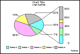
A pie graph is drawn with pie feelers and labels and the PieDepth set to 0. If a multiple pie graph type is used, the graph is imaged with three pies per row. The pie feeler text format is set to zero (standard) so that the actual value that makes up the pie slice is displayed. All groups in a series are combined to form a single pie slice.
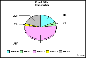
The graph legend area at the bottom of the graph shows the series labels.
When GraphType(93) is selected, the series is mapped in the pie graph to a bar showing the values associated with each wedge.
You can use the PieBarSeries property to select the series in the pie graph that will be used to map the bar. The default pie bar series is zero.
In a scatter graph, the X1 axis is drawn on the bottom of the graph and the Y1 axis is drawn on the left side of the graph. If a dual axes scatter graph is selected, the Y2 axis is drawn on the right side of the graph.
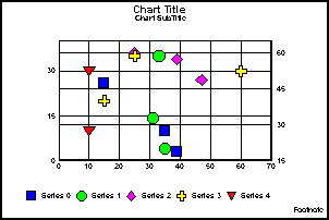
Note: The X-axis for Scatter graphs is expected to be numeric. While you are allowed to substitute with an alphanumeric X-axis, not all features will work correctly.
The High/Low Stock, Candle graph is a Japanese style stock graph. Risers are defined by open and close values. Ticks poke out from the top and bottom for high and low values. The bars will be one color if the close value is greater than the open value. Another color is used if the open value is greater than the close.
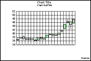
In stock graphs, green risers show high values and blue risers show low values. In single axis stock graphs, the Y1 axis is drawn on the left side of the graph and the O1 axis is drawn on the bottom of the graph. For dual-axes and bi-polar stock graphs, the Y1 axis is drawn on the left side and the Y2 axis is drawn on the right side.
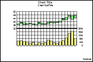
If close values are included in the graph, a line is drawn in the riser at the close value. If volume values are included, the volumes are shown in the bottom of the graph on the Y2 axis and high, low, open, and/or close values are shown in the top of the graph.
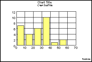
The vertical histogram is drawn with the X1 axis at the bottom of the graph and the Y1 axis on the left side as shown in the following illustration. If a horizontal histogram is used, the Y1 axis is drawn at the bottom of the graph and the X1 axis is drawn along the left side.
The spectral map graph type is a row or column matrix of markers that are colored according to data values. The default graph with sample data draws the O2 (series) axis labels on the left side of the graph and the O1 (group) axis labels at the bottom of the graph.
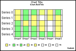
In a spectral map, the risers are colored by height (rather than by series or by group). The graphing engine chooses the color of quantitative data representations based on the data values supplied to the graph. You can use the getColorByHeight() and gradient methods to modify the gradient.
You can create single or dual axes bubble graphs, with or without labels.
In the default configuration, the Y1 axis labels are drawn on the left side of the graph and the X1 axis labels are drawn at the bottom of the graph. Three quadrant lines are drawn for the Y1 axis and two quadrant lines are drawn for the X1 axis.
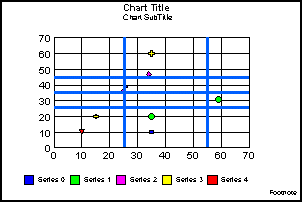
Note: The X-axis for Bubble graphs is expected to be numeric. While you are allowed to substitute with an alphanumeric X-axis, not all features will work correctly.
| WebFOCUS |