dataLabels: {
       visible: boolean,
       displayMode: 'dstring',
       position: 'pstring',
       font: 'fstring',
       color: 'cstring',
       numberFormat: nformat,
       formatCallback: function()
}
where:
- boolean
Can be:
- true, which makes the data text labels visible. This is the default value. When visible is true, use the series-specific showDataValues property to hide data labels for individual series.
- false, which makes the data text labels not visible. This is the default value.
Before data labels can be made visible, the ShowDataValues property has to be set to true. For most types of charts, showDataValues can be set for all series by specifying the following:
series: [{series:'all', ShowDataValues:true}]However, for pie charts, you must set showDataValues to true for each individual series.
- 'dstring'
Controls the data text to show. Valid values are 'x', 'y', 'z', '%', '%+', 'cumulative', 'groupLabel', or 'seriesLabel'. The default value is 'x'.
- For a bubble chart, use 'x', 'y', or 'z' to identify which value to show (x-Position, y-Position, or Size (z)).
- For a line chart where the data set includes marker size values, use 'x' or 'y' to show the Y-axis value. Use 'z' to show the marker size values.
- For a scatter chart, use 'x' or 'y' to identify which value to show (X-Position, Y-Position).
- For a pie chart, use '%' to show the percentage value of a pie
slice.
For % mode in pie charts, you must set the numberFormat property to display the value as a percentage (for example, numberFormat: '[>9]#,#%;[<0]-#.#%;[<=9]#.##%;[=0]0'). For information on formatting numbers, see Formatting Numbers.
- For stacked bar, line, or area charts (blaProperties: {seriesLayout: 'stacked'}), use 'cumulative' to show the stack total, '%' to show the stack value as a percentage, or '%+' to show percentage and cumulative values.
- You can use the formatCallback property and define a function to display multiple values. See the example under the formatCallback property.
- 'pstring'
Is a string that defines the position of data labels relative to the risers. Valid values are 'bottom', 'center', 'insideBottom', 'insideTop', 'left', 'outside', 'right', 'top'. The default value is 'top'.
- The 'insideBottom' and 'insideTop' settings are for bar risers only and draw the data labels inside the bottom or top of the riser.
- For pie charts, the only valid settings are 'center' (on pie slices) and 'outside' (outside pie slices with feeler lines).
- For bar risers, positions are orientation aware (for example, 'top' corresponds to 'right' in a horizontal bar).
- For bullet charts, also see the series-specific marker position property that defines the position of the marker relative to data text.
- 'fstring'
Is a string that defines the size, style, and typeface of the data text labels. The default value is font: '7.5pt Sans-Serif'.
- 'cstring'
Is a string that defines the color by name, numeric specification string, or gradient definition string, of the data text labels. The default value is 'black'.
- nformat
Is the number format for the data labels. The number format can be specified as a JSON object, a format string, or a user-defined function. The default value is 'auto'. For information on number formats, see Formatting Numbers.
- function()
Identifies a function to call for each data label. The default value is undefined. This function can use up to four arguments (data value, series ID, group ID, and data object) and should return a string to be displayed.
function myCallback(dataValue, seriesID, groupID, data);
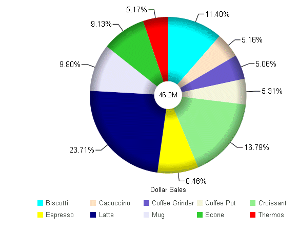
The following request against the GGSALES data source generates a pie chart. The data labels are made visible, are displayed in percent mode in 10pt Sans-Serif font, are positioned outside of the slices, and are formatted differently depending on the data value. In addition, each series has the showDataValues property set to true:
GRAPH FILE GGSALES
SUM DOLLARS
ACROSS PRODUCT
ON GRAPH PCHOLD FORMAT JSCHART
 ON GRAPH SET LOOKGRAPH PIE
ON GRAPH SET STYLE *
*GRAPH_JS
 pieProperties: {totalLabel: {visible: true},holeSize:25},
dataLabels: {visible:true,
     displayMode: '%',
     position: 'outside',
     font: '10pt Sans-Serif',
     numberFormat: '[>9]#,#%;[<0]-#.#%;[<=9]#.##%;[=0]0'
     },
series: [
   {series: 0, color: 'cyan', showDataValues:true},
   {series: 1, color: 'bisque', showDataValues:true},
   {series: 2, color: 'slateblue', showDataValues:true},
   {series: 3, color: 'beige', showDataValues:true},
   {series: 4, color: 'lightgreen', showDataValues:true},
   {series: 5, color: 'yellow', showDataValues:true},
   {series: 6, color: 'navy', showDataValues:true},
   {series: 7, color: 'lavender', showDataValues:true},
   {series: 8, color: 'limegreen', showDataValues:true},
   {series: 9, color: 'red', showDataValues:true}
]
*END
INCLUDE=ENIADefault_combine.sty,$
ENDSTYLE
END
On the chart output, the data labels are outside of the pie with feeler lines:
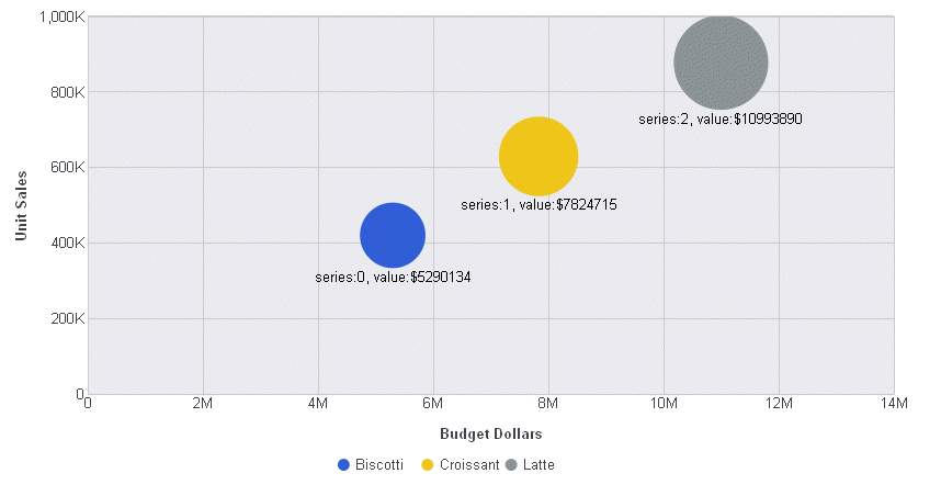
The following request against the GGSALES data source enables data labels for all series, makes the data labels visible, places them below the bubbles, and uses a function to return the label. The function takes the data values array and series number as arguments and returns a label that has the series number and value of the first field in the data array, each prefixed with appropriate text:
GRAPH FILE GGSALES
SUM BUDDOLLARS UNITS DOLLARS
BY PRODUCT
WHERE PRODUCT EQ 'Latte' OR 'Croissant' OR 'Biscotti'
ON GRAPH PCHOLD FORMAT JSCHART
ON GRAPH SET LOOKGRAPH BUBBLE
ON GRAPH SET STYLE *
*GRAPH_JS
legend: {visible:false},
series: [{series:'all', showDataValues:true}],
dataLabels: {
  visible: true,
 position: 'bottom',
  formatCallback: function(d, s){return 'series:' + s + ', value:$' + d[0];}
    }
*END
INCLUDE=ENIADefault_combine.sty,$
ENDSTYLE
END
The output is:
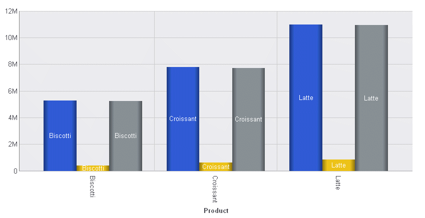
The following request against the GGSALES data source uses the group labels as the data text:
GRAPH FILE GGSALES
SUM  BUDDOLLARS UNITS DOLLARS
BY PRODUCT
WHERE PRODUCT EQ 'Latte' OR 'Croissant' OR 'Biscotti'
ON GRAPH PCHOLD FORMAT JSCHART
ON GRAPH SET LOOKGRAPH VBAR
ON GRAPH SET STYLE *
*GRAPH_JS
legend: {visible:false},
series: [{series:'all', showDataValues:true}],
dataLabels: {
  visible: true,
  color:'white',
  position: 'inside',
  displayMode: 'groupLabel'
}
*END
INCLUDE=ENIADefault_combine.sty,$
ENDSTYLE
END
On the output, the group (sort field) label (product name) is used as the data label:
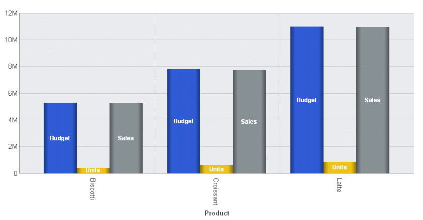
The following request against the GGSALES data source uses the series labels as the data text. The series are generated from the display fields in the request. In this request, the default column headings are replaced with AS names:
GRAPH FILE GGSALES
SUM  BUDDOLLARS AS Budget
UNITS AS Units
DOLLARS AS Sales
BY PRODUCT
WHERE PRODUCT EQ 'Latte' OR 'Croissant' OR 'Biscotti'
ON GRAPH PCHOLD FORMAT JSCHART
ON GRAPH SET LOOKGRAPH VBAR
ON GRAPH SET STYLE *
*GRAPH_JS
legend: {visible:false},
series: [{series:'all', showDataValues:true}],
dataLabels: {
  visible: true,
  color:'white',
  font: 'Bold 8pt Sans-Serif',
  position: 'inside',
  displayMode: 'seriesLabel'
}
*END
INCLUDE=ENIADefault_combine.sty,$
ENDSTYLE
END
On the output, the series (display field) AS name is used as the data label: