Syntax: How to Specify Properties for Polar and Radar Charts
polarProperties: {
   straightGridLines: boolean1,
   extrudeAxisLabels: boolean2,
   drawAsArea: boolean3},
where:
- boolean1
Defines the grid line style. Valid values are:
- true, which draws straight grid lines with yaxis:majorGrid.
- false, which draws round grid lines with yaxis: majorGrid. The default value is false.
- boolean2
Defines where to draw y-axis labels. Valid values are:
- true, to draw y-axis labels extruded from the circular grid.
- false, to draw y-axis labels within the circular grid. The default value is false.
- boolean3
Applies to radar charts only. Valid values are:
- true, to draw a circular area chart.
- false, to draw a circular line chart. The default value is false.
Note:
- A polar chart is a circular scatter chart.
- Like scatter charts, a polar chart requires two values to draw each marker.
- yaxis properties control the circular grid around polar chart markers. These properties also control the appearance of axis labels and gridlines.
- xaxis properties control the appearance of labels and values on the x-axis (around the outside edge of the circular grid) and x-axis gridlines.
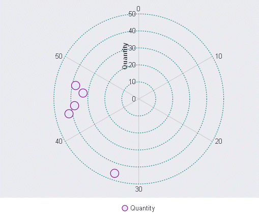
Example: Setting Polar Chart Properties
The following request against the GGORDER data source generates a polar chart with the default properties. The major grid lines are dashed teal circular lines, and the series properties set the marker shapes, sizes, and colors:
GRAPH FILE GGORDER
PRINT QUANTITY AS 'Quantity'
ACROSS PRODUCT_CODE
WHERE PRODUCT_CODE EQ 'B144'
WHERE QUANTITY LT 51
ON GRAPH PCHOLD FORMAT JSCHART
ON GRAPH SET LOOKGRAPH POLAR
ON GRAPH SET STYLE *
*GRAPH_JS
legend: {visible: true},
polarProperties: {
   straightGridLines: false,
   extrudeAxisLabels: false
},
yaxis: {
   majorGrid: {
   lineStyle: {width: 1,color: 'teal',dash: '2 2'},
   }
},
series: [
   {series: 0, color: 'lavender', marker:{size: 15, shape: 'circle',
border: {width: 1, color: 'purple'}}},
   {series: 1, color: 'cyan', marker:{size: 15, shape: 'circle', border:
{width: 1, color: 'green'}}},
   {series: 2, color: 'lightblue', marker:{size: 15, shape: 'circle',
border: {width: 1, color: 'blue'}}},
   {series: 3, color: 'lightgreen', marker:{size: 15, shape: 'circle',
border: {width: 1, color: 'teal'}}},
   {series: 4, color: 'coral', marker:{size: 15, shape: 'circle', border:
{width: 1, color: 'navy'}}},
]
*END
INCLUDE=ENIADefault_combine.sty,$
ENDSTYLE
END
The output is:
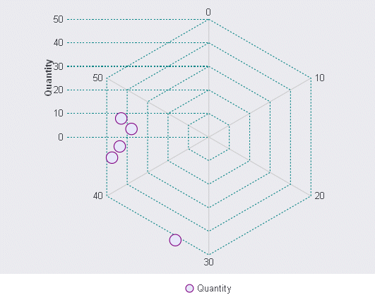
Changing straightGridLines to true, and extrudeAxisLabels to true, generates the following chart:
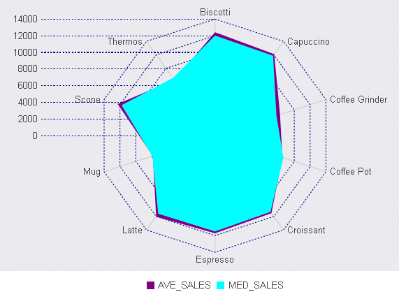
Example: Setting Radar Chart Properties
The following request against the GGSALES data source generates a radar chart with the default properties:
GRAPH FILE GGSALES
SUM DOLLARS NOPRINT
AND COMPUTE
AVE_SALES = AVE.DOLLARS;
MED_SALES = MDN.DOLLARS;

ACROSS PRODUCT
ON GRAPH PCHOLD FORMAT JSCHART
ON GRAPH SET LOOKGRAPH RADARL
ON GRAPH SET STYLE *
*GRAPH_JS
legend: {visible: true},
polarProperties: {
  straightGridLines: false,
   extrudeAxisLabels: false,
   drawAsArea: false
},
yaxis: {
   majorGrid: {
      lineStyle: {width: 1,color: 'navy',dash: '2 2'},
      }
   },
series: [
   {series: 0, color: 'purple', border: {width: 2}},
   {series: 1, color: 'cyan', border: {width: 2}},
   {series: 2, color: 'grey', border: {width: 2}},
   {series: 3, color: 'teal', border: {width: 2}},
]
*END
INCLUDE=ENIADefault_combine.sty,$
ENDSTYLE
END
The output is:
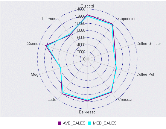
Changing straightGridLines, extrudeAxisLabels, and drawAsArea to true generates the following chart: