Accessing Chart Formatting Tools
Your presentation of data on a chart is successful when
it communicates to your audience the message that you intend. InfoAssist
helps you meet the needs of your audience and convey your message
by providing numerous chart features. For example, you can adjust
the appearance of a chart, add layers of information, or customize
the labels that identify the data on the chart.
xIdentifying Chart Elements
The following image identifies the basic elements that
you can customize on a chart. The elements that are annotated here
are for a vertical bar chart. The available elements and their right-click
menu options vary according to the chart that you are creating.
Note: The 3D effect is not a default setting. It was enabled
for the chart in the following image to enhance the appearance of
the chart. To access the 3D option, go to the Format tab, and in
the Features group, click 3D Effect.
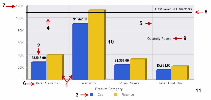
- Series
- Data Labels
- Legend
- Horizontal Gridlines
- Vertical Gridlines
- X-Axis Label
- Y-Axis Label
- Reference Line
- Annotation
- Frame
- Background
x
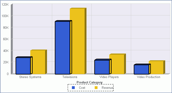
In Live Preview, the canvas on the right of the window
provides a preview of the report or chart that you can interact
with. The preview is context sensitive, meaning that depending on
what portion you select different options become available.
In Live Preview, when you hover the mouse over a graph element
(for example, legend, axis label, title), the bounding area is highlighted
with a dotted line. In the following image, the legend is highlighted.
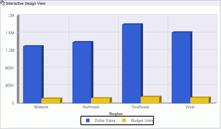
In Live Preview, when you select a graph element (for example,
legend, axis label, title), the bounding area is highlighted with
a solid line. In the following image, the legend is selected.
Once you select a chart element, you can access all available
design options on the ribbon, or you can right-click an element
to open a right-click menu of frequently-used design options. Once
you have selected your design option from the ribbon or the menu,
InfoAssist instantly applies it to the chart element, so that you
see the result immediately.
This image shows a Live Preview of a bar chart in Live Preview.
In this example, the right-click menu for a series (field) element
is opened.
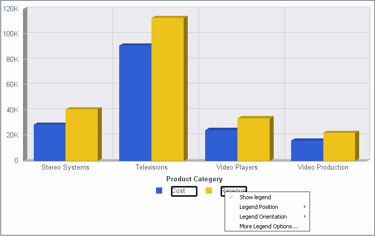
Right-click menus are enabled for charts that are generated with
either sample data, or live data from your data source.
Note: Right-click menus are not
available in InfoAssist Basic.
The following sections describe the chart elements, the ribbon
options, and the right-click menus that you can work with to design
your charts in Live Preview.
xUsing Right-Click Field Options in the Query Design Pane
In the Query design pane, you can right-click any field
and select from a list of available options that are displayed in
the menu that appears. The options that you can select vary, depending
on the type of Query field container in which the field is located,
and the type of chart that you are creating.
When you create a chart, the Query field containers in the Query
Design pane include Measure (Sum), X Axis, Legend (Series), Multi-graph,
and Coordinated (for documents only).
Right-clicking a Measure (Sum) field in a chart displays the
Filter Values, Sort, Visibility, Change Title, More, and Delete
options. You can point to More to access
the Aggregation Functions, Traffic Light Conditions, and Missing
options.
Right-clicking an X Axis or Legend (Series) field in a chart
displays the Filter Values, Sort, Visibility, Change Title, More,
and Delete options. You can point to More to
access the Missing option.
Right-clicking a Coordinated field or a Multi-graph field in
a chart displays only the Delete option.
For more information, see Using Right-Click Field Options in the Query Design Pane.