In this section: How to: |
A bar chart or bar graph is a diagram that provides a means of quantitative comparison by displaying rectangular bars of differing heights or lengths that are proportional to the statistics or data they represent. Bar charts display the distribution of a single, discrete or dependent variable across an independent variable. This means that a bar chart plots the distribution of numerical data against a scale. The length of a bar chart corresponds to a value or amount, and can be arranged either horizontally or vertically. These are also known as column charts or graphs. Bar charts are most frequently used to analyze changes within a data group or category or to demonstrate dissimilarities between items.
Viewers can develop a clear mental image of comparisons among data series by distinguishing the relative heights of the bars. You can also use a spine plot in a bar chart, where the values correspond to the width of the bar, rather than the height.
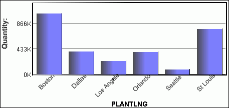
The following image shows an example of a bar chart diagram.
With WebFOCUS Visual Discovery, you can measure and compare information by creating comprehensive, easily understandable bar charts. These bar charts can support thousands of bars and can include robust features, such as:
 or the Vertical button
  .
.
Tip: In the pop-up menu, if Horizontal has a check next to it then the graph has a horizontal orientation. Click Horizontal to remove the check and change the orientation to vertical.
How to: Reference: |
You can display data in a bar chart either with the standard bar chart display, where data is mapped to the length of the bar, or as a spine plot. The spine plot presentation normalizes the regular bar chart data, then uses the bar width to represent the number of cases and the comparative percentages of items in each case.
The spine plot is useful when you want to compare the percentage of a category that is selected with other categories.
Note:
 (all
bars are of equal height).
(all
bars are of equal height).
Tip: From the pop-up menu, select Spineplot.
How to: Reference: |
A cluster bar chart is a bar chart with multiple y-axis data fields. Instead of weighting the bar chart using one y-axis selection, you can use two or more data fields for the y-axis, creating groups of bars for each x-axis value.
The following image shows the Bar Chart tab in the Visual Discovery Properties dialog box.
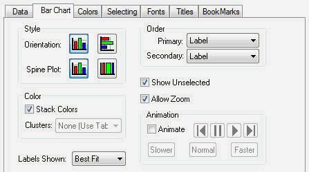
Is vertical or horizontal. See How to Change the Orientation of a Bar Chart.
Changes the style of the bar chart to a spine plot. See Using a Spine Plot in a Bar Chart.
Colors bars according to data in a third field. See Assigning Color to the Data and the Graph.
Creates a bar chart with multiple y-axis fields. See Using Clusters in a Bar Chart.
Sets the label mode. See Displaying Labels.
Controls the sequence in which glyphs are presented. See Selecting Primary and Secondary Order.
Shows unselected data in gray. If Show Unselected is not checked, unselected data is omitted from the display.
To add unselected data, either turn on Show Unselected in the Properties dialog box, or use the right mouse button menu in the view and choose Select All.
Enables the zoom bar. The zoom bar lets you zoom in on the details of data or zoom out to look at the big picture.
Select this option to put a single component or a perspective into a mode where its glyphs are automatically colored and not colored in sequential order. See Animating Data.
The pop-up menu appears when you right-click a Visual Discovery control in the analytical dashboard. These options do not appear in a bar chart when you are developing in HTML Composer.
Is the orientation of the graph. If Horizontal is checked, the orientation of the graph is horizontal. If it is not checked, the orientation is vertical.
Spine plot is a bar chart where width, rather than height, represents the value of the data. See Using a Spine Plot in a Bar Chart.
Shows aggregated data. See Aggregating Data in Pie and Bar Charts.
Shows unselected data in gray. If Show Unselected is not checked, unselected data is omitted from the display.
To add unselected data, either turn on Show Unselected in the Properties dialog box, or use the right mouse button menu in the view and choose Select All.
Shows goal lines on the graph. See Using Goal Lines.
Select this option to put a single component or a perspective into a mode where its glyphs are automatically colored and not colored in sequential order. See Animating Data.
Displays the items in one of the following orders: Original Order, Label, Size, Total Selected, or Percent Selected. See Selecting Primary and Secondary Order.
Sets the label mode. See Displaying Labels.
Adds or removes the label from the selected data item.
Places a goal line on the graph. See Using Goal Lines.
Shows text in a normal, readable size.
Shows the entire table in the current window. If there are fewer table rows than will fit in the window at full size, then the lines are shown in a larger font with more spacing. If there are more lines than will fit, then they are reduced to a smaller size, with a minimum of 1 pixel high. If all table rows does not fit at 1 pixel high, then lines are overplotted to allow all to fit. When values are overplotted, the line that is the longest or with the hottest color is drawn on the top, obscuring all others under it.
Draws text as one-pixel-high lines. This is helpful when you need to reduce the size of the text to see more of the data. Depending on how many lines you have in your table, this may still require paging to see all rows.
Reverses the previous action. You may repeatedly undo actions retained in the history file for your current session by selecting Undo over and over again. A description of the previous action appears on the pop-up menu. If you have performed no action, Undo is not available for selection and no action appears to the right of the word Undo.
Restores the previous undo action. If you have performed no action, Redo is not available for selection and no action appears to the right of the word Redo.
Selects all of the items in the graph. When you choose Select All, any previous selections are ignored. Selection state returns to the original setting.
When selected, all of the items become unselected. All items appear in the unselected color (gray, by default) or are hidden in the graph (if hidden, unselected is active).
Reverses the selection state of items. Selected items become unselected and unselected items become selected.
Excludes (temporarily removes) items from the graph.
Restores the items you excluded. If you accidentally excluded the unselected, this menu option restores those excluded items.
Enables you to save the graph to a GIF or JPEG file.
Enables you to copy the selected component and paste it to another file.
Takes you to the collection of tabs available for the respective visualization component. Common tabs include Data, Selecting, and Colors.
| WebFOCUS |