How to: Reference: |
You can apply data visualization bar graphs to columns in a report from Report Painter, and define triggering conditions that determine when those bar graphs will be displayed and how they will look.
- Open the report in Report Painter.
- Right-click a column containing numeric data and select Visualize to open the Data Visualization dialog box.
- Click Visualize to activate the option and invoke the bar graph when you subsequently run the report.
- Click the drop-down box to choose a color for the bar graphs, or accept the default (black). The color you select will be applied to all bar graphs.
-
Accept
the defaults for maximum length and for the width of the bar graphs,
or set a custom measurement. For more information about defaults
and customization options, see Data Visualization Dialog Box.
Tip: If you set custom measurements or color and then decide you want the default values, you can reset them by clicking the Default Values button. If you wish to apply different colors to bar graphs to reflect different conditions, click the Conditional Styling button and click New to open the Edit Condition dialog box.
- If you are not defining conditions for data visualization bar graphs, click OK to close the Data Visualization dialog box and accept your selections.
-
Click Run.
The report opens in the browser with bar graphs inserted.
Tip: To remove data visualization bar graphs from your report, turn off the check box next to Visualize in the Data Visualization dialog box.
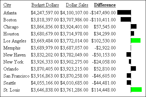
You can assign a style (color) to data visualization bar graphs based on conditional statements you define. In this example, you use the DIFFERENCE column to highlight those bar graphs showing gains of $100,000 or more.
- From the Explorer, create a procedure, then open the Define tool from the component connector toolbar.
- Choose the GGSALES data source in the Open dialog box and click Open.
- Name the virtual field DIFFERENCE, then click the Format button to open the Format dialog box. Accept the default format, D12.2, and click Floating dollar--M in the Edit Options box. Click OK to close the Format dialog box and return to the Define tool.
- In the Fields List tab, double-click DOLLARS, click the minus sign (-) on the calculator, and double-click BUDDOLLARS to complete the expression.
- Click Check to make the virtual field active, then close the Define tool and update the procedure.
- Open Report Painter from the component connector toolbar, again choosing GGSALES as the data source in the Open dialog box.
- Add the following columns from the Object Inspector Fields tab: CITY, BUDDOLLARS, DOLLARS, DIFFERENCE.
- Highlight the City column and click the By button. Highlight BUDDOLLARS and click the Sum button. Notice that DOLLARS and DIFFERENCE also become Sum columns.
- Right-click the DIFFERENCE column in Report Painter and select Visualize. The Data Visualization dialog box opens.
- Select the Visualize check box.
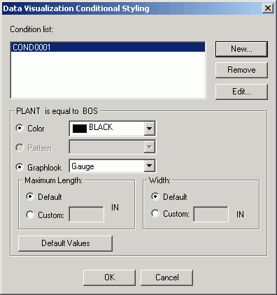
- Click the Conditional Styling button. The Data Visualization Conditional Styling dialog box opens.
- Click New to create a condition. The Edit Condition dialog box opens.
- Select the DIFFERENCE field from the Field list.
- Click Is greater than or equal to from the Relation list box.
- Type the value 100000 in
the Value box and click OK.
Your edited condition is added to the Condition list in the Condition List dialog box.
- Click OK in
the Condition List dialog box.
The new condition is added to the Condition list in the Data Visualization Conditional Styling dialog box.
- Highlight the condition, select Lime from the Color list box, and click OK.
- Click OK to close the Data Visualization dialog box.
- Close Report Painter and update the procedure.
When you run the report, your new condition takes effect, showing where the sales budget was exceeded by $100,000 or greater as a lime green bar graph, as shown in the following image. (If your report is in black and white, the lime green color appears as a lighter shade of gray.)
You use the dialog box shown in the following image to define the data visualization bar graphs that appear in your report.
If you are setting conditions to control the display of bar graphs, you use the Data Visualization Conditional Styling dialog box instead of this one, as shown in the following image.
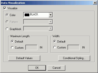
The Data Visualization dialog box contains the following fields or options:
- Visualize
-
Initiates the Data Visualization feature.
- Color
-
Specifies the color of the bar graphs. Select a color from the drop-down list. Black is used as the default color.
The color option is the default for HTML, PDF, and PS formats.
- Pattern
-
Specifies the shading patterns for bar graphs. Select a shading pattern from the drop-down list.
This option is only available for PDF and PS formats to make graphs in black and white reports more readable. If the report format is HTML, the Pattern option button is inactive because the shading option is only available for PDF and PS formats.
- Graphlook
-
Specifies how the graph looks. Select a look from the drop-down list.
Note: Graphlook Gauge or Quality do not support negative values. Use Bar Graphs instead.
- Scale
-
Specifies the relative bar graph scaling for multiple report columns under a common Across sort field to which you have applied data visualization.
-
Note: This option only appears when applied to the entire report.
-
Choose one of the following options from the Scale drop-down list:
- Uniform
-
Specifies that each vertical bar graph be scaled based on the minimum and maximum values of the entire set of values compiled from each Across column to which you have applied data visualization bar graphs.
- Distinct
-
Specifies that each vertical bar graph be scaled based on the distinct minimum and maximum values for each Across column to which you have applied data visualization bar graphs.
- Maximum Length:
-
Specifies the length of the longest bar graph.
-
Default. The default length of 60 pixels is used for a vertical bar graph and 80 pixels for a horizontal bar graph.
-
Custom. Sets the value for displaying the vertical or horizontal bar graph for the maximum data value in the associated report column. This value must be a positive number.
-
This value is initially expressed in the current windows measurement units (inches, centimeters), then converted into the corresponding number of pixels.
- Width:
-
Specifies the width of the bar graphs in a report.
Default. This value is preset based on the current font size.
Custom. Sets the value for displaying the width of the bar graphs in a report. This value must be a positive number.
This value is initially expressed in the current windows measurement units (inches, centimeters), then converted into the corresponding number of pixels.
- Default Values button
-
Resets all defaults.
- Conditional Styling button
-
Opens the Data Visualization Conditional Styling dialog box where you can define conditions and colors for bar graphs.
The following image shows the Data Visualization Conditional Styling dialog box, which you use to define the colors of bar graphs based on conditions you define.
- New
-
Opens the Edit Condition dialog box. For instructions on how to define conditions, see Defining a Conditional Report Style.
Note: In Report Painter, when viewing conditions from the Data Visualization Conditional Styling dialog box, any existing conditions for the report components are not visible. The Data Visualization Conditional Styling dialog box only shows conditions for the data visualization.
- Color
-
Specifies the colors of the bar graphs. Select a color from the drop down list. Black is used as the default color. You can select as many colors as you need to show different conditions.
- Pattern
-
Specifies the shading patterns for bar graphs. Select a shading pattern from the drop-down list.
This option is only available for PDF and PS formats to make graphs in black and white reports more readable. If the report format is HTML, the Pattern option button is inactive because the shading option is only available for PDF and PS formats.
- Graphlook
-
Specifies how the graph looks. Select a look from the drop-down list.
- Maximum Length:
-
Specifies the length of the longest bar graph.
- Default
-
The default length of 60 pixels is used for a vertical bar graph and 80 pixels for a horizontal bar graph.
- Custom
-
Sets the value for displaying the vertical or horizontal bar graph for the maximum data value in the associated report column. This value must be a positive number.
This value is initially expressed in the current Windows measurement units (inches, centimeters), then converted into the corresponding number of pixels.
- Width:
-
Specifies the width of the bar graphs in a report.
- Default
-
This value is preset based on the current font size.
- Custom
-
Sets the value for displaying the width of the bar graphs in a report. This value must be a positive number.
This value is initially expressed in the current Windows measurement units (inches, centimeters), then converted into the corresponding number of pixels.
- Default Values button
-
Resets all defaults.