-
In your
application folder, create a new, empty text file, and name it irpcusf.js (or irpuflex.js).
-
Copy the
styling section of the irpfusc.js file (or the irpfstd.js file)
from the WebFOCUS Reporting Server location (\home\etc directory),
and paste it into the irpcusf.js file (or irpuflex.js file) in your
application folder. This should be the same directory as the location
of the active report or active dashboard.
For example, from the Projects on localhost
area in Developer Studio, create the irpcusf.js file (or the irpuflex.js
file) in the Other subfolder of the project folder.
-
For active
reports and dashboards in HTML formats, open the JavaScript file
and locate the fcinfo variable.
For active reports and dashboards for Adobe
Flash Player, open the JavaScript file and locate the getFCGlobal
function.
-
In the fcCategory
section, locate the chart type you need to modify. This is defined
in the swfName parameter.
-
Locate the
corresponding chartParams parameter name. The chartParams parameter
name is defined separately and contains all of the properties used
to style each chart type in the swfName parameter.
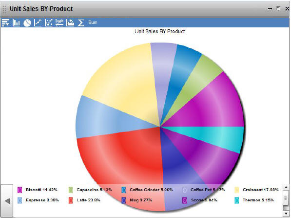
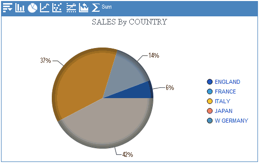
For example, in order to modify a Pie 2D
chart, locate the Pie2D value in the swfName parameter, as below.
The chartParams called pieParams contains all of the properties
you can modify to change the look and feel of the Pie 2D chart.
In the irpcusf.js file:
{swfName:'Pie2D', label:'Pie 2D', chartParams: 'pieParams'},
In the irpuflex.js file:
{swfName:'Pie2D', label:this.ibiMsgStr['Pie 2D'],
   chartParams: 'pieParams'},
Note: It is recommended that you create a new
chartParams name for the chart types you are modifying because the
same chartParams name may be assigned to other chart types that
you may not need to modify. You can also create one default chartParams
name and assign it to all chart types to globally apply the same styles.
-
For active
reports and dashboards in HTML formats, locate the chart properties
section defined in fcinfo.chartParams_name. For example, fcinfo.pieParams.
For active reports and dashboards for Adobe
Flash Player, locate the chart properties section defined in this.chartParams_name.
For example, this.pieParams.
For this Pie
2D chart example, the properties section should look like the following sample
code for active reports and dashboards in HTML formats:
fcinfo.pieParams = '{'+
         '"caption":"%caption%",'+
         '"alternateHGridAlpha":"100",'+
         '"alternateHGridColor":"f9f9fa",'+
         '"baseFont":"Arial",'+
         '"baseFontColor":"000000",'+
         '"baseFontSize":"10",'+
         '"bgColor":"e5e5e5,ffffff",'+
.
.
.
For this Pie 2D chart example, the
properties section should look like the following sample code for
active reports and dashboards for Adobe Flash Player:
this.pieParams = [
           {alternateHGridColor:"f9f9fa"},
           {alternateHGridAlpha:"100"},
           {anchorRadius:"3"},
           {anchorBorderThickness:"3"},
           {baseFont:"Arial"},
           {baseFontSize:"10"},
           {baseFontColor:"000000"},

.
.
.
The values on the left-hand side
correspond to chart element attribute names defined in the FusionCharts
documentation, and the default values used in advanced active charts
are set on the right-hand side, wrapped in double quotation marks.
-
Copy the
entire fcinfo.pieParams section (or this.pieParams section) into
clipboard and paste it under the pieParams section.
-
Rename the
copied section as fcinfo.testParams (or this.testParams).
-
In the fcinfo.fcCategory
section (or this.fcCategory section), change the chartParams name
for the Pie 2D chart to testParams.
In the irpcusf.js file:
{swfName:'Pie2D', label:'Pie 2D', chartParams: 'testParams'},
In the irpuflex.js file:
{swfName:'Pie2D', label:this.ibiMsgStr['Pie 2D'],
   chartParams: 'testParams'},
-
For active
reports and dashboards for Adobe Flash Player, define the new testParams
name as a variable with array type before the getFCGlobal function starts.
public var testParams:Array;
In the irpcusf.js file, you should now have:
fcinfo.fcCategory = [
…
         {category:this.ibiMsgStr['crtpie'],  //Pie Category
…
          {swfName:'Pie2D', label:'Pie 2D', chartParams: 'testParams'},
…
         isCreated:false}
];
…
fcinfo.testParams = '{'+
         '"caption":"%caption%",'+
…
         '"zeroPlaneThickness":"3"},';
In the irpuflex.js file, you should now have:
<fx:Script>
  <![CDATA[
  …
    public var testParams:Array;
    private function getFCGlobal(): void {
    …
      this.fcCategory = [
      …
        {category:this.ibiMsgStr['crtpie'], //Pie Category
        …
           {swfName:'Pie2D', label:this.ibiMsgStr['Pie 2D'], chartParams:
                                                             'testParams'},
           …
           isCreated:false}
       ];
             …
     this.testParams = [
          {alternateHGridColor:"f9f9fa"},
          …
          {zeroPlaneColor:"717171"}
      ];  //end testParams
   } // end getFCGlobal()
 ]]>
</fx:Script>
Note: In the preceding examples of code, the ellipses
indicate additional lines of code.
If you
are modifying the irpuflex.js file for active reports and dashboards
for Adobe Flash Player, you are almost ready to customize the styles
and run a chart. There is one more editing step to perform in the
irpuflex.js file.
-
Locate the
following code at the beginning of the irpuflex.js file:
public var fcCategory:Array;
public var APDFCategory:Array;
public var defaultParams:Array;
public var pieParams:Array;
public var testParams:Array;
private function getFCGlobal(): void {
Replace the preceding code with this code to initialize the
custom parameter that you have added:
public var testParams:Array;
public function user_init(): void {
-
You can
now modify the values assigned for each chart style property in the
testParams section, or add or remove each chart style property.
For example, the attributes, such as baseFont,
baseFontSize, and baseFontColor, define the generic font properties
for all the text used on the chart inside the chart canvas, including
data labels, values, and so on.
baseFont. Specify the font family name to be used
for all the text (data labels, values, and so on) on the chart inside
the chart canvas.
baseFontSize. Specify
the font size to be used for all the text (data labels, values,
and so on) on the chart inside the chart canvas using a numeric value
between 0 to 72.
baseFontColor. Specify
the font color to be used for all the text (data labels, values,
and so on) on the chart inside the chart canvas using the HTML color
code. Do not include the number (#) character when using the HTML
color code.
The following font properties
set the fonts used for the pie chart label and mouse-over data tip
text to be Comic Sans MS in dark red color and size 20:
{baseFont:"Comic Sans MS"},
{baseFontSize:"20"},
{baseFontColor:"D70A0A"},
-
The chart
series colors are defined in the paletteColors property for active
reports and dashboards in HTML formats and in the paletteColors
property for active reports and dashboards for Adobe Flash Player.
In order to change the chart series color, you need to define a
set of colors for these properties.
paletteColors. Specify
a list of HTML color codes separated by commas. Do not include the
# character when using the HTML color code. The chart cycles through
the list of specified colors.
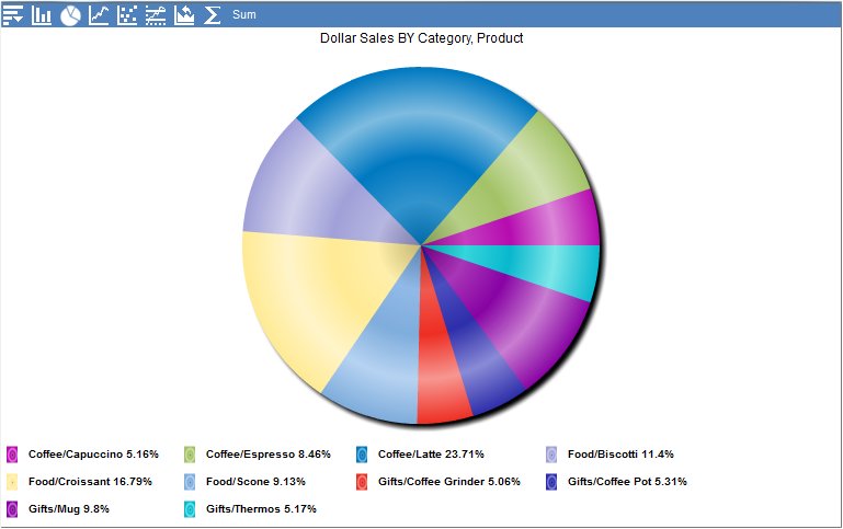
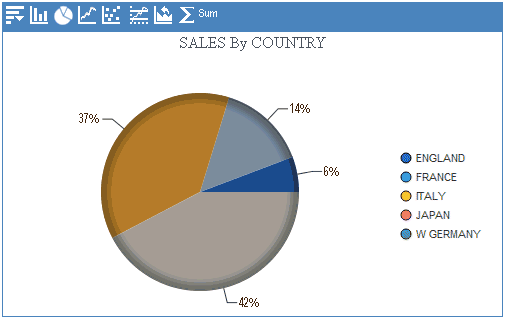
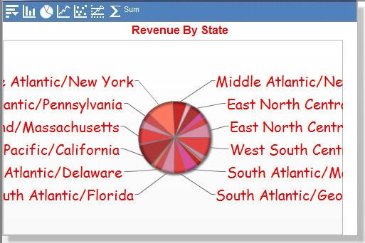
For example,
the following set of eight colors changes the color of pie chart
slices into a red color scheme.
{paletteColors:"D788A2, E13939, DC4295, A52A2A, FAAFBE, C11B17, FF7157, CC4444"},
-
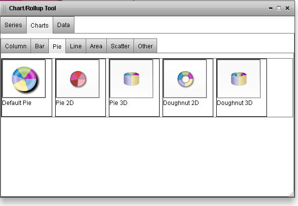
Open the
Chart/Rollup Tool dialog box if you have the modified irpuflex.js
file for active reports and dashboards for Adobe Flash Player.
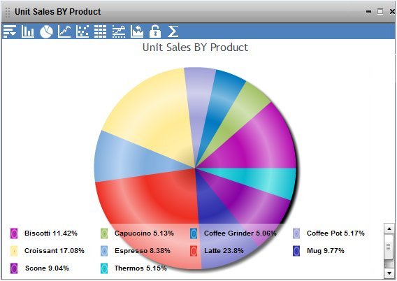
Notice the same style changes are reflected
for the Pie 2D chart in the Chart/Rollup Tool. Because we assigned
testParams only to the Pie 2D chart type in this example, the other
charts still retain the default chart styles specified in other chartParams
parameters.
-
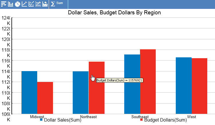
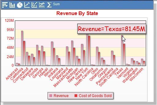
You can
apply the same chartParams name to other chart types to change their
styles. For example, change the chartParams name for the Multi-series Column
2D chart as below.
In the irpcusf.js file:
{swfName:'MSColumn2D', label:'Multi-series Column 2D',
   chartParams: 'testParams'},
In
the irpuflex.js file:
{swfName:'MSColumn2D', label:this.ibiMsgStr['MSColumn2D'],
   chartParams: 'testParams'},
The
same red color scheme is now applied to the Multi-series Column
2D chart.
-
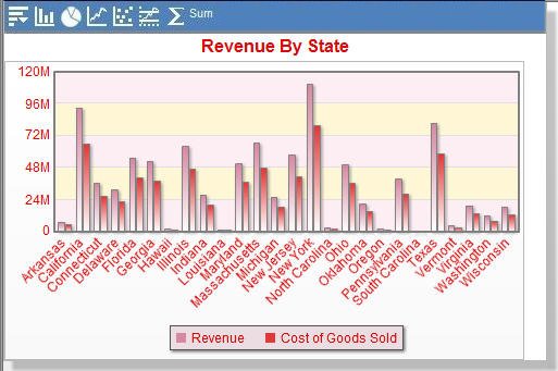
You can
change the alternating background color of the chart canvas for chart
types such as column, bar, line, and area.
In the testParams section, locate the canvasBgColor
property, and change its value as follows. If the canvasBgColor
property does not exist, you can simply add it.
{canvasBgColor:"FDEEF4"},
For alternating background color, locate the alternateHGridColor
property, and change its value as follows. If the alternateHGridColor
property does not exist, you can simply add it.
{alternateHGridColor:"FEF7D6"},
Depending on the chart type, different types of
properties are available to modify multiple areas of the chart.
For more information, see the FusionCharts documentation.
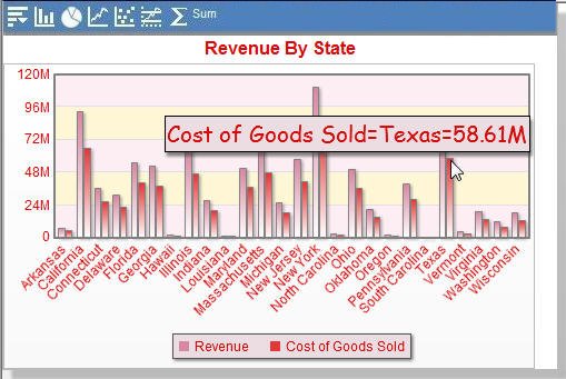
The chart now contains light pink and yellow alternating
background color.
Adding or modifying the following
properties changes the background colors used in the mouse-over
data tip and legend.
{legendBgColor :"EBDDE2"},
{toolTipBgColor:"EBDDE2"},