-
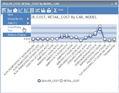
Run the
active report, click the arrow in any column heading, and select Chart/Rollup
Tool.
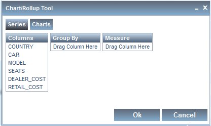
The Chart/Rollup Tool opens, as shown in the following image.
-
Drag the
columns into the Group By and Measure sort fields.
For charts, the Group By section is the columns used for the X-axis and Measure is the columns used for the Y-axis.
- You can edit the sort fields by clicking the X icon to delete columns, drag multiple columns into the Group By and Measure sort fields, reorder the sort fields, and change the aggregation type of the Measure by clicking the Calculation icon.
-
You can
select the Line, Pie, Bar, Scatter, or Rollup icon.
Pie chart is selected by default.
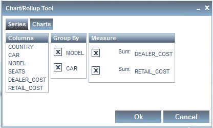
In the example below, CAR and MODEL are the Group By sort fields, DEALER_COST and RETAIL_COST are the Measure fields, and Line chart is selected.
-
Click OK to
close the Chart/Rollup Tool.
The Chart or Rollup Table is generated based on the sort fields selected. You can click the New icon from the Chart or Rollup Table and select Chart/Rollup Tool to open the Chart/Rollup Tool again.