Associating Bar Graphs With Report Data
To make HTML, PDF and PS reports
more powerful, you can insert visual representations of selected
data directly into the report output. These visual representations
are in the form of vertical or horizontal bar graphs that make relationships and
trends among data more obvious. You can add a:
-
Vertical Bar Graph. You can apply
a vertical bar graph to report columns associated with an ACROSS
sort field. The report output displays a vertical bar graph in a
new row above the associated data values.
Bar
graphs that emanate above the zero line represent positive values,
while bar graphs that emanate below the zero line represent negative
values.
To see how each of these types of reports is generated,
see the example following How to Associate Data Visualization Bar Graphs With Report Columns.
-
Horizontal Bar Graph. You can
apply a horizontal bar graph to report columns. The report output
displays a horizontal bar graph in a new column to the right of
the associated data values.
Bar
graphs that emanate to the right of the zero line represent positive
values, while bar graphs that emanate to the left of the zero line
represent negative values.
The length of each vertical or horizontal bar graph is proportional
to the magnitude of its associated data value. The shortest bar
graph is displayed for the value with the minimum magnitude, the
longest bar graph for the value with the maximum magnitude, and bar
graphs of varying length are displayed for each value within the
minimum-maximum magnitude range. Notice in the figure above that
a value of 147,490.00 produces a longer horizontal bar graph than
a value of 50,153.00. Therefore, a complete row of vertical bar graphs
or a complete column of horizontal bar graphs forms a bar chart.
You can only apply data visualization bar graphs to numeric report
columns (integer, decimal, floating point single-precision, floating
point double-precision, and packed). Bar graphs applied to alphanumeric,
date, or text field formats are ignored. For details about assigning
field formats, see the Describing Data
With WebFOCUS Language manual.
You apply data visualization bar graphs to columns by adding
a declaration to your WebFOCUS StyleSheet that begins with the GRAPHTYPE
attribute. This attribute adds either a vertical or horizontal bar
graph to the specified data.
Note: Data visualization bar graphs are not supported
in a request that includes the OVER option.
x
Syntax: How to Associate Data Visualization Bar Graphs With Report Columns
To add data visualization graphics to
report output, add the following declaration to your WebFOCUS StyleSheet.
GRAPHTYPE=DATA, {COLUMN|ACROSSCOLUMN}=identifier, $where:
- GRAPHTYPE=DATA
Generates vertical or horizontal bar graphs for the data
component of a report. Currently, you can only specify DATA as the
report component.
- COLUMN
Displays a horizontal bar graph to the right of the specified
report column.
- ACROSSCOLUMN
Displays a vertical bar graph above every occurrence of the
data value associated with an ACROSS sort field.
- identifier
Is any valid identifier. For details, see Identifying a Report Component in a WebFOCUS StyleSheet.
You
can define WHEN conditions and bar graph features associated with those
conditions using StyleSheet syntax. For details, see Formatting Report Data.
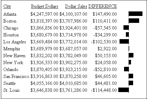
Example: Generating Data Visualization Bar Graphs in a Report
The following illustrates how to generate
a bar graph for data in your report. Since this report is sorted
with the BY field CITY, horizontal bar graphs display in the output.
You can change this to vertical bars be changing the sort field
to ACROSS CITY and the StyleSheet declaration to GRAPHTYPE=DATA,
ACROSSCOLUMN=DIFFERENCE, $.
DEFINE FILE GGSALES
DIFFERENCE/D7M=BUDDOLLARS-DOLLARS;
END

TABLE FILE GGSALES
BY CITY
SUM BUDDOLLARS/D7M DOLLARS/D7M DIFFERENCE
ON TABLE SET PAGE-NUM OFF
ON TABLE SET STYLE *
GRID=OFF, $
GRAPHTYPE=DATA, COLUMN=N4, $
ENDSTYLE
END
The output is:
xControlling Bar Graph Scaling in Horizontal (ACROSS) Sort
Fields
You can apply vertical bar graphs to different columns
above a common ACROSS sort field. The entire set of values for each
column is grouped over an ACROSS sort field that has bar graphs
applied. Therefore, the longest bar graph corresponds to the maximum
value of the entire set of values.
This action is acceptable for separate
column values that have ranges that are close. Many times, however,
there is a marked discrepancy between the sets of values for separate
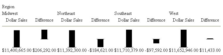
columns. The following figure illustrates such a discrepancy.
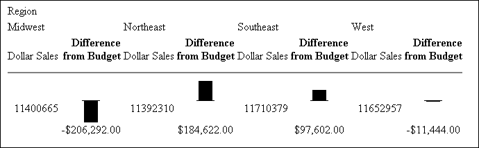
As you can see from the figure above, the values for the Dollar
Sales field ($11,392,310.00 to $11,710,379.00) is much larger in
magnitude than the set of values for the Difference field ($206,292.00
to -$184,622.00). Also notice that the vertical bar graphs associated
with the Difference values all but disappear when graphed against
the entire set of values.
To display separate vertical bar graphs based on each column's
set of values, use the GRAPHSCALE StyleSheet attribute. This attribute
modifies data visualization graphics to use the minimum and maximum
values for each column below a common ACROSS sort field to construct
a distinct vertical bar graph.
x
Syntax: How to Apply Vertical Scaling to Data Visualization Bar Graphs
TYPE=REPORT, GRAPHSCALE={UNIFORM|DISTINCT}where:
- TYPE=REPORT
Specifies that the declaration applies to the entire report,
and not to a specific bar graph within the report.
- GRAPHSCALE
Specifies the relative bar graph scaling for multiple report
columns under a common ACROSS sort field in which you have applied
data visualization graphics.
- UNIFORM
Scales each vertical bar graph based on the minimum and maximum
values of the entire set of values compiled from each ACROSS column
in which you have applied data visualization graphics.
- DISTINCT
Scales each vertical bar graph based on the distinct minimum
and maximum values for each ACROSS column in which you have applied
data visualization graphics.
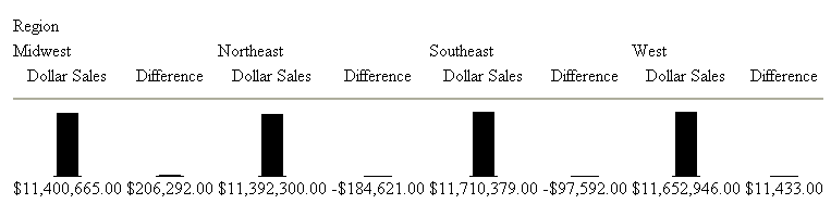
Example: Using GRAPHSCALE to Display Distinct Vertical Bar Graphs
The following report request displays
vertical bar graphs for two columns (DOLLARS and DIFFERENCE) associated
with a common ACROSS field (REGION):
DEFINE FILE GGSALES
Difference/D12.2M=DOLLARS-BUDDOLLARS
END

TABLE FILE GGSALES
SUM DOLLARS/D12.2M Difference
ACROSS REGION
ON TABLE SET STYLE *
TYPE=REPORT,GRID=OFF,$
GRAPHTYPE=DATA, ACROSSCOLUMN=N1,$
GRAPHTYPE=DATA,ACROSSCOLUMN=N2,$
END
This request produces
the following report output:

Since
the GRAPHSCALE attribute is not specified, the default setting UNIFORM
is applied to the report. This setting uses the entire set of values
(values from Dollar Sales and Difference) to plot the bar graphs
for both columns.
The following request
is the same as the above request, except it has the GRAPHSCALE=DISTINCT
attribute included in the StyleSheet.
DEFINE FILE GGSALES
Difference/D12.2M=DOLLARS-BUDDOLLARS AS 'Difference'
END

TABLE FILE GGSALES
SUM DOLLARS/D12.2M Difference
ACROSS REGION
ON TABLE SET STYLE *
GRAPHTYPE=DATA, ACROSSCOLUMN=N1,$
GRAPHTYPE=DATA, ACROSSCOLUMN=N2,$
TYPE=REPORT, GRAPHSCALE=DISTINCT,$
END
Notice the difference
in the output:
Now
each bar graph is plotted based on the set of values for each field.
xFormatting Data Visualization Bar Graphs
You can specify optional formatting attributes for data
visualization bar graphs. These attributes are graph color, patterns,
length, and width. For complete details, see Visualizing Trends in Reports in the Creating
Reporting Applications With Developer Studio manual.