In this section: |
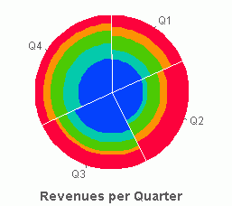
Pie charts, also known as pie graphs, circular charts, or circular graphs, divide complete data sets into slices with each slice representing a group or subset of that data. The size of the slice corresponds with the percentage of the whole that particular group makes up. Pie charts are best for understanding data in terms of proportions and showing how sizes of parts relate to a whole.
The following image shows an example of a pie chart.
WebFOCUS Visual Discovery enables you to create powerful pie charts or view groups of pie charts to compare a number of categories at once. You can also customize the view of the pie chart through flexible color-coding, rotation, exploding, and ordering. Additional features include:
Keep in mind that pie graphs work best when your data consists of several large sets. Too many variables divide the pie into small segments that are difficult to see. Use color or texture on individual segments to create visual contrast.
The values in the y-field (weighting) should be greater than zero since zeros and negative values are ignored in the calculation of the wedge size.
How to: |
You can change the positioning of the wedges in a pie chart by using the rotate option. This controls the position of the first ordered wedge. You may want to rotate the pie chart so the most important wedge is at a more visible position (such as the 12 o'clock position).
Options (by degrees) are: 0, 45, 90, 130, 180, 225, 270, 315. At 0 rotation, the first wedge begins at the top position (12 o'clock), and at 180 rotation, the first wedge begins at the bottom position (6 o'clock). The default is 0.
Tip: From the pop-up menu, select Rotation and then select the appropriate value.
How to: |
The explode option increases the space between each wedge, pulling apart each wedge of the pie from the center. The available options are None, Small, Medium, and Large. The default is None.
The explode option applies to two-dimensional components.
How to: Reference: |
In pie and bar charts, you can choose to show net aggregation. Net aggregation generates the sum of all positive and negative values in a data set, and the Visual Discovery control displays the net sum rather than the weighted sum.
Also in a pie chart, you can show only data with positive values or only data with negative values.
The following image shows a pie chart that displays the profit from three countries.
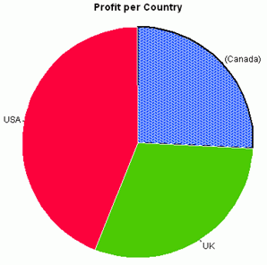
In this example, Canada has a loss that is indicated by the slice texture, the line along the edge of the slice, and the parentheses around the country name. With this net sum representation of the data there is no loss of information. If a weighted mode were used, Canada would be omitted from this chart.
Right-click the pie chart and select Weighting Mode, then one of the following:
Right-click a bar chart and select Net Mode.
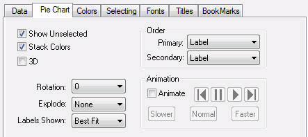
The following image shows the Pie Chart tab in the Visual Discovery Properties dialog box.
Shows unselected data in gray. If Show Unselected is not checked, unselected data is omitted from the display.
To add unselected data, either turn on Show Unselected in the Properties dialog box, or use the right mouse button menu in the view and choose Select All.
A glyph may be colored to show two fields that have been colored by a third field. See Assigning Color to the Data and the Graph.
Displays the slices of a pie chart in three dimensions.
Rotates the placement of slices in a pie graph. See Rotating Data.
Explodes slices so they stand out. See Exploding Data.
Sets the label mode. See Displaying Labels.
Controls the sequence in which glyphs are presented. See Selecting Primary and Secondary Order.
Puts a single component or a perspective into a mode where its glyphs are automatically colored and not colored in sequential order. See Animating Data.
The pop-up menu appears when you right-click a Visual Discovery control in the analytical dashboard. These options do not appear when you are developing in the HTML Composer.
Shows unselected data in gray. If Show Unselected is not checked, unselected data is omitted from the display.
To add unselected data, either turn on Show Unselected in the Properties dialog box, or use the right mouse button menu in the view and choose Select All.
Rotates the placement of slices 0, 45, 90, 135, 180, 225, 270, or 315 degrees.
Moves the slices apart so that they stand out more dramatically. Available options are None, Small, Medium, and Large.
Select from Include All, Positives Only, or Contributors Only. See Aggregating Data in Pie and Bar Charts.
Puts a single component or a perspective into a mode where its glyphs are automatically colored and not colored in sequential order. See Animating Data.
Displays the items in one of the following orders: Original Order, Label, Size, Total Selected, or Percent Selected. See Selecting Primary and Secondary Order.
Sets the label mode. See Displaying Labels.
Adds or removes the label from the selected data item.
Reverses the previous action. You may repeatedly undo actions retained in the history file for your current session by selecting Undo over and over again. A description of the previous action appears on the pop-up menu. If you have performed no action, Undo is not available for selection and no action appears to the right of the word Undo.
Restores the previous undo action. If you have performed no action, Redo is not available for selection and no action appears to the right of the word Redo.
Selects all of the items in the graph. When you choose Select All, any previous selections are ignored. Selection state returns to the original setting.
When selected, all of the items become unselected. All items appear in the unselected color (gray, by default) or are hidden in the graph (if hide unselected is active).
Reverses the selection state of items. Selected items become unselected and unselected items become selected.
Excludes (temporarily removes) items from the graph.
Restores the items you excluded. If you accidentally excluded the unselected, this menu option restores those excluded items.
Enables you to save the graph to a GIF or JPEG file.
Enables you to copy the selected component and paste it to another file.
Takes you to the collection of tabs available for the respective visualization component. Common tabs include Data, Selecting, and Colors.
| WebFOCUS |