Each page layout in the coordinated compound document creates a separate page in the active dashboard. These pages are accessible through the active dashboard panels at run time. You must build each page layout in Document Composer.
-
In Document Composer, name the panels for the active dashboard
by changing the name of the TOC description in the Page Layout.
- Click anywhere in the Page Layout, or select Page layout(n), where n is the number, from the Properties window drop-down list.
- In the Properties window, double-click the TOC description properties field.
- Enter a name for the active dashboard.
Each panel name in the active dashboard corresponds to the TOC description properties field.
- On the Insert menu, select Add New Page Layout to add additional page layouts and repeat the steps from How to Create an Active Technologies Dashboard in Document Composer.
- Optionally, you can insert images and text in the page layout that will appear in the active dashboard.
- Save and run the active dashboard.
The following image is an example of an active dashboard.
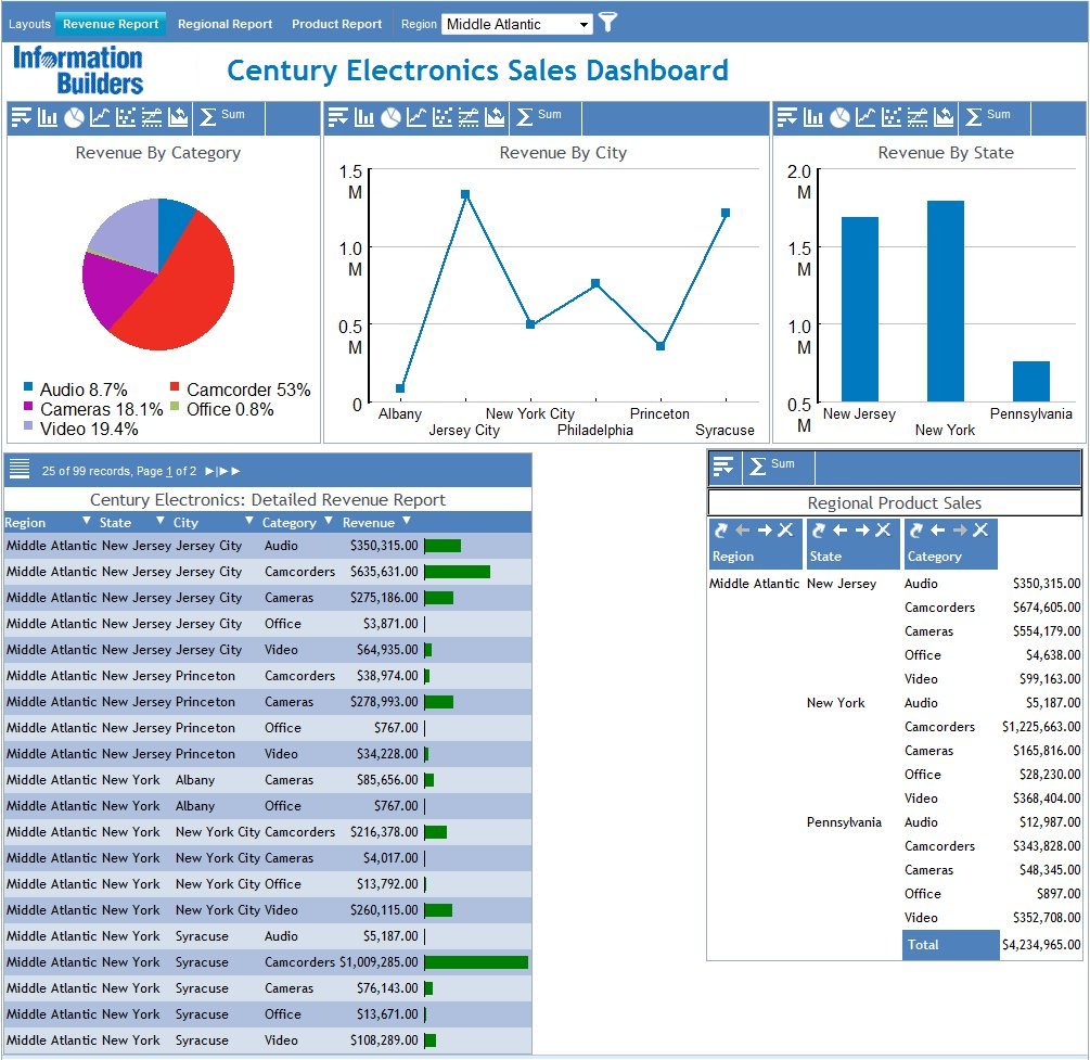
Every type of active report visualization is demonstrated in the image above. These types include pie, line, and bar charts, a tabular report, and a pivot table. You can quickly switch from one reporting scenario to another by clicking on each of the panels at the top of the page.
Each panel on the active dashboard corresponds to a page layout from the coordinated compound document, and displays as the name in the TOC description properties field.
The active dashboard is universally filtered by the region field, represented by the Region drop-down list, which is also located at the top of the page in the preceding image.
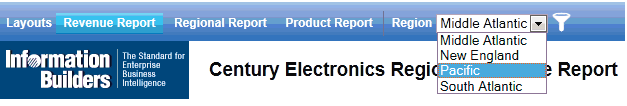
The drop-down list for the primary sort field lists all the values found for the primary sort field among the active reports, and will filter the entire active dashboard.
The tabs and drop-down list in an active dashboard are shown in the following image.
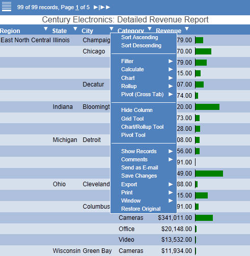
Each type of active report in an active dashboard provides you with powerful reporting menus that you can use to further refine the content. An example is the active report column heading menu that is shown in the following image.