Working with Dashboards

In this section:

Reference:

Dashboards appear to PMF owners (users) the same as other Today pages. Dashboards can be designated for use by particular users by the PMF Administrator. This can be changed at any time by selecting a personalized dashboard as a Today page on the Today tab.

When an owner first selects a dashboard, it automatically populates itself with data appropriate to their access role or owner access (depending on how this is configured in PMF). Metrics are displayed using the default choices set up by the dashboard designer.

PMF users can personalize each gadget to display the metric information that is important to them. As a user, you can group, filter, and select the data points that are displayed in the gadgets on your dashboards. The available choices for each gadget depend on how the gadget was designed.

PMF includes a set of gadgets that use Flex technology with local intelligent caching. As you navigate through data, the intelligent caching agent determines if data is already in your browser. If it is, the data is instantly delivered to the Flex gadgets. If not, the agent requests the needed data.


Top of page

x
Dashboard Designer

In this section:

How to:

The Dashboard Designer is available to the user if the user was given Administrator rights to the dashboard.

To access the Dashboard Designer from the Today page, click the Unlock the Dashboard unlock dashboard icon icon, followed by the Edit current selected Today page Edit current selected Today page icon icon or click the Create a new Today Page Create a new Today Page icon icon.

The Dashboard Designer opens, as shown in the following image.

Dashboard Designer

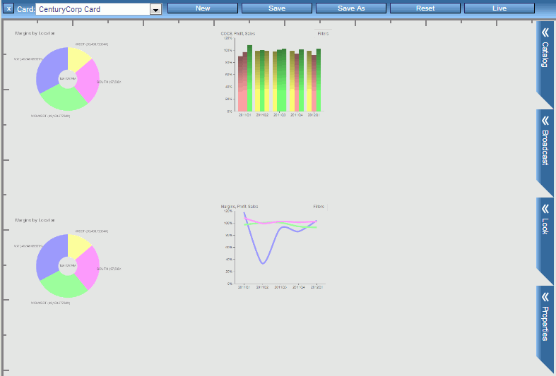
Dashboard Designer includes:


x
Procedure: How to Design a New Dashboard
  1. Unlock the Today page and click the Create a new Today Page Create a new Today Page icon icon. You can also click New from the Dashboard Designer.
  2. Click the Catalog chevron to display a list of gadgets available for use in your design.

    The following image shows part of a sample Catalog.

    Catalog Chevron

  3. Use the scroll bar directly to the right of the Catalog chevron to display the entire list of available gadgets. You can also search for a specific gadget by typing its name in the Search field.
  4. Drag the desired gadget or gadgets onto the design canvas.

    PMF retrieves the default size for each gadget that you add to the canvas.

  5. Perform the following actions to achieve the desired result.
    • To re-position a gadget on the canvas, click anywhere inside the gadget to display its title bar. Move the cursor inside the title bar of the gadget to display the move Move symbol in title bar of a gadget symbol. Drag the gadget to the desired location.

      Dashboard Designer automatically aligns the top edges of gadgets that are in proximity.

    • To resize a gadget on the canvas, click the Resize Resize button button in the lower-right corner of the gadget, and drag the borders of the gadget to the desired height and width.
    • To delete a gadget from the dashboard, click the Remove Gadget Remove Gadget button on a dashboard button on the title bar of the gadget.
    • To change the values used to display the data for a gadget, click the Preferences Preferences icon button on the title bar of the gadget. Make your selections from the drop-down menus. For details, see Changing Dashboard Gadgets and Preferences.
    • On the ribbon, click Live at any time to display the dashboard as it will appear at run time. From run-time mode, click Design to return to design-time mode.
  6. Optionally, click the Broadcast Broadcast chevron chevron to implement simultaneous run-time changes across multiple gadgets.

    For details on Broadcast, see Setting Up Broadcast on a Dashboard.

  7. On the ribbon, click Save when you are satisfied with your design. When you are prompted, type a name for the new dashboard. If this option can be changed, indicate whether the dashboard is public or private.

    The following image shows the Save As panel.

    Save as panel

    The following options are available:

    • Public Dashboard. Visible to all owners in PMF. Administrator access is required to create a public dashboard.
    • Private Dashboard. Visible only to the owner who created it. You can create a private dashboard with Edit or higher dashboard access.


x
Procedure: How to Edit an Existing Dashboard
  1. In the Today tab in PMF, click the Edit the current selected Today page Edit Today page icon icon.

    The dashboard opens in the Dashboard Designer.

  2. Edit the dashboard. On the ribbon, click Save when you are done.


x
Controlling the Look of a Gadget

You can make changes to a gadget when its title bar appears. To display the title bar, click anywhere inside the gadget.

The gadget controls include the following.


x
Procedure: How to Search the Gadget Catalog

There is a built-in search capability in the Gadget Catalog which makes it easier to find specific gadgets for your dashboard.

To search for a gadget or a category of gadgets:

  1. Click the Catalog chevron in the Dashboard Designer.
  2. In the Search field, enter the first few letters of the gadget type or category, as shown in the following image.

    Gadget Catalog Search

  3. Select the desired gadget from the list that appears. You can either select the listed category to view all gadgets related to your search, or select a specific gadget.

To clear the search and show all available gadgets, click the Clear Search Clear Search Button button.


x
Draggable Guidelines

You can place draggable guidelines on your Dashboard designs that enable you to lay out your Dashboards more precisely. With the guidelines, you can set and lock vertical and horizontal positions along which gadgets can be placed.

Guidelines are only visible to the dashboard designer. A consumer will not be able to see the guidelines unless the consumer was given rights to use the Dashboard Designer.

Any dashboards that are saved either by using the Save or Save As functions are saved along with the guidelines in their exact positions and locked state. If you enter the Dashboard Designer at a later time, all guidelines display in their last known position and locked state.


x
Procedure: How to Add a Guideline to a Dashboard Design

Vertical and horizontal guidelines can be added to your dashboard at any time.

Note: Rulers must be displayed in order to add a guideline.

From the Dashboard Designer:

  1. Move the pointer over the vertical or horizontal rule until the ruler line flashes and the pointer becomes a double-headed arrow, as shown in the following image.

    Adding Guidelines

  2. Click the ruler line and drag the pointer to set the guideline. As you drag the guideline, a hover control appears that shows the exact pixel position of the guideline while it is being moved, as shown in the following image.

    Pixel Position

  3. Once the guideline is positioned, release the pointer.

Guidelines can be locked on the dashboard or left floating. Unlocked guidelines can be moved at any time.


x
Procedure: How to Move a Guideline

Guidelines can only be moved if they are not locked.

  1. Move the pointer over the guideline until the point becomes a double-headed arrow.
  2. Click the guideline and drag it into its new position.
  3. Release the pointer to set the guideline in place.


x
Procedure: How to Lock a Guideline
  1. Move the pointer over the guideline until the hover control appears.
  2. Click the lock Lock Button button to lock the guideline.

Note: Locked guidelines cannot be moved but they can be removed.


x
Procedure: How to Remove a Guideline
  1. Move the pointer over the guideline until the hover control appears.
  2. Click the Delete button to remove the guideline, as shown in the following image.

    Removing a Guideline

The guideline disappears and has been removed.


x
Target Screen Resolution Support

Guidelines can be automatically placed on the Dashboard design based on the target screen size of the consumer. For example, if many of your users have a 1024 x 768 total screen resolution, your Dashboard designs can be targeted to display all onscreen with no scrollbars using this capability.


x
Procedure: How to Set Up Target Screen Resolution

In the Dashboard Designer:

  1. Click the Properties chevron.
  2. Select the desired target resolution from the Screen Resolution drop-down menu, as shown in the following image.

    Target Screen Resolution


x
Moving Gadgets Together

The Dashboard Designer allows you to perform multiple selection of gadgets, which enables you to move and position gadgets as a group.


x
Procedure: How to Move Gadget Groups
  1. Select the first gadget you want to move.
  2. Press CTRL while selecting each gadget you want to group together.
  3. Move the group while continuing to press CTRL.

When you select gadgets to be moved as a group, the Dashboard Designer restricts the move by drawing a rectangle around all of the gadgets. This prevents you from dragging any portion of the group outside of the onscreen dimensions of the dashboard.


x
Procedure: How to Turn Snap Grid Control On or Off

The auto-snap feature in the Dashboard Designer can be turned off, which enables you to freely move gadgets on the dashboard with no constraints on positioning.

To turn snap grid control off:

  1. Click the Properties chevron in the Dashboard Designer.
  2. Clear the Snap Control check box.
  3. Optionally, change the size of the snap grid by entering a different pixel value in the Snap Control field. The default snap grid size is 10 pixels.

Note: Saving the dashboard design will save with the state of the current snap control setting.


x
Procedure: How to Change the Dashboard Owner

You can change the dashboard owner directly from the Dashboard Designer:

  1. Click the Properties chevron from the Dashboard Designer.
  2. Select the new owner from the Owner drop-down menu, as shown in the following image.

    Properties chevron

  3. Click Save.


x
Adding Gadgets From the Catalog

Gadgets can be added directly from the catalog in the Dashboard Designer. Gadgets that are added and configured from the catalog are immediately available to use in dashboard designs.


x
Procedure: How to Add a New Gadget From Inside the Catalog

From the Dashboard Designer:

  1. Click the Catalog chevron.
  2. Click the New Gadget button.

    The new gadget designer window opens.

  3. Enter all values in their appropriate fields.

    Note: This capability is only available to users with administration rights to dashboards.


x
Registering Gadgets From the Catalog

Gadgets can be registered directly from the catalog in the Dashboard Designer. Gadgets that are added and configured from the catalog are immediately available to use in dashboard designs.


x
Procedure: How to Register a New Gadget From Inside the Catalog

From the Dashboard Designer:

  1. Click the Catalog chevron.
  2. Click the Register button.

    The Register window opens.

  3. Enter all values in their appropriate fields. For more information, see Registering a Gadget.

    Note: This capability is only available to users with administration rights to dashboards.


x
Resetting Dashboard User Preferences

Dashboard user preferences can be reset to the default preferences in the original dashboard design.

The dashboard preferences control settings a user sees, such as metrics and dimensional filters. Preferences are stored for each of the following:

Default preferences are stored for each dashboard in the system. These preferences are set during the dashboard design process in the Dashboard Designer.

Users can override preferences set for a dashboard by saving their changes in the Preference panel in the dashboard.

User preferences can be reset from many areas within PMF. Where the reset is performed determines the scope of where those preferences are overridden.


x
Procedure: How to Reset Dashboard Preferences From the Dashboard Designer

If a user has administrator rights in a dashboard, the user has the ability to clear user preferences for any of their dashboard designs.

Any preferences that are changed from within the Dashboard Designer changes the default preferences for that dashboard, as well as each scorecard that can be selected and configured.

From the Dashboard Designer:

  1. Click the Reset button on the Dashboard Designer ribbon.

    The Reset window opens, as shown in the following image.

    Reset window

  2. Select Auto-reset this Dashboard’s default preferences to only clear the default preferences. Selecting Clear all User Dashboard preferences will delete any saved user preferences.

Top of page

x
Personalizing Gadgets

PMF Owners, including consumers and analysts, can configure their gadgets to display the exact metrics they want to see from any of their scorecards. PMF enables owners to interactively view and personalize the metrics displayed on a dashboard, and PMF saves the preferences for each user.

The following three icons are available in the upper-right corner of each gadget:

Note: These three icons are removed from the view when you click anywhere outside the gadget.

When you select the preferences preferences icon, the gadget configuration form appears, as shown in the following image.

Gadget preferences

You can select specific display options, depending on which groupings and filters are available in the dialog, and then click Preview to re-display the gadget with the new configuration. There are options to Save your personalizations, Revert back to your current saved preferences, or Close the dialog without further changes. If you save your preferences, the next time you refresh the page, or log out and log back in to PMF, the gadget displayed reflects your saved preferences. PMF permanently retains all preferences for every gadget for each user until it is changed. The menus available in the configuration form vary depending on how the gadget was designed. For more information about designing gadgets, see Designing Gadgets.


Top of page

x
Resizing and Displaying Gadgets

The size of a PMF Gadget depends on the content it contains. PMF Gadgets can contain drill downs to many contexts including operational reports, detailed views, websites, mini-dashboards, and graphs. After you utilize a drill down, a Gadget automatically detects the area required to display the new content and resizes accordingly.

If a resized Gadget covers part of another Gadget, you can bring the covered Gadget back into full visibility by clicking any part of it. You can also click any space on the dashboard where no Gadgets exist to restore visibility to all of the Gadgets on the dashboard. Additionally, if you click the Back button on a Gadget, PMF automatically resizes the Gadget back to its default size.

The following is an example of how multiple gadgets may appear on your dashboard:

multiple gadgets on dashboard


Top of page

x
Working With Flex Gadgets

How to:

PMF includes a set of gadgets that use Flex technology with local intelligent caching. As you navigate through data, the intelligent caching agent determines if data is already in your browser. If it is, the data is instantly delivered to the Flex gadgets. If not, the agent requests the needed data.

The Flex technology gadgets include the ability to alternate between a chart and its underlying data grid and to change filters on the fly. The Preferences panel for any Flex gadget decides the downloaded data pool to the local controller. You can select more data to display. For example, if a Flex gadget can display one measure, you can download five or eight measures worth of data. Then, that data will be available to you for On the Fly changes. Likewise, if a control can show one point in time, or even multiple points in time, you can download more of the data to display at a time, and that data will be available to the Flex control for On the Fly changes.

Note: When sorted across a Dimension, Flex bar charts respond to clicks made on the actual bars by extracting, displaying, and breaking out additional data at the next lower Dimension level.


x
Procedure: How to Alternate Between a Chart and the Underlying Data Grid
  1. From the dashboard, select a Flex gadget.

    For example, the Sales Target over Actual by Quarter gadget is shown in the following image.

    Example gadget

  2. Click the heading of the gadget.

    The selected filters and the Reveal grid button display, as shown in the following image.

    Reveal Grid button

  3. To alternate between the chart and underlying data grid, click the Reveal grid button.

    The underlying data grid is shown in the following image.

    Data grid

  4. To return back to the chart, click the heading of the gadget.

    The selected filters and the Return to Chart button display, as shown in the following image.

    Return to chart button

  5. Click the Return to Chart button.


x
Procedure: How to Change Filters on the Fly
  1. From the dashboard, select a Flex gadget.

    For example, the Sales, profit, Margins % Reached by Quarter gadget is shown in the following image.

    Flex gadget

  2. Click the heading of the gadget.

    The selected filters display.

  3. Select the filter you want to change, for example, Measures, as shown in the following image.

    Flex gadget

  4. Select a new value for the measure, for example, Profit.

    The chart and underlying data grid changes, using Profit as the Measure, as shown in the following images.

    Flex gadget

    Flex gadget grid


Top of page

x
What is Broadcast?

In this section:

How to:

Broadcast enables changes you make to the parameters passed to a gadget to be shared among other gadgets on the dashboard. If an administrator has enabled Broadcast for your dashboards, it enables you to cascade simultaneous changes which you specify across multiple gadgets on the dashboard. As a result, you can quickly compare similarities and differences between multiple Dimension areas, or compare different Measures for the same Dimension areas. With Broadcast, changing the Dimension Preferences on any gadget can change the displayed Dimension data for all gadgets. It works as if you had changed the Dimension groupings or filters on all gadgets in the Broadcast group and then clicked Preview simultaneously. You can add a gadget or remove a gadget from a Broadcast group with a few clicks.

For all gadgets, (both Flex and other) if Broadcast is active, the Preferences box also controls the currently displayed filters. This actually controls all gadgets grouped for Broadcast on the dashboard, regardless of whether they are Flex or not.

If your administrator enabled time animation when setting up a Broadcast group on a dashboard, you can select the time range that you want to display in the group. PMF automatically refreshes the views in the Broadcast group so that they display the selected time range.


x
Setting Up Broadcast on a Dashboard

When you implement the Broadcast capability, run-time values specified by a user in the Preferences panel for a single gadget are applied to all the gadgets in a group. As a result, users can quickly compare similarities and differences among multiple dimensional areas, or compare different measures for the same dimensional areas.

You can also enable animation of the time range that appears in a Broadcast group.

To implement those capabilities for your users, use the Broadcast chevron in Dashboard Designer when creating a new dashboard or editing an existing dashboard.

For an example of a dashboard on which Broadcast has been applied, see What is Broadcast?.


x
Procedure: How to Set Up Broadcast on a Dashboard

This procedure assumes that you are in Dashboard Designer, that you have added gadgets from the Catalog to the dashboard, and that you have specified your preferences for each gadget.

  1. Click the Broadcast chevron. When the Broadcast chevron is open, Dashboard Designer is in Broadcast design mode.
  2. From the Broadcast drop-down menu, click the type of change that you want to share among the grouped gadgets. Possible values are:
    • Metrics only
    • Dimensions only
    • All (for both metrics and dimensions)

    The following image shows the Broadcast drop-down menu.

    Broadcast drop-down list

  3. With the Broadcast chevron still open, click each gadget on the design canvas that you want to add to the Broadcast group.

    A gadget that you select on the design canvas is highlighted to indicate that it is in the group.

    In the following image, the two gadgets in the group are highlighted.

    Broadcast

    Tip: To remove a highlighted gadget from a group, click the gadget.

  4. Optionally, select the Time Animation check box to enable animation of the time range that the Broadcast gadgets display when the gadgets are run.

    When you enable time animation, a user can apply it using the instructions in How to Apply Time Animation.

    In the following image, the Time Animation check box is selected.

    Time Animation check box

  5. Click Set on the Broadcast chevron.

    The Broadcast properties are saved to the dashboard, and the Broadcast chevron is closed.

When your user specifies run-time values in the Preferences panel for a gadget in the group, those values are applied to all the gadgets in the group.


x
Procedure: How to Change Multiple Gadgets in a Broadcast Group
  1. Display the dashboard, for example, Metric Flex Mix - 01, as shown in the following image.

    Dashboard

  2. Click the heading of the top-left gadget on the dashboard, for example, Profit: Target over Actual by Quarter.
  3. Click the My Preferences for this Gadget button. PMF displays the Preferences panel for the gadget, as shown in the following image.

    Gadget preferences

  4. In the Filters drop-down menu, select the one showing Time and change the Time Range selection from Last 9 Quarters to Last 5 Quarters, as shown in the following image.

    Gadget preferences

  5. Click Preview.

    The gadget you selected updates to show the last 5 quarters. This change automatically propagates to all the gadgets in the Broadcast group so they are all showing data from the Last 5 Quarters.


x
Procedure: How to Apply Time Animation
  1. On the Today tab, run the dashboard for which Broadcast and time animation have been enabled.

    Your administrator must set up those capabilities.

  2. Click the Explore Time chevron, as shown in the following image.

    Explore Time chevron

  3. From the drop-down menu, click the time range that you want to display in the Broadcast group.

    When you select a time range, the view of the data in the group changes to reflect your selection.

  4. Optionally, you can:
    • Click the left arrow and right arrow buttons on the chevron to move forward and backward in time.
    • Use the slider to adjust the speed of the time animation.

Top of page

x
Styling the Dashboard

How to:

You can change the overall look of your Dashboard Designer from the Look chevron.

Look Chevron

The following options are available:


x
Procedure: How to Change the Look of a Dashboard

To change the look of a new or existing Dashboard, from the Today Page:

  1. Click the Create a new Today Page icon or the Edit the current selected Today Page icon.

    The Dashboard Designer opens.

  2. Click the Look chevron.
  3. Select your desired changes and click Save.

Top of page

x
Reference: Catalog of Available Gadgets

The following table lists and describes the Gadgets that are available in the current release of PMF.

Note: More Gadgets will be made available in subsequent releases.

Gadget

Example

Description and Filters

Flex - Magnify Tag Cloud

Magnify Tag Cloud

Displays multiple text items selected from a search engine.

Displays results from a search of measure data, user comments, projects, and the Strategy Map. There are no required or optional filters.

Flex - Metric Actual Dual Line Slider

Flex - Metric Actual Dual Line Slider

Displays an area chart that shows the percent reached for a specific time period.

Required filter is measure selection. Optional filters are dimension and time.


Flex - Metric Share of Actual Pie

Flex - Metric Share of Actual Pie

Displays a pie chart showing the actual share of quantities and percents across a selected measure.

Required filter is measure selection. Optional filters are dimension and time.

Flex - Metric Target Pct-Rchd Gauge

Flex - Metric Target

Displays the percent reached for the target value for the selected measure.

Required filter is measure selection. Optional filters are dimension and time.

Flex - Metrics Actual Bars

Flex - Metric Actual Bars

Displays a series of bars using indicator colors to show the actual percent reached for the selected measure.

Required filter is measure selection. Optional filters are dimension and time.

Flex - Metrics Pct-Rchd Line

Flex - Metric Pct-Rchd Line

Displays a line chart to show the actual percent reached over the target value with a smooth line. For comparison, each line is a different measure.

Required filter is measure selection. Optional filters are dimension and time.

Flex - Metric Tree Map

Metric Tree Map

Displays a drillable tree map of shares of various contributors.

Required filters are dimension name and measures to display in the map.

Flex - Metric Actual Line Over Target Pct-Rchd Bar

Flex - Metric Target Pct-Rchd Line Over Bar

Flex - Metric Actual Line Over Target

Displays a time series of bars using indicator colors with a line drawn over the bars to show actual or target percent reached values.

Required filter is measure selection. Optional filters are dimension and time.


Flex - Strategic Dual Line Slider

Flex - Strategic Dual Line Slider

Displays an area chart that shows the percent of the blended profit goal that was reached for a specific time period.

Required filter is objective, risk, compound objective, or consequence selection. Optional filters are dimension and time.

Flex - Strategic Pct-Rchd Line

Flex - Strategic Pct-Rchd line

Displays a line chart that shows the percent of the blended profit goal and margin that was reached for a specific time period.

Required filter is objective, risk, compound objective, or consequence selection. Optional filters are dimension and time.

Flex - Strategic Target Pct-Rchd Gauge

Flex - Strategic Target

Displays a gauge that shows the percent of the blended profit goal that was reached.

Required filter is objective, risk, compound objective, or consequence selection. Optional filters are dimension and time.

Flex - Strategic Pct-Rchd Bars

Flex - Strategic Pct-Rchs Bars

Displays a series of bars using indicator colors to show the percent of the blended profit goal and margin that was reached for a specific time period.

Required filter is objective, risk, compound objective, or consequence selection. Optional filters are dimension and time.

HTML5 - Metric Actual Target Prior Lines

Actual Target Prior Lines

Displays a line graph showing the variance of actual values against the variance of target values, along with prior actual values for year-over-year comparison.

Required filter is measure name. No optional filters.

HTML5 - Metric Actual Target YTD & Prior Bars

Actual Target YTD and Prior Bars

Provides a visual analysis using bar charts to display Year-To-Date and current period performance for actual, target, and prior year values.

Required filter is measure name. No optional filter.

HTML5 - Metric Actual v. Flattened Target Lines

Actual v. Flattened Target Lines

Displays a line graph showing the variance of actual over target values, which is flattened to emphasize variances.

Required filter is measure name.

Optional filter is time range (defaults to Last Five Periods view if no time range is provided).

HTML5 - Metric Bubble Chart

Metric Bubble chart

Displays a placed distribution of performance values where the midpoint of each value falls along a horizontal Dimensional axis and Performance on the vertical axis. Size of the bubble indicates the actual value.

Required filters are dimension name and measure name.

Optional filter is Time Range used.

HTML5 - Metric Counts of Actual RYG Bars

Counts of Actual RYG Bars Gadget

Displays the total Hi-Mid-Low (H-M-L) counts of a metric range. Also shows the H-M-L share of the total count of metric values in the metric range of each indicator.

HTML5 - Metric Dim Breakout Actual Bars

Metric Dim Breakout Actual Bars

Displays actual value distribution for any Dimension and level. Displays a series of bars across a selected dimension using indicator colors for the current time period.

Required filters are dimension name and measure name.

Optional filter is dimension level to pre-drill.

HTML5 - Metric Dim. Breakout Donut

Metric Dim Breakout Donut

Displays a donut chart showing metric quantities distributed across a selected dimension and level value.

Required filter is dimension name.

Optional filter is the level value to begin the breakout for the dimension.

HTML5 - Metric Dim. Breakout Perf. Bars

Dimensional Breakout Performance Bars

Displays performance distribution for any dimension and level.

Displays a series of bars across a selected dimension using indicator colors for the current time period.

Required filters are dimension name and measure name.

Optional filter is dimension level to pre-drill.

HTML5 - Metric Dim. Breakout Pie

Dimensional Breakout Pie

Displays a pie chart showing metric quantities distributed across a selected dimension and level value.

Required filter is dimension name. Optional filter is the level value to begin the breakout for the dimension.

HTML5 - Metric Dim. Pareto Distribution Chart

Dimensional Pareto Distribution Chart

Shows the proportion of Actual values for all measures for the selected Perspective for the current or any single-point Time Period. Differs by Scorecard.

Required filter is one user-selected dimension.

HTML5 - Metric Pct Reached for Perspective

Percent Reached for Perspective

Shows the percent reached for all measures for the selected Perspective. Differs by Scorecard.

Required filter is one user-selected perspective.

HTML5 - Metric Perf. Gauge

Performance Gauge

Displays the percent achieved for the selected measure, and illustrates the measure set tolerances in red/yellow/green.

Required filter is measure selection. No optional filters.

HTML5 - Metric Perf. Trend Bars

Performance Trend Bars

Displays a time series of bars using indicator colors.

Required filter is measure name. Optional filter is time range (defaults to Last Five Periods view if no time range is provided).

HTML5 - Metric Perf. Trend Lines & Bars

Performance Trend Lines and Bars

Displays a time series of bars using indicator colors with two lines drawn over the bars to show actual and target values.

Required filter is measure name. Optional filter is time range.

HTML5 - Metric Tree Map

Metric Tree Map

Displays a drillable tree map of shares of various contributors.

Required filters are dimension name and measures to display in the map.

HTML5 - Metrics Actual Multiline

Metrics Actual Multiline

Displays a line chart to show the actual value with a smooth line. For comparison, each line is a different measure.

Required filter is measure multi-selection.

Optional filters are dimension and time.

HTML5 - Metrics Pct-Rchd Multiline

Metrics Pct-Rchd Multiline

Displays a line chart to show the percent reached with a smooth line. For comparison, each line is a different measure.

Required filter is measure multi-selection.

Optional filters are dimension and time.

HTML5 - Metrics Strategic Pct-Rchd Multibars

Metrics Strategic Pct-Rchd Multibars

Displays a multi-bar chart to show the percent reached for groups of Measures across a Dimensional breakout. For comparison, each color series of bar in each group represents a different measure, and groupings indicate the dimensional breakout.

Required filter is measure multi-selection and Dimension and level for the breakout.

Optional filter is time.

HTML5 - Perspective Compare Perf. - Horz Bars

Perspective Compare Perf. Horz Bars

Displays a horizontal grouping of performance trends for all objectives in a perspective.

No required filters (defaults to the currently selected scorecard).

Optional filters are perspective and time range (defaults to Last Five Periods view if no time range is provided).

HTML5 - Perspective Compare Perf. - Vert Bars

Perspective Compare Perf Vert Bars

Displays a vertical grouping of performance trends for all objectives in a perspective.

No required filters (defaults to currently selected scorecard). Optional filters are perspective and time range (defaults to the Last Five Periods view if no time range is provided).

HTML5 - Perspective Perf. Gauge

Performance Gauge

Displays the Percent Reached aggregate at the Perspective level for the selected Scorecard. Differs by Scorecard.

Required filter is perspective name.

Metric - Sparkline & Bullet Chart Grid

Sparkline and Bullet Chart Grid

Displays actual, target, and variance data with an actual vs. target horizontal sparkline and bullet chart.

No required filters.

Metric - Counts of RYG Bars

Counts of RYG Bars

Displays performance data using red, yellow, and green indicator color bars for the current time period.

No required filters.

Metric - Performance Grid

Performance Grid

Displays a grid of all metrics for the current scorecard and can show multiple measure selections if desired. Optional grouping can be done on the dimension name and level.

No required filters. Optional filter is perspective. If you apply filtering, it limits the grid to displaying only measures linked to that object.

Metric - Dimensional Crosstab Across Measure Grid

Dimensional Crosstab Across Measure Grid

Displays a drillable grid view of multiple measure values distributed in a particular dimension and level for use as a quick comparison of metrics.

Required filters are dimension name and measures to display in columns.

Optional filter is dimension level to pre-drill.

Metric - Performance Trend Grid

Performance Trend Grid

Displays a drillable grid view of values distributed for single or multiple measures across a selectable time range to provide quick trending of one or more Measures.

Required filter is time range for trending (default is 5 periods).

Optional filter is single, multiple, or all measures.

Perspective - Objectives Summary Grid

Objectives Summary Grid

Displays a summary showing current and previous achievement percentages, trend, weight, and all corresponding indicators for the selected group of objectives.

No required filters (defaults to currently selected scorecard). Optional filter is perspective.

Perspective - Compact Overview Grid

Compact Overview Grid

Displays a summary showing bars and indicators for the count of high, mid, and low objectives for each perspective included.

No required filters (defaults to currently selected scorecard). Optional filter is perspective.

Scorecard - Strategy Map

Strategy Map

Displays a strategy map in the dashboard that is a peer in display.

Utility - Administration - Measures Metadata Grid

Measures Metadata Grid

Displays detailed information about scorecard metrics to a PMF Administrator and contains drill downs to view detailed properties for all measures.

Utility - Google Search on Filter

Google Search on Filter

Displays search results in Google for a selected Dimension level value. Does not differ by scorecard.

Required filter is user-specified dimension and level value.

Utility - Legend

Legend

Displays the color language used in all Graph gadgets on the dashboard. Since all legends on all charts would be the same, this saves space on your dashboard.

There are no required filters.

Utility - Action Block

PMF Action Block

Displays the PMF Action Block which enables owners to work with their fired alerts, create new alerts, manage scheduled alerts, manage Schedule This reports, and input user-entered measures for their scorecard.

There are no required or optional filters.

Utility - Administration - DB Overview Grid

DB Overview Grid

Displays overview statistics for the PMF data mart to a PMF Administrator. This grid also fires the resynchronization function if the data mart is switched to point to a different data mart.

There are no required or optional filters.

Utility - Dimension Tree

Dimensions Tree Dialog Box

Displays all dimensions in a tree.

There are no required or optional filters.

Utility - Scorecard Tree

Scorecard Tree

Displays all scorecards in a tree.

There are no required or optional filters.

Utility - Analysis Designer

Analysis Designer gadget

Displays the PMF Analysis Designer, which enables you to specify parameter options and run a view based on those options. The available parameter options are grouped into five sections: Layout, Groupings, Data, Filter, and Report.

Utility - UE Sources

UE Sources

Allows end users to input data for groups of User Entered Source Datapoints they have access to. Also filterable by Dimensions as defined on each Source.

Utility - Feedback Live with Update

Feedback Live with Update

An easy-to-use accordion view that allows you to quickly view and respond to Feedback on any Measure for the current Dashboard.


WebFOCUS