How to: Reference: |
This chapter describes the logistic models.
What is Logistic Regression?
Logistic regression is used to predict outcomes or responses.
Logistic regression is conceptually similar to linear regression, where linear regression estimates the target variable. Instead of predicting values, as in the linear regression, logistic regression would estimate the odds of a certain event occurring. If predicting admissions to a school, for example, logistic regression estimates the odds of students being accepted in the school. The logistic regression algorithm takes the response (target variable) and transforms it into the odds of the event to occur.
Logistic regression has many analogies to linear regression: logit coefficients correspond to b coefficients, and a pseudo R2 statistic is available to summarize the strength of the relationship, for example, how much of the variation in the data is explained by the independent variables. See the explanation of R2 in Building a Linear Regression Model. The predictive success of the logistic regression can be assessed by looking at the error table. For details, see How to Evaluate the Logistic Regression, which shows the correct and incorrect classifications of the target variable. Goodness-of-fit tests, such as the likelihood ratio, indicate the appropriateness of the model and the Z statistics, analogously to the F statistics, which in linear regression indicates the significance of individual independent variables. See F-Statistics in Building a Linear Regression Model.
How Does Logistic Regression Work?
To see the similarities to linear regression, an example is provided using a data set that predicts admissions into graduate school based on two variables, GRE and GPA. A more complicated example includes categorical variables. The training set contains observations of individuals, and the response variable indicates whether the observed individual was admitted to graduate school. The following is the linear formula. In logistic regression, all coefficients represent odds. The odds ratio allows us to compare the probabilities between groups. For example, the odds of team A winning versus team B is 2:1. In the example below, the odds are calculated for the Binary event - admission versus rejection. The independent variables, GPA and GRE provide an explanation of the odds. Odds can be converted to probabilities as will be explained later in this chapter.
Y = ß0 + ß1x1 + ß2x2
Similar to a linear regression equation, substitute the parameters with the estimated coefficients:
Y = - 4.949378 + 0.002691*GRE + 0.754687*GPA
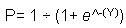
For a student with GPA = 4 and GRE = 800, the estimated value of the target variable is 0.22217, which is used to compute the probabilities of the response being 1, as shown in the following formula. In WebFOCUS RStat, the scoring routine calculates the probabilities directly for you.
where:
 is the base of the natural logarithm, for example, 2.718.
Once applied, it appears that the student with GPA =4 and GRE = 800 has a 0.56 probability of being admitted to graduate school.
Practical Applications of Logistic Regression
Logistic regression is used for:
This example creates a logistic regression, using the sample college admissions data, and targets admit.
The status bar confirms your data settings, as shown in the following image.

Note: Logistic regression is the only available selection, since your target variable is binary.
The Model Data output appears in the bottom window of the Model tab, as shown in the following image.

For details about the regression output, see Output From Binomial Logistic Regression.
The following image shows the Model tab with the binomial logistic regression output. For details about creating this output, see How to Create a Logistic Regression Model.

Summary of the Logistic Regression model (built using glm):
glm(formula = admit ~ ., family = binomial(link = "logit"), data = crs$dataset[crs$sample,
c(2:6)])Min 1Q Median 3Q Max -1.2936 -0.8931 -0.7381 1.3225 1.8528
             Estimate Std. Error z value Pr(>|z|)
(Intercept) -3.618671   1.298793  -2.786  0.00533 **
gre          0.002584   0.001242   2.080  0.03750 *
topnotch     0.491049   0.347595   1.413  0.15774
gpa          0.330209   0.391405   0.844  0.39886
GenderMale   0.254581   0.264021   0.964  0.33492
---
Signif. codes: 0 '***' 0.001 '**' 0.01 '*' 0.05 '.' 0.1 ' ' 1
Null deviance: 351.65  on 279  degrees of freedom
Residual deviance: 339.63  on 275  degrees of freedom
AIC: 349.63
Number of Fisher Scoring iterations: 4
Log likelihood: -169.813 (5 df)
Null/Residual deviance difference: 12.021 (4 df)
Chi-square p-value: 0.00737176
Pseudo R-Square (optimistic): 0.20130800
The following output shows the Model tab with the ANOVA table for the binomial logistic regression output. The ANOVA table provides statistics on each variable used in the regression equation. For details about creating this output, see How to Create a Logistic Regression Model.
          Df Deviance Resid. Df Resid. Dev P(>|Chi|)
NULL                        279     351.65
gre        1     7.83       278     343.81      0.01
topnotch   1     2.41       277     341.40      0.12
gpa        1     0.84       276     340.56      0.36
Gender     1     0.93       275     339.63      0.33
Time taken: 0.16 secs
Generated by RStat 2009-03-05 12:37:53
======================================================================
The ANOVA table shows how the addition of independent variables reduces the Residual deviance (Resid. Dev). It is used to determine the significance of the independent variables. This is frequently used to determine whether to keep variables in the model.
Time taken: 0.17 secs
Generated by RStat 2008-07-26 18:58:57
======================================================================
Note: This is the same footer as the linear regression model.
After the model data is generated, the RStat Evaluation tab provides options to help you determine the performance of the regression.
An error matrix simply lists, in tabular form, the number of predicted cases that are correct (true positives and true negatives) and incorrect (false positives and false negatives). Both the raw numbers and the proportions will be displayed in two tables.

Lift charts provide means to assess the performance of a scoring model. The purpose of a targeting model is to identify segments of the population with potentially higher response rates. A model is good if the targeted segment has a higher response rate than the average for the population as a whole. Lift is the ratio of positive responders in a segment to the positive responders in the population as a whole. For example, if a population has an average response rate of 10% and the targeted segment has a response rate of 50%, then the lift is 5 (50% divided by 10%). The lift chart then allows you to quickly determine what proportion of the population you want to target in order to maximize your return.
RStat displays the cumulative Lift curve. It is a downward-sloping curve. The population is sorted in a descending order from high responders to low responders. As you target larger segments of the population, your response rate will become closer to the average response rate of the population, and therefore your cumulative Lift will become closer to 1. At the moment when the cumulative curve converges to 1, there are no further gains from using the model. So imagine now that your lift curve converges to 1, for example, lift becomes 1.01, when the X-axis (rate of positive predictions, also known as hit) is 0.5. That would imply that by using the model you can achieve the same response rate by targeting half the population. If you were sending direct mail, you can realize 50% savings by using the model and sending mails to less people. Identifying all positives in a population (100%), implies targeting the entire population. So, there is a trade-off between how many positives you want to identify and cost. The lift chart allows you to determine the cut off points based on your cost constraints.
The chart in our example indicates that the biggest gains are realized by targeting up to 30% of the population. Beyond this point, the marginal cost of identifying one additional positive response increases. Stated differently, you have to target more and more people for each positive response rate.

An ROC Curve (Receiver Operating Characteristic) provides a quick assessment of the quality of a model with respect to the true positive prediction, that is, the targets that have positive response and are classified by the model as positive responders. In every model, there is a trade off. As you target more and more of the population to identify true positives, you are also going to get false positives, that is, respondents who are negative but are classified by the model as positives. In other words, you have to decide how many false positives you are willing to tolerate for each true positive identified. For example, if you are conducting a direct mail and for each positive you have to accept one false positive in the mailing list, your cost will double. Thus, the ROC chart is especially useful to compare models and determine thresholds that yield high proportions of positive hits.
The ROC curve is usually plotted in reference to a baseline model. The base model is represented by the diagonal line starting at (0,0) and ending at (1,1). The area under the ROC Curve is the indicator of the quality of a model. The larger the area under the ROC curve, the higher the likelihood that an actual positive case will be assigned a higher probability of being positive than an actual negative case. For the Base Model, the area under the ROC curve is equal to 0.5. An area of 1 represents a perfect model. A curve with an area of 1 will have Y=1 and X=0, which indicates that all cases are classified correctly. Conversely, if Y=0 and X =1 the model identifies only false positives.
In our example, the ROC curve is close to the baseline indicating that for each positive you are getting approximately one false positive. This can be verified by looking at the error matrix. You can see that the model has identified 4 true positives and 3 false positives.

This plots sensitivity (the true positive rate) against the specificity (the true negative rate), as shown in the following image.
The Sensitivity versus Specificity chart is an alternative ROC curve, with Sensitivity being the true positive rate (the count of true positives, that is, cases with response = 1, divided by the count of positives) and Specificity being the true negative rate (the count of true negatives, that is, case with response =0, divided by the count of negatives). In the case of a curve having x=1 and y = 1, the sensitivity correctly identifies both cases with an outcome of 1, and cases with an outcome of 0. It will have an Area of 1. Compared to the ROC curve, sensitivity is a right-sided curve. It enables you to judge whether the prediction is better on the positive or on the negative side of the response variable.

| WebFOCUS |