Analyzing Data in an OLAP Report
WebFOCUS Online Analytical Processing
(OLAP) enables you to view and quickly analyze data in order to
make critical business decisions.
xWe Do It Every Day: A Typical Web Query
Suppose that you own a small business in New York and
are exploring a partnership with a company in Oakland, California.
You need to get to a Monday morning meeting. How do you go about
arranging your flight?
Most likely, you go online.
First, you check available flights on the airline that holds
your frequent flyer miles. You discover that your frequent flyer
carrier requires a change of planes and you would prefer a direct
flight, so you look at routes and fares for other airlines.
In New York, you can get to LaGuardia, JFK, and Long Island MacArthur
Airport. In California, you can fly into Oakland or San Francisco.
While you would prefer to fly out on Sunday and return Tuesday
morning, you could consider a Saturday flight to California and
a return flight on the red-eye Monday night, if fares and schedules
are better.
You begin your search by airline and then look at options for
each departure point and destination by day, time, and price.
Another approach is to start with an online consolidator, enter
the times you can fly, and see what flights and fares are available.
There are a lot of variables to play with, but in a half hour,
you have done your research and can make a good decision based on
all available factors.
The websites you access are designed to facilitate your queries.
Various menus and selection panes make it easy to pursue each line
of inquiry. Required and optional information is identified for
you. You can move forward down a path of choices, backtrack and
start down a different path, or resume the original path with different
selections.
You need to keep track of the question you want to answer, but
a well-designed site makes your investigation easy. For most of
us, this process has become intuitive.
The same process works when analyzing the data in an OLAP-enabled WebFOCUS report.
x
You can run all of the examples in this chapter using
OLAP-enabled published content. If the reports are not already available
in your sample repository, ask your WebFOCUS administrator to provide
them for your use. There are nine reports, named olaprep1.fex through
olaprep9.fex, located on the Reporting Server in the \ibinccen demo directory.
Each example indicates which published content to run. After
the report appears in your browser, you can perform the analytic
task shown, or pursue your own line of inquiry.
Suppose that you are an analyst for Century Corporation, which
manufactures electronics equipment. You need to determine which
of the stores that sells your products had the highest sales in
2002, and whether there is a pattern in sales periods and/or best selling
products that should be considered when planning manufacturing schedules
and parts inventories.
You have created a base report that shows sales data only for
2002. You have also OLAP enabled the report to permit quick analysis
of the data.
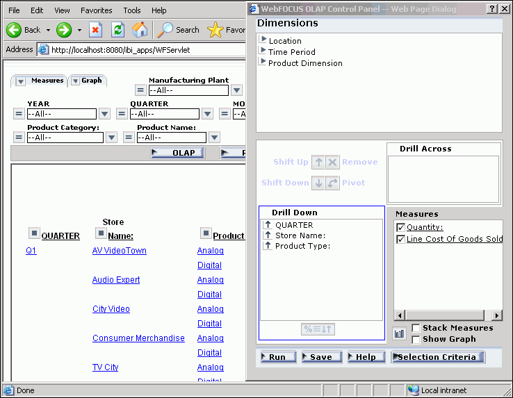
- Run OLAPREP1.
Before
you begin your analysis, the OLAP report looks like the following
image.
The
quarterly information is spread out over the left-most column. You
can try a horizontal display to make comparison easier.
- Drag QUARTER above
the report.
The report changes immediately and appears, as shown
in the following image, across the top of the report with the Quantity
and Line Cost of Goods Sold columns repeating for each quarter.

The
store information is more compact, but it is not easier to identify
the store with the best sales record, so drag QUARTER back to its
original position.
- Right-click Line
Cost of Goods Sold and choose Visualize.
This applies a data visualization bar graph to each value in the
column.
Note: The options available
may vary, depending on your OLAP format settings. For more information,
see Setting OLAP Reporting Options.
The display changes, as shown
in the following image.
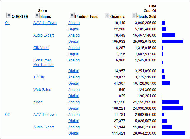
The
bar graphs still do not reveal a trend.
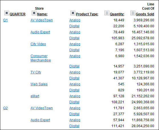
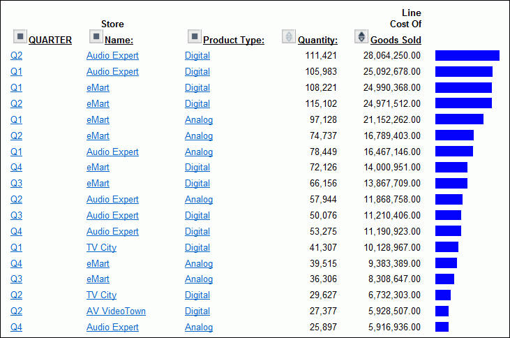
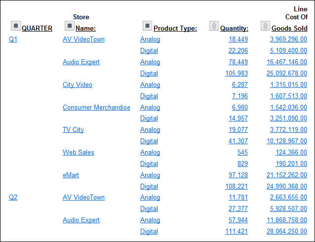
- Sort the data
by highest value by either right-clicking Line Cost of
Goods Sold and choosing Sort by Highest,
or clicking the Up arrow next to Line Cost
of Goods Sold.
As shown in the following image, the report
shows that Audio Expert has the highest sales in the digital product
lines in Quarters 1 and 2, with eMart trailing slightly. Each value
under the QUARTER, Store Name, and Product Type column is hyperlinked for
more details.
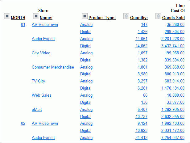
- Click Q2 to
check the monthly breakdown.
In the monthly report, both stores
recorded their highest sales in June (06), as shown in the following
image.
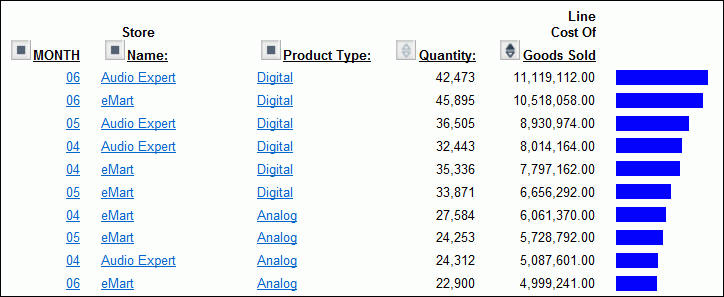
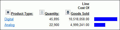
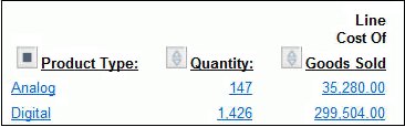
- Click Audio
Expert on the top line, next to MONTH 06. This filters
out the other stores, showing a breakdown of Audio Expert June sales,
as shown in the following image.
You
now see information for digital and analog sales at Audio Expert.
Since the significant sales for Audio Expert are in the digital
area, let us see which digital products contributed to the June
figures.
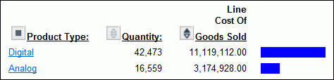
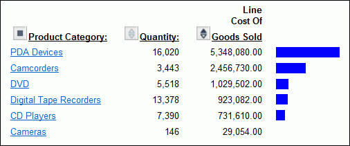
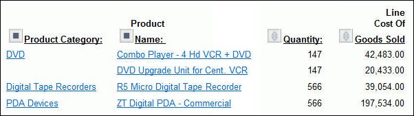
- Click Digital.
The
breakdown shows clearly that PDAs drove Audio Expert digital sales.
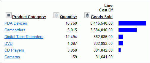
- Click PDA
Devices to see the details.
As
shown in the following image, ZT Digital PDA - Commercial was
by far the top selling PDA in June for Audio Expert.
Let
us now see what drove digital sales at eMart, the second highest producer.
- Click Back in
your browser until you return to the following window, showing second-quarter
sales for all stores.
-
This time, click eMart next
to MONTH 06, to see the June sales information for eMart.
Once
again, the Digital category leads sales, as shown in the following
image.
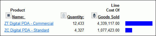
- Click Digital.
PDA
is the strong seller for eMart too, as shown in the following image
- Click PDA
Devices to examine the models that compose these sales.
The
report shows sales figures for the two PDA models, as shown in the
following image.

ZT
Digital PDA - Commercial far outsells ZC Digital
PDA - Standard.
This information from the two
top selling stores suggests that Century Corporation should evaluate
and adjust available parts inventories for each model and consider shifting
production schedules of plants to produce more Commercial units.
You
have done all of your data manipulation from the report. But, because
of the options you selected when OLAP-enabling this report, it is
easy to expose the OLAP Selections panel where you can review the
selections that are currently in effect, and make additional selections
if you like. For details on OLAP set-up options, see OLAP-Enabling a Report.
- To expose the
OLAP Selections panel, right-click Product Name and
select Show Panel from the menu.
Note: The options available may
vary, depending on your OLAP format settings. For more information,
see Setting OLAP Reporting Options.
The Selections panel appears
above the report, as shown in the following image.
Notice
that Store Name is eMart, Product Type is Digital, and Product Category
is PDA Devices.
xOLAP Reporting Requirements
OLAP reporting requires some preparation both of the
data to be reported against and of the report itself. In many instances,
this preparation is entirely transparent, having been done before
a user encounters an OLAP report. However, for developers who are
charged with OLAP-enabling data and reports and for users who wish,
and are authorized, to OLAP enable their personal reports, the following
summary will be useful.
x
Behind the scenes of any WebFOCUS OLAP
report is a hierarchical data structure. For example, a typical
hierarchy of sales regions might contain a GEOGRAPHY category including
the fields (in descending order) Region, State, and City. Region,
the highest level in this hierarchy, would contain a list of all
available regions within GEOGRAPHY. State, the second highest level
in the hierarchy, would contain a list of all available states within
those regions, and others.
In WebFOCUS, the hierarchical structure
is generally built into the Master File for a data source, where
it becomes active for any report that uses that data source. Developers
or administrators who are responsible for describing data in a Master
File can use WebFOCUS language. The keyword WITHIN defines the elements
in each dimension in the hierarchy.
For those interested in the underlying
code, see OLAP Hierarchy Syntax Summary and the Describing Data With WebFOCUS Language manual
for details.
In addition, those working in Developer Studio have access to
a variety of graphical tools that make it easy to drag fields into
position to form a hierarchy. The hierarchy may be global to all
procedures or local to one procedure.
- Global hierarchy
in a Master File for use with multiple procedures, use the Dimension
Builder.
- Local hierarchy
as a component of a particular procedure, use the Dimension tool. The
hierarchy you define with this tool does not affect the source Master
File.
For details about these related tools, see the Describing Data With Graphical Tools manual.
x
Reference: OLAP Hierarchy Syntax Summary
For
those interested in the underlying code, the following syntax applies:
- For OLAP hierarchies
defined in a Master File, the syntax is
WITHIN='*dimensionname'
WITHIN=field
where:
- '*dimensionname'
Is the name of the dimension and can include up to 66 characters.
The dimension is defined in the field declaration for the field
that is at the top of the hierarchy. The name must be preceded by
an asterisk (*) and enclosed within single quotation marks (‘).
The name must start with a letter and can consist of any combination
of letters, digits, underscores, or periods. Avoid using special
characters and embedded blanks.
- field
Is used to define the hierarchical relationship among additional
elements to be included in a given dimension. After the dimension
name is defined at the top of the hierarchy, each element (field)
uses the WITHIN attribute to link to the field directly above it
in the hierarchy. The WITHIN attribute can refer to a field either
by its field name or its alias. Note that a given field may participate
in only one dimension, and two fields cannot reference the same
higher level field.
For example,
FILENAME=OSALES, SUFFIX=FOC
SEGNAME=SALES01, SEGTYPE=S1
FIELD=PRODCAT, ALIAS=PCAT, FORMAT=A11,
WITHIN='*PRODUCT',$
FIELD=PRODNAME, ALIAS=PNAME, FORMAT=A16,
WITHIN=PRODCAT,$
- For OLAP hierarchies
defined in a procedure, the syntax is:
OLAP DIMENSIONShierarchy1: field1, field2, ... fieldn;hierarchy2: field1, field2, ... fieldn;
.
.
.hierarchy3: field1, field2, ... fieldn;
END
For example,
OLAP DIMENSIONS
Time Period: YEAR, QUARTER, MONTH;
Products: PRODCAT, PROD_NUM, PRODNAME;
END
x
In addition to using OLAP-enabled data, a report must
be enabled to support OLAP analysis. OLAP-enabling a report consists
of specifying how a user will interact with and drill down on OLAP
data.
The primary interactions occur in the report itself. In addition,
you can choose to expose two supplementary tools, the OLAP Selections
panel and the OLAP Control Panel.
x
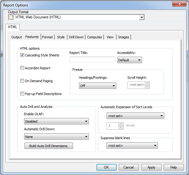
Reference: Setting OLAP Reporting Options
Developer Studio
In
Developer Studio, OLAP options are available on the Options Features
tab in Report Painter. The relevant options (Enable OLAP and Automatic
Drill Down) are located in the OLAP section of the tab,
as shown in the following image.
Tip: In Report Painter, you can
also make OLAP selections from the OLAP option
on the Report menu. For more information about using Report Painter,
see the Creating Reports With Report Painter manual.
Enable OLAP
The Enable OLAP options
in Developer Studio control how users can interact with an OLAP
report and access OLAP tools.
For
published content delivered to Managed Reporting users, these decisions
are made by Managed Reporting content developers. However, users
who are creating their own reports can OLAP enable them and control
the OLAP interfaces and following drill-down options.
-
Disabled. OLAP options are disabled
and not shown in the OLAP report.
-
Off. Turns
off the OLAP Control Panel and the OLAP Selections panel, but allows
OLAP functionality from the report itself. You can access options
on right-click menus, drag columns within the report, and use up
and down arrows to sort columns from high to low or low to high.
-
On. Provides access to the OLAP
Selections panel from a square icon to the left of the column titles.
You can open the OLAP Control Panel by clicking the OLAP button
in the OLAP report.
-
Top Panel. Opens the OLAP Selections
panel above the report. The Measures, Graph, and Dimension controls,
as well as the band containing the OLAP, Run, and Reset buttons
appear above the report output. You can open the OLAP Control Panel
by clicking the OLAP button on the Selections panel.
-
Bottom Panel. Opens the OLAP
Selections panel below the report. The Measures, Graph, and Dimension
controls, as well as the band containing the OLAP, Run, and Reset
buttons appear below the report output. You can open the OLAP Control Panel
by clicking the OLAP button on the Selections panel.
-
Hidden Panel. Opens the OLAP
report with the OLAP Selections panel hidden. You can perform a
variety of analytic tasks from the report itself. Selection Criteria
are shown next to the OLAP button.
-
Show Tabbed. For OLAP reports
that have multiple dimensions, this option groups the dimension
elements under a tab labeled with the dimension name.
Automatic Drill Down
These options enable you to sort instantly
from high to low or low to high for selected report columns:
-
None. Disables
automatic drill downs.
-
Dimensions. Enables
automatic drill downs on dimensions in both reports and graphs.
-
Dimensions and Measures. Enables
automatic drill downs on dimensions in both reports and graphs and
also on measures in reports.
Note: Explicit drill
downs in a StyleSheet (if they exist) take precedence over OLAP-enabled
hyperlinks. If you click a hyperlink associated with an explicit
drill down, the behavior will be defined by the StyleSheet, rather
than by the AutoDrill On or All settings.
Build Auto Drill Dimensions
This
option opens the Dimension Builder using the Master File you selected
for the report.
x
Reference: OLAP Report Syntax Summary
For those
interested in the underlying code, the following syntax applies:
- Code that precedes the Table request
-OLAP ON
where:
- ON
Turns on the OLAP Control Panel.
- Code within
the Table request for drill downs
ON TABLE SET AUTODRILL {ON|ALL|OFF}where:
- ON
Enables automatic drill downs on dimensions. ON is the default value.
- ALL
Enables automatic drill downs on dimensions and measures.
- OFF
Disables automatic drill downs.
- Code within
the Table request for the Selections panel
ON TABLE SET OLAPPANE {TOP|BOTTOM|HIDDEN|NONE|CONTROL}where:
- TOP|BOTTOM
Exposes the Selections panel above or below the report.
- HIDDEN
Hides the Selections panel. You can open it from the report.
- NONE
Restricts analysis to the report. The Selections panel and
Control Panel are not available. NONE is the default value.
- CONTROL
Provides access to the OLAP Control Panel from the report.
With
this setting, Report Painter generates the -OLAP ON command in the procedure,
which turns on the OLAP Control Panel.
- Code within
the Table request for drag-and-drop functionality
ON TABLE SET OLAPDRAGDROP {ON|OFF}where:
- ON
Enables Internet Explorer® users to move report columns to
different positions within the report. ON is the default value.
- OFF
Disables drag-and-drop functionality within the report when
using browsers other than Internet Explorer. OFF should be set for
Netscape® and Firefox® users.
For more
information about these options, see Setting OLAP Reporting Options.
Example: OLAP Report Syntax
The
following code example turns OLAP on, calls a customer help file,
sets drill-down capabilities for dimensions and measures, and sets
the OLAP Selections panel to open the report:
-OLAP ON
-OLAP HELP http://webserver/olaphelp/olaphelp.htm
TABLE FILE CENTORD
SUM COST PRICE
BY PLANT
ON TABLE SET AUTODRILL ALL
ON TABLE SET OLAPPANE TOP
ON TABLE SET ONLINE-FMT HTML
END
x
The following table describes OLAP terms that may be
useful as you work in the WebFOCUS OLAP
tools. Some of these terms are directly reflected in the interfaces
of the OLAP Selections panel and the OLAP Control Panel. Others
provide useful background information.
The first column of the following table
provides the term and the second column provides the definition.
|
Term
|
Definition
|
|---|
|
Dimension
|
Group or list of related elements, usually
structured in a hierarchy. For example, a Location dimension could
include the elements Country, Region, State, and City arranged in
a hierarchy where Country is the top level and City is the base
level. Dimensional data usually describes the measured item.
|
|
Hierarchy
|
Logical parent-child structure of elements
within a dimension.
|
|
Measure
|
Type of item that specifies the quantity
of another element with which it is associated. A measure typically
defines how much or how many. For example, Units, Revenue, and Gross
Margin are measures in the Account dimension and specify how many
units were sold, how much revenue was generated, and at what profit
margin, respectively.
|
|
Pivot
|
Manipulating (or rotating) the view of a
report by moving a field (or a group of fields) from a column to
a row, or row to column.
|
xCharacteristics of an OLAP Report
An OLAP-enabled report has a
number of features that distinguish it from other WebFOCUS reports.
A basic OLAP report is shown in the following
image.
Every OLAP user can take advantage of
the analytic features that are built into the OLAP report:
-
Hyperlinks. The
values in an OLAP report are usually hyperlinks from which you can
drill down to related information.
Depending on your OLAP settings,
the hyperlinks may be active for both the dimension fields (by which
the report is sorted) and the measures fields (which display quantitative
data), or only for the dimension fields. For related information,
see OLAP-Enabling a Report.
-
Context menus. You
can right-click any column title to access a menu of options that
facilitate analysis. The options vary slightly to suit the tasks
associated with dimensions and measures.
-
Sorting diamonds
 . The
measures (fields that make up the body of the report) have blue
diamonds adjacent to them. You can click the top or bottom of the
diamond to instantly sort data from high to low or low to high.
. The
measures (fields that make up the body of the report) have blue
diamonds adjacent to them. You can click the top or bottom of the
diamond to instantly sort data from high to low or low to high.
-
Drag-and-drop capabilities for dimensions and measures.
- You can drag
sort fields to shift sorting from vertical (By) to horizontal (Across)
or horizontal to vertical.
- You can change the order in which sorting
occurs by dragging sort fields from inner to outer positions or
outer to inner positions.
- You can drag measures from one position
to another to affect the order in which data appears.
Beyond the features in the report itself, your OLAP options depend
on the interface and drill-down settings that are in effect for
a particular report. Those choices determine whether you have access
to the following tools:
-
Selections Panel. When
this tool is available, a pane may appear above or below your report,
as shown in the following image. For details, see Selections Panel.
-
OLAP Control Panel. When
this tool is available, the square icons
 adjacent
to the sort fields (By or Across) in the report, become active.
You can click a square or the OLAP button
to open the OLAP Control Panel, as shown in the following image.
For details, see OLAP Control Panel.
adjacent
to the sort fields (By or Across) in the report, become active.
You can click a square or the OLAP button
to open the OLAP Control Panel, as shown in the following image.
For details, see OLAP Control Panel.
xThree Ways of Working With OLAP Data
There are three ways to work with OLAP data, from the
report itself, from the Selections panel, and from the OLAP Control
Panel. This documentation is organized to help you understand what
you can do from each location and which method is most suitable and
efficient for your particular OLAP settings.
x
You can perform a wide range of basic analytic functions
from the report itself. Changes you make in the report are implemented
instantly. Every OLAP user can perform these tasks:
- Sort the data
in measures in either ascending (lowest value to highest) or descending
order (highest value to lowest).
- Drill down
on measures, dimensions, or both (depending on the settings described in Setting OLAP Reporting Options).
- Hide fields
in the current report.
- View hidden
fields in the dimensions hierarchy and add them to the report.
- Change a vertical
(By) sort field to a horizontal (Across) sort field and vice versa.
- Delete sort
fields.
- Add a column
of small bar graphs that help you visualize trends in numeric data (measures).
- Display a graphical
representation of your data in a frame above the tabular report.
For an illustration of report-powered OLAP analysis, see We Do It Every Day: A Typical Web Query.
x
When the OLAP Selections panel is turned on, you can
quickly limit the data in the report by selecting specific values
for the dimensions in the hierarchy. A drop-down list is available
for each dimension. You can multiselect values from one or more dimension
lists to refine your report output.
If you wish to add a dimension element to the report, you can
drag it from the Selections panel into the report frame. (The cursor
changes to a plus sign (+) to indicate an acceptable location.)
Each dimension has a relational operator button located to its
left. This button toggles through a selection of basic numeric operators
that enable you to quickly define your selection criteria. The operators
are:
- Equal to.
- Not equal to.
- Less than or equal
to.
- Less than but not
equal to.
- Greater than or
equal to.
- Greater than but
not equal to.
For details, see Selection Criteria Relational Operators.
The following image shows the Equal to operator as the selection
for each dimension in the Selections panel.
The name of the dimension field appears as defined in the Master
File, even if an alternate column title has been specified.
In addition, you can customize the display of the measures in
your report from the Selections panel. You can click either the
Measures or the Graph arrow in the upper-left corner of the pane
to list the measures.
- From the Measures
arrow, you can display or hide the selected measures or request
a column of simple bar graphs to reveal trends.
- From the Graph
arrow, you can choose the measures you wish to graph and specify one
of the following basic graph types: vertical and horizontal bar,
line, area graphs, or pie charts.
Note that the Selections panel is resizable. The controls for
dimensions, measures, and graphs float as you resize the report
window, so that they continue to be visible in the frame.
Five buttons appear below the Selections panel: OLAP, Run, Reset,
Save, and Help.
-
OLAP. Opens
the OLAP Control Panel (OCP).
-
Run. Executes
the report with the current set of selections.
-
Reset. Resets
all the controls in the report to their previous state (that is,
before the current set of selections was made and after the last
execution of the report).
-
Save. Opens
a list of options from which you can save or view the document.
-
Help. Opens
the WebFOCUS online Help.
x
From the OLAP Control Panel, you can perform every analytic
function available to a WebFOCUS OLAP
user, as shown in the following image.

The main window of the OLAP Control Panel
contains the following components:
-
Dimensions pane. Reflects
the hierarchical structure of the data source being used by the
current report. For example, the Location dimension contains the
Region, State, and City fields. The Region is made up of several
States, and each State contains several Cities. You click the arrow
to the left of a dimension name to view the elements that comprise
it. (The fields shown here are also listed in the Selections panel.)
-
Drill Down and Drill Across panes. List
the fields being used to sort the report. You can pivot a Drill
Down field to a Drill Across field or a Drill Down Across field to
a Drill down field, and shift their positions in the report. You
can also accomplish these tasks by dragging fields within the report.
-
Measures pane. Contains
the body of your report (usually numeric fields). You can change
the display mode of a measure by clicking the check box next to
the measure. The options are display, hide, and show a column of
associated bar graphs. This is equivalent to the options available
from the Measures control in the Selections panel.
Although the most frequently used functions are available directly
from an OLAP report and/or from the Selections panel, several can
only be performed from the OLAP Control Panel.
OLAP Control Panel operations include:
- Sorting options
for dimensions: from lowest to highest or highest to lowest (A to
Z or Z to A), restricting sort field values to a specified number
of either highest or lowest values, and assigning a rank number
to each row in the report. For details, see Sorting Data.
- Options for
grouping numeric data by tile (for example, percentile, decile,
or quartile). For details, see Grouping Numeric Data Into Tiles.
- Defining selection
criteria based on omitted or existing characters, dates, and range
specifications. For details, see Limiting Data.
- Saving OLAP
output in PDF and Excel formats. In Managed Reporting, users can also
save OLAP output in the private content folder. For details, see Saving and Displaying OLAP Reports and Graphs in Other Formats.
- Stacking multiple
measures to limit the width of the report. For details, see Stacking Measures.
xDrilling Down On Dimensions and Measures
You can drill down on dimensions in OLAP reports and
graphs and on measures in reports. The settings activate the required hyperlinks:
-
Dimensions. Enables
automatic drill downs on dimensions in reports and graphs.
-
Dimensions and Measures. Enables
automatic drill downs on dimensions in both reports and graphs and
on measures in reports.
-
None. Disables
automatic drill downs. This is the default.
In Developer Studio, you can set drill-down options from the
Report Options Features tab. For details about this setting, see Setting OLAP Reporting Options.
Example: Drilling Down on Dimensions in a Report
This
report you are about to run uses data from a hierarchy that contains
three dimensions, each of which has three elements. The report is
sorted by the specified field from each dimension. The following
table outlines three dimensions, Time Period, Location, and Product,
each containing three elements.
|
Time Period
|
Location
|
Product
|
|---|
|
Year
|
Manufacturing Plant
|
PRODTYPE
|
|
Quarter
|
State
|
PRODCAT
|
|
Month
|
Store Name
|
PRODNAME
|
The report will show data at different levels
in each dimension. Quarter is down one level in its dimension, Store
Name is at the lowest level in its dimension, Product Type is the
top level in its dimension. This determines how much farther you
can drill down within each dimension. If you drill down on a value
of Quarter, the report shows information broken down by Month within
that Quarter. The Quarter column itself will no longer appear.
- Run OLAPREP2.
In
this quarterly report, drill-down hyperlinks are active for both
dimensions and measures.
- Click Q1 in
the quarterly report to see a monthly report, as shown in the following
image.
Since
Month is the bottom level in its dimension, if you drill down on
a month value, you will no longer see the month column. However,
you will see the data that relates to the selected month in subsequent
columns.
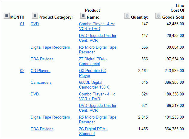
- Click 01 in
the MONTH column to see details for January.
As shown in the
following image, the January report displays Product Type, Quantity,
and Line Cost Of Goods Sold for each store.
Next,
see what happens when you drill down in the Location dimension (in
this case, on a value of Store Name in the second column of the
report). When you drill down on a dimension column other than the
first, the output is affected to the right and left of that column.
- Click Back in
your browser to return to the monthly report.
- Click AV
VideoTown in the second column.
Since Store Name
is the lowest level in its dimension, the Store Name column no longer
appears, nor does the Time Period column to its left. Nevertheless,
both the Store Name (AV VideoTown) and the current time period (January)
set the context for the information you see, which now consists
of types of Product Type, Quantity, and Line Cost of Goods Sold
for AV VideoTown in January, as shown in the following image.
Example: Drill Down on Measures in Reports
By
drilling down on a measure, you expose the next level of detailed
information associated with that measure for each displayed dimension
in the hierarchy. In other words, when you drill down on a measure,
the current dimension is used as a limiting criterion. The rest
of the hierarchy is then expanded based on that limitation.
Remember
that a measure contains quantitative information about fields in
each dimension.
In this example, Quantity and
Line Cost of Goods Sold provide data about products at particular
stores during particular time periods.
- Run OLAPREP2.
Notice
that quantity of sales for all digital products at AV VideoTown
in the first quarter of the year is 22,206. You want to find out
how much each digital product contributed to the total quantity.
- Click 22,206 under
Quantity.
As
shown in the following image, the report now displays total quantity
for digital products sold at AV VideoTown broken out by MONTH, Product
Category, and Product Name. Notice that Store Name no longer appears.
Since it is the lowest level of the Location dimension, there is
no lower level of detail.
Since
all relevant information is now visible, no further drill downs
are possible and the measure is no longer represented as a hyperlink.
Next,
verify this behavior at another level in the hierarchy.
- Click Back in
your browser to return to the original report.
- Click Q1 to
see the monthly breakdown for that quarter.
- Click AV
VideoTown. You are now looking at Product Type sold,
Quantity sold, and Line Cost Of Goods Sold at AV VideoTown.
- Drill down
on 1,426 under Quantity.
Note: When
you drill down on a measure value, results may differ depending
on the combination of sort fields in the report. The examples that
follow show several variations.
Product Type: Digital serves
as the limiting criterion. Therefore, the expanded hierarchy shows
the next level of detail for each digital product, as shown in the following
image.
This
level is composed of digital product categories and the names of
the products in each category. The report displays the detailed
data for each element in the Product Type dimension (in this case,
the product categories and product names that compose the quantity
figure of 1,426). The total Quantity and the Line Cost Of Goods
Sold are now broken down by product.
Example: Drilling Down on a Measure in a Report with ACROSS Fields
When
you drill down on a measure in a report with at least one dimension
Across field and no By fields, all Across fields are removed from
the report and all of the dimension elements under the removed Across
fields become By fields from left to right in the resulting report.
This convention ensures that the maximum number of Across values
supported by WebFOCUS is not exceeded.
The values that appear
for the new By fields are controlled by internally generated selection
criteria. The measure values in the resulting report depend on the
values of the new By fields.
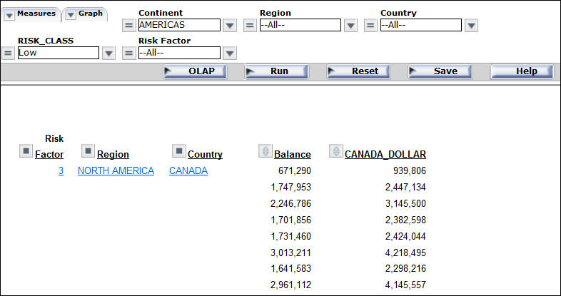
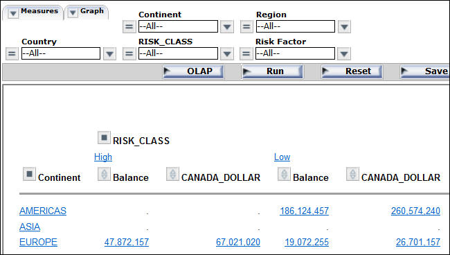
- Run OLAPREP3.
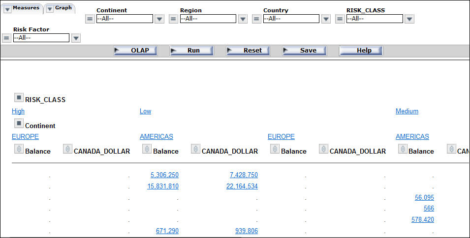
In
the report, RISK_CLASS and Continent are dimension Across fields
on which you can drill down.
- Click the Balance
value 671,290 under RISK_CLASS Low and Continent
AMERICAS.
The report now looks like the following image.
In
the new report, the RISK_CLASS and Continent fields are removed
based on two internally generated criteria: IF RISK_CLASS EQ 'Low'
and IF Continent EQ 'AMERICAS'.
The only dimension element
under RISK_CLASS is Risk_Factor. The dimension elements under Continent
are Region and Country. These become By fields in the new report,
from left to right. The data displayed for the measures in the resulting
report are those that satisfy the values in the current By fields.
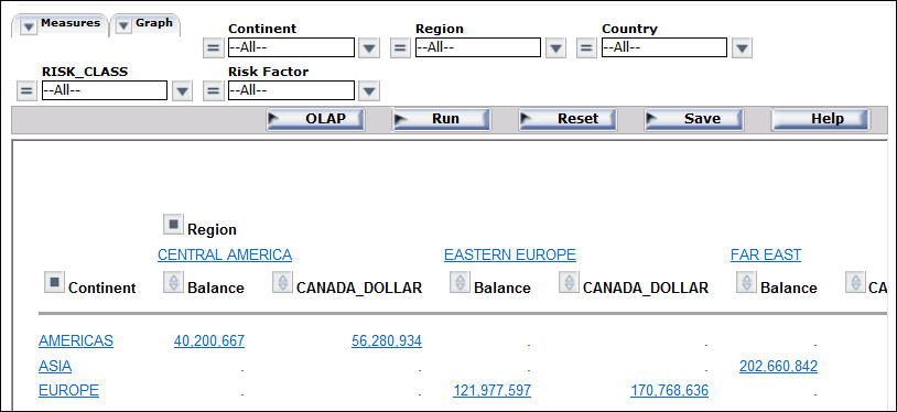
Example: Drill Down on a Measure When BY/ACROSS Fields Are Under the Same Dimension
When
you drill down on a measure in a report with at least one By and
one Across dimension field under the same root dimension, both the
By and Across fields are hidden and the subordinate elements in
the same dimension become By fields in the new report. In effect,
the report is filtered based on the values of the dimensions. As
a result, the sorting controlled by both hidden and visible dimensions
remains in effect.
- Run OLAPREP4.
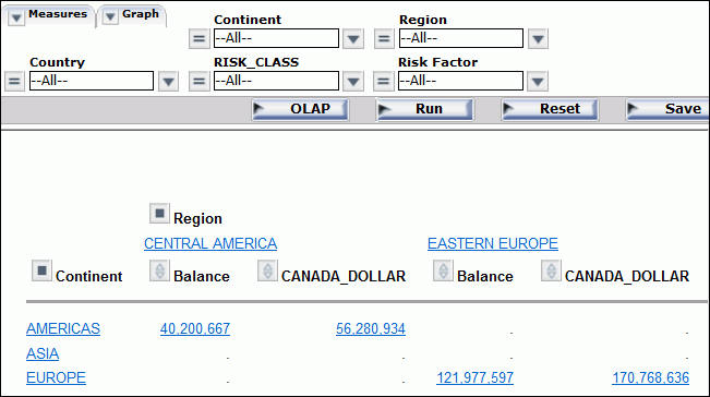
In
the report, Continent is a By field and Region is an Across field.
Both are in the Geographic Area dimension.
- Click the CANADA_DOLLAR
value of 56,280,934 in the Continent row
for AMERICAS under the Region CENTRAL AMERICA.
The report now
looks like the following image.
In
the new report, data is filtered based on the internally generated
criteria: IF Continent EQ 'AMERICAS' and IF REGION EQ 'CENTRAL AMERICA.'
(Continent and Region are no longer visible.)
REGION is replaced
by the last element in the Geographic Area dimension, Country, which
becomes the controlling By field in the report. The data displayed
for the measures are those that satisfy the values in the current
By field.
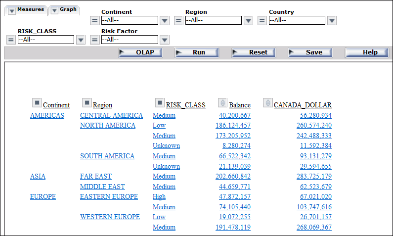
Example: Drill Down on a Measure When BY/ACROSS Fields Are Under Different Root Dimensions
When
you drill down on a measure in a report with at least one By and
one Across dimension field from different root dimensions, the By
fields are broken down to their last dimension level, then the Across
fields are broken down.
The original By and Across
fields are removed. The dimension elements under the removed By
fields become the first set of By fields from left to right. The
dimension elements under the removed Across fields follow the first
set of By fields from left to right.
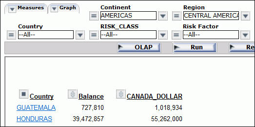
- Run OLAPREP5.
In
the report, Continent is a By field from the Geographic Area dimension
and RISK_CLASS is an Across field from the Risk dimension.
- Click the CANADA_DOLLAR
value of 67,021,020 in the Continent row
for EUROPE under the RISK_CLASS High.
The report looks like the
following image.
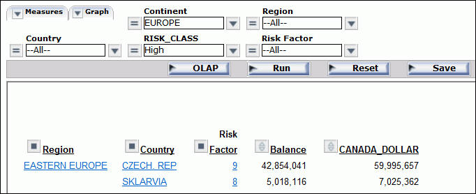
In
the new report, the Continent and RISK_CLASS fields are removed
based on the internally generated criteria: IF CONTINENT EQ 'EUROPE'
and IF RISK_CLASS EQ 'High'.
The By field (Continent) is broken
down to its last dimension element. Then, the Across field (RISK_CLASS)
is broken down to its last dimension level. The resulting By fields
in the report, from left to right, are Region, Country, and Risk
Factor. The data displayed for the measures satisfy the values in
the current By fields.
x
You can sort the data in an OLAP report based on the values of
dimensions in the hierarchy and/or the values of the quantitative
measures that constitute the body of the report. Sorting options
vary depending on the nature of the data being sorted. For details, see Sorting Measures and Sorting Dimensions.
You can also group numeric data into any number of tiles (percentiles,
quartiles, deciles, and so on). See Grouping Numeric Data Into Tiles.
x
You can apply aggregation and sorting simultaneously
to a numeric measure in an OLAP report, and sort the data from high
to low (descending order) or from low to high (ascending order).
All other columns are sorted correspondingly.
For the measure being sorted, you can restrict the report to
a specified number of highest values (when sorting high to low)
or lowest values (when sorting from low to high).
When you sort a measure, any subtotals, subheadings, or subfootings
in the report are automatically suppressed since these elements
relate to a specific sort field and are not meaningful when the
report is resorted by the values in a measure column. For an illustration,
see Applying a Percent Calculation to a Measure.
Note: Sorting by measures is not available in a report
in which measures have been stacked. See Hiding and Displaying Measures.
x
Procedure: How to Sort Measures High to Low or Low to High in an OLAP Report
To sort the values of a measure from
high to low:
- Click the diamond button.
or
- Right-click
the measure and select Sort By Highest from the
menu.
The report runs automatically. The highest value
is now first in the column. The top of the diamond button becomes
solid blue to indicate the current sort direction.
To sort
the values of a measure from low to high:
- Click the bottom
half of the diamond button.
or
- Right-click
the measure and select Sort By Lowest from
the menu.
The lowest value is first in the column. The
bottom of the diamond button becomes solid blue.
Tip: After
a measure has been sorted once, clicking the upper or lower half of
the diamond button inverts the sort order of that measure. Place
your mouse pointer over either half of the diamond to see a message
that indicates the next sort order that will occur if you click
the diamond.
Example: Sorting a Measure From High to Low in the Report
- Run OLAPREP2.
The
OLAP report shows sales information sorted by quarter, store, and
Product Type.
You are interested in seeing where the greatest
quantity of goods has been sold.
- Click the top
half of the diamond button next to the Quantity measure to sort
the values from high to low.
As shown
in the following image, the report now displays data values for
the Quantity measure in descending order. The top half of the diamond
next to Quantity is blue and solid to indicate the current sort
order of the measure. This is now the controlling sort in the report.
All other values are reordered correspondingly.
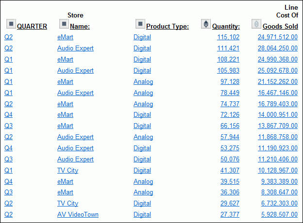
Tip: To
invert the sort order, click the diamond button again.
x
Procedure: How to Sort Measures High to Low or Low to High From the OLAP Control Panel
-
Open
the OLAP Control Panel.
-
Click
a measure name in the Measures pane in the upper portion of the OLAP
Control Panel to open the sort options pane.
Do not click the Stack Measures check
box, which controls the display of a measure, not its sorting.
-
Select the Sort check
box. This setting is required to apply sorting specifications to
the selected measure.
-
Select
the High to Low or Low to High option
button to specify the sort order you wish to apply. The default sort
order is high to low.
-
Click Ok.
The sort pane is replaced by the Measures pane, where the
measure becomes blue to indicate that sorting specifications have
been defined.
-
Click Run to
display the report with sorting applied to the selected measure.
The diamond button next to the sorted measure changes to
reflect the sort order. If the sort order is high to low, the top
half of the diamond is solid blue. If the sort order is low to high,
the bottom half is solid blue.
Note:
- Report execution
is automatic when you sort a measure in an OLAP report. However,
if the OLAP Control Panel is open, all current changes in the OLAP
Control Panel are applied.
- If an OLAP
request contains a horizontal (Across) sort field, the measures
appear several times in the report, once for each Across value.
If you apply sorting to a measure, the sort is performed on the
first column occurrence of the measure, and reflected in all subsequent
instances. The appropriate half of the diamond button becomes solid
only for the first instance. Any additional sorting you wish to
perform must be done from the first occurrence of the measure.
x
Procedure: How to View a Subset of Data for Sorted Measures
You
can select to view only a subset of the total number of records
in your report.
-
Open
the OLAP Control Panel.
-
Click
a measure name in the Measures pane to open the sort options pane.
Do not click the Stack Measures check
box, which controls the display of a measure, not its sorting.
-
Verify that
the Sort check box is selected. (This setting
is required to apply sorting specifications to a measure.)
-
Select
the Rank check box, then specify the number
of sort field values to be included in the report.
- Use the spin
controls located to the right of the word Highest or Lowest to increase
or decrease the number of sort fields.
or
- Position the
cursor in the input pane and type a number.
The default
number of sort fields values is 5.
-
Click Ok.
The sort pane is replaced by the Measures pane, where the
measure becomes blue to indicate that sorting specifications have
been defined.
-
Click Run to
display the report with the designated number of sorted values.
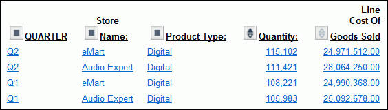
Example: Displaying a Subset of Sorted Data for a Measure
- Run OLAPREP2.
The
report shows sales information sorted by quarter, store, and Product
Type.
- Click the square
icon next to QUARTER to open the OLAP Control Panel (notice that the
original report is open on the left).
- Click Quantity in
the Measures pane.
The sort pane opens, as shown in the following
image.
- If not already
selected, click the Sort check box.
High
to Low sorting is selected by default.
- Click the Rank check
box.
Because the report is being sorted from high to low, you
can indicate the number of values you wish to see, beginning with
the highest.
- Specify Highest 4.
- Click Ok.
The
main OLAP Control Panel window appears. In the Measures pane the
Quantity measure is blue, indicating that sorting specifications
have been defined.
- Click Run at
the bottom of the OLAP Control Panel.
As shown in the following
image, the report now displays Quantity sorted from high to low
with the highest four values appearing.
x
Procedure: How to Remove Sorting Criteria for a Measure
You
can remove sorting specifications for a measure whether the measure
appears or is hidden.
-
Open
the OLAP Control Panel.
-
In the
Measures pane, click the measure for which you want to remove sorting
specifications.
-
Clear
the Sort check box.
-
Click Ok.
x
There are several ways in which you can sort dimensions
in an OLAP hierarchy:
- Control the
order in which data is sorted: ascending or descending.
- Restrict sort
field values to a specified number of either highest or lowest values.
- Assign a rank
number to each row in a vertically sorted report.
- Shift the positions
of sort fields in the report. For example, you can change from sorting
by State and then by Product to sorting by Product and then by State.
- Pivot a vertical
(By) sort field to make it a horizontal (Across) sort field and
vice versa.
- Hide a sort
field in the report while retaining the sorting associated with
it. For example, you can sort data by quarters without showing the
Quarter column.
- Group numeric
data in tiles (for example, percentile, decile, and so on).
x
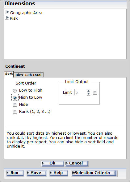
Procedure: How to Change Sort Order for a Dimension
-
Open
the OLAP Control Panel.
-
Select
a field from the Drill Down or Drill Across pane.
-
Click
the Sort
 button.
The sort pane opens.
-
Under
Sort Order, choose the Low to High or High
to Low option button (Low to High is the default for
a dimension).
-
Click Ok.
The main OLAP Control Panel window reopens.
-
Click Run to
execute the report.
Example: Reversing the Sort Order of a Dimension
- Run OLAPREP4.
In
the report, the values of both sort fields (Continent and Region)
are sorted from low to high (A to Z), as shown in the following
image.
- To sort the
report in reverse alphabetical order, click the OLAP button
on the band below the Selections panel to open the OLAP Control
Panel.
- Select Region in
the Drill Across pane and click the Sort
button.
The
sort pane opens.
- Under Sort
Order, choose the High to Low option button, as
shown in the following image, on the OLAP Control Panel.
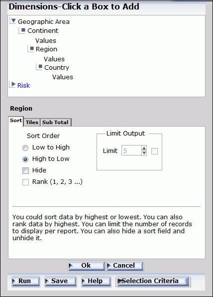
- Click Ok.
The
main OLAP Control Panel window reopens.
- Repeat the process for Continent. Select Continent in
the Drill Down pane and click the Sort button.
When the sort pane opens, select the High to Low option
button and click Ok.
The
main OLAP Control Panel window opens.
- Click Run.
Both
dimensions are now sorted in reverse alphabetical order (Z to A),
as shown in the following image.
x
Procedure: How to Restrict the Display of Sort Values
-
Open
the OLAP Control Panel.
-
Select
a field from the Drill Down pane.
-
Click
the Sort
button.
The sorting pane opens.
-
Under
Sort Order, choose the Low to High or High
to Low option button, as shown in the following image,
on the OLAP Control Panel.
-
Under
Limit Output, click the Limit check box and
choose or type a value in the input area.
-
Click Ok.
The main OLAP Control Panel window reopens.
-
Click Run to
execute your report.
x
Procedure: How to Rank Rows in a Vertically Sorted Report
-
Open
the OLAP Control Panel.
-
Select
a field from the Drill Down pane.
-
Click
the Sort
button.
The sort pane opens.
-
Under
Sort Order, choose the Low to High or High
to Low option button.
-
Click
the Rank check box.
-
If you
wish to place a restriction on the number of sort field values to rank,
click the Limit check box, and choose or
type a value in the input area.
- If the High
to Low option button is selected, you can rank a specified
number of Highest values.
- If the Low
to High option button is selected, you can rank a specified
number of Lowest values.
-
Click Ok.
The main OLAP Control Panel window reopens.
-
Click Run to
execute your report.
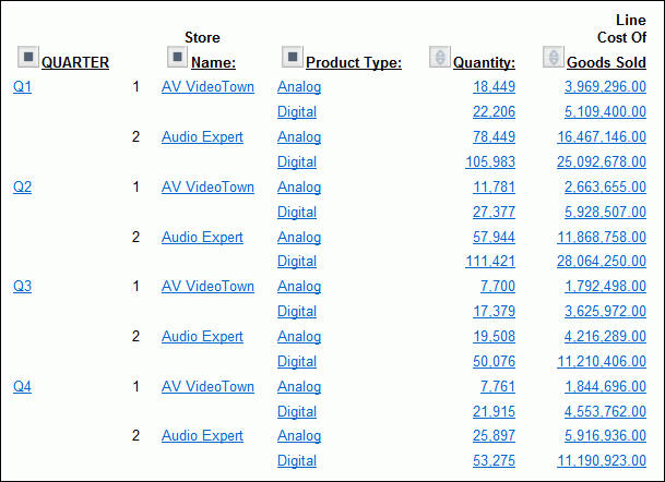
Example: Ranking and Restricting the Number of Sort Values
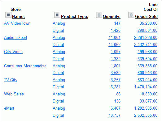
- Run OLAPREP2.
Information
for all stores is shown for each quarter. You want to see quarterly information
for only the first two stores in alphabetical order (low to high).
- Click the square
icon next to QUARTER to open the OLAP Control Panel (notice that the
original report remains open at the left).
- Choose Store
Name in the Drill Down pane and click the Sort
button.
The
sort pane opens.
The following image shows these three selections
on the OLAP Control Panel.
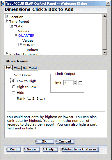
- Accept the
default sort order: Low to High.
- Select the Limit check
box and choose 2 for the limit.
- Select the Rank check
box.
- Click Ok to
return to the main OLAP Control Panel window.
- Click Run at
the bottom of the OLAP Control Panel.
Notice that only two values
now appear for each Quarter and they are ranked low to high within
each group, as shown in the following image.
x
Procedure: How to Reposition Sort Fields in an OLAP Report
You
can change the order in which data is sorted and presented in the
report. For example, you can change from sorting by State and then
by Product to sorting by Product and then by State. If you want
to reposition:
- Vertical (By)
sort fields, drag a field into a new column position.
- Horizontal
(Across) sort fields, drag the lower field above the higher one
or the higher field above the lower one.
In each case,
the cursor changes to a plus sign (+) to indicate acceptable places
into which you can drop the field. Unacceptable positions are shown
by a circle with a slash across the center.
Example: Repositioning Sort Fields in an OLAP Report
- Run OLAPREP2.
- Click the top
half of the diamond button next to Quantity to
sort values from high to low.
The dimension values adjust accordingly.
The report now shows the Quantity values from high to low, but according
to the QUARTER sort order, as shown in the following image.
You
would like to change the sort order in the report, making Store
Name the first sort field, followed by Product Type and QUARTER.
- Drag QUARTER after
Product Type.
The cursor changes to a plus sign (+) to indicate
acceptable places into which you can drop the field.
The
report changes immediately, as shown in the following image, with
the Store Name being the first sort order.
x
Procedure: How to Reposition Sort Fields from the OLAP Control Panel
-
Open
the OLAP Control Panel.
-
Select
a field in the Drill Down or Drill Across pane.
-
Click
the Shift Up or Shift Down arrow
until the field is in the desired position.
Repeat for other fields as needed.
-
Click Run to
execute your report.
Example: Repositioning Sort Fields from the OLAP Control Panel
- Run OLAPREP2.
- Click the top
half of the diamond button next to Quantity to sort values from
high to low.
The dimension values adjust accordingly. The report
now shows the Quantity values from high to low, but according to
the QUARTER sort order, as shown in the following image.
You
would like to change the sort order in the report, making Store
Name the first sort field, followed by Product Type and QUARTER.
- Click the square
icon next to QUARTER to open the OLAP Control Panel.
- Select Quarter from
the Drill Down pane.
- Click the Shift
Down arrow twice.
QUARTER is now the third item in
the Drill Down list, as shown in the following image.
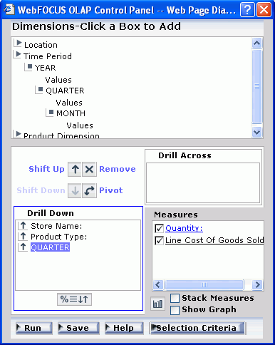
- Click Run at
the bottom of the OLAP Control Panel.
QUARTER appears in the third
column of the report, as shown in the following image.
x
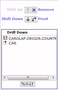
Procedure: How to Hide a Sort Field
In OLAP,
you can hide a sort field by clicking the Hide check box in a report.
Note: Hidden
sort fields are indicated by reversing the color of the icon that appears
at the left of the field name.
-
Enter the
following code in an ad hoc page.
-OLAP ON
TABLE FILE CAROLAP
SUM CAROLAP.BODY.DEALER_COST
CAROLAP.BODY.RETAIL_COST
BY CAROLAP.ORIGIN.COUNTRY
BY CAR
END
-
Open the
OLAP Control Panel.
-
Double-click
on the Country field in the Drill Down pane
of the OLAP Control Panel. In the resulting window panel, select
the Hide check box.
-
Click Ok.
Notice that the color of the sort icon has been
reversed. The Drill Down pane now appears, as shown in the following
image.
x
Procedure: How to Pivot Rows and Columns In an OLAP Report
You
can quickly change a field from one that sorts data vertically,
creating rows, to one that sorts data horizontally, creating columns,
or vice versa.
To change a:
- Vertical (By)
sort field to a horizontal (Across) sort field, drag a field above
the row of column titles.
- Horizontal
(Across) sort field to a vertical (By) sort field, drag the field
into the desired location in the row of column titles.
In
each case, the cursor changes to a plus sign (+) to indicate acceptable
places where you can drop the field. Unacceptable places have a
circle with a slash across the center.
Example: Pivoting Rows and Columns in a Report
- Run OLAPREP2.
- Click Q1.
The
report is now sorted vertically, by month, store, and Product Type,
as shown in the following image.
You
want to create a matrix in which data is sorted horizontally by
month, and vertically by store and Product Type.
- Drag MONTH above
the report to sort data horizontally (Across).
The cursor changes
to a plus sign (+) to indicate acceptable places where you can drop
the field.
In the new report, Quantity and Line Cost of Goods
Sold are repeated horizontally for each month, as shown in the following
image.

x
Procedure: How to Pivot Rows and Columns from the OLAP Control Panel
You
can change a field from one that sorts data vertically, creating
rows, to one that sorts data horizontally, creating columns, or
vice versa.
-
Open
the OLAP Control Panel.
-
Select
the title of the row or column you want to pivot in the Drill Down or
Drill Across pane.
-
Click
the Pivot
 button.
The title appears in the new location.
button.
The title appears in the new location.
-
Click Run to
execute your report.
Example: Pivoting Rows Into Columns from the OLAP Control Panel
- Run OLAPREP2.
- Click Q1.
The
report is now sorted vertically, by month, store, and Product Type,
as shown in the following image.
You
want to create a matrix in which data is sorted horizontally by
month, and vertically by store and Product Type.
- Click the square
icon next to MONTH to open the OLAP Control Panel.
- Select MONTH in
the Drill Down pane and click the Pivot
button.
MONTH
moves into the Drill Across pane, as shown in the following image.
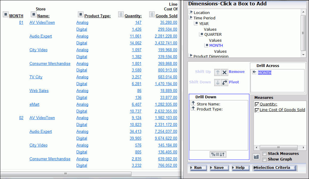
- Click Run on
the OLAP Control Panel.
In the new report, Quantity and Line
Cost of Goods Sold are repeated horizontally for each month, as
shown in the following image.
x
Procedure: How to Sort by a Field Without Displaying the Sort Column
-
Open
the OLAP Control Panel.
-
Select
a field in the Drill Down or Drill Across pane.
-
Click
the Sort
button.
The sort pane opens.
-
Under
Sort Order, select the Hide check box.
-
Click Ok.
The main OLAP Control Panel window reopens.
-
Click Run to
execute the report.
Tip: To
expose the hidden sort field, repeat the process and deselect the Hide check
box.
Example: Sorting by a Hidden Field
- Run OLAPREP2.
The first sort field in the report is
QUARTER. You want to retain the sorting but not display this field.
- Click the square icon next to QUARTER
to open the OLAP Control Panel.
- Select QUARTER in
the Drill Down pane, then click the Sort
button.
The sort pane opens.
- Select the Hide check
box, as shown in the following image.
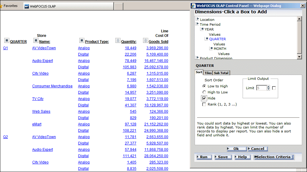
- Click Ok.
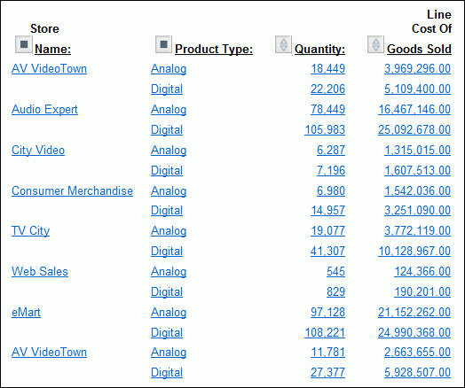
The
main OLAP Control Panel window reopens.
- Click Run in
the OLAP Control Panel.
Report sorting is unchanged, but the
QUARTER column no longer appears, as shown in the following image.
x
Grouping Numeric Data Into Tiles
You can group numeric data into any number of tiles
(percentiles, deciles, quartiles, and so on) in tabular reports.
For example, you can group student test scores into deciles to determine
which students are in the top ten percent of the class.
Grouping is based on the values in the selected vertical (BY)
field and data is apportioned into the number of tile groups you
specify.
The following occurs when you group data
into tiles:
- A new column
(labeled TILE by default) is added to the report output and displays
the tile number assigned to each instance of the tile field. You
can change the column title in the Tiles section of the OLAP Control
Panel.
- Tiling is calculated
within all of the higher-level sort fields in the request and restarts
whenever a sort field at a higher level than the tile field value
changes.
- Instances are
counted using the tile field. If the request displays fields from
lower-level segments, there may be multiple report lines that correspond
to one instance of the tile field.
- Instances with
the same tile field value are placed in the same tile. For example, consider
the following data, which is to be apportioned into three tiles:
1
5
5
5
8
9
In
this case, dividing the instances into groups containing an equal
number of records produces the following table:
|
Group
|
Data Values
|
|---|
|
1
|
1,5
|
|
2
|
5,5
|
|
3
|
8,9
|
However, because all of the same data values
must be in the same tile, the fives (5) that are in group 2 are
moved to group 1. Group 2 remains empty. The final tiles look like
the following table:
|
Tile Number
|
Data Values
|
|---|
|
1
|
1,5,5,5
|
|
2
| |
|
3
|
8,9
|
x
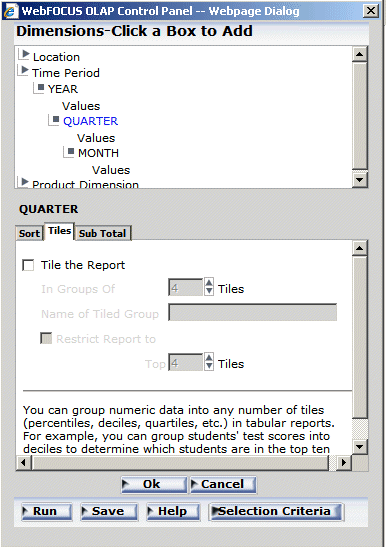
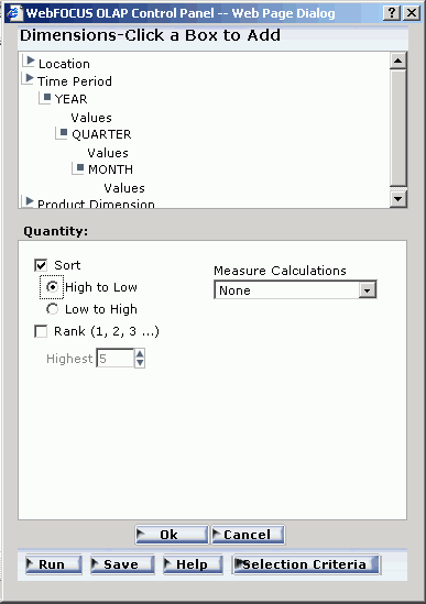
Procedure: How to Group Data Into Tiles in an OLAP Report
-
Open
the OLAP Control Panel.
-
Select
a numeric or date field from the Drill Down pane.
-
Click
the Sort button.
-
Click the Tiles tab,
as shown in the following image.
-
Click
the Tile the Report check box.
-
In the In
Groups Of input area, select the number of tiles to
be used in grouping the data. For example, 100 tiles produces percentiles
or 10 tiles produces deciles.
-
In the Name
of Tile Group input pane, type a name for the Tile column.
-
In the Restrict
Report to only the Top input area, select the number
of tile groups to display in the report.
-
Optionally,
select the Sort tab and select a Sort Order
option button:
- Choose High
to Low to sort data in descending order so that the
highest data values are placed in tile 1.
- Choose Low
to High to sort data in ascending order so that the
lowest data values are placed in tile 1. This is the default.
-
If you
wish to specify the highest tile value to appear in the report, select
a value from the Limit input area. For example, if you enter a limit
of 3, the report will not display any data row that is assigned
a tile number greater than 3.
-
Click Ok to
accept the selections and return to the main OLAP Control Panel
window.
-
Click Run to
reexecute and view the report.
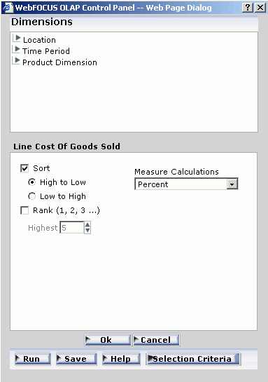
xPerforming a Calculation on a Measure
You can perform standard calculations, such as average,
percent, and summarize, on the numeric data in measures on an OLAP
report.
x
Procedure: How to Apply a Calculation to a Measure
-
Open
the OLAP Control Panel.
-
Click
a measure name in the Measures pane.
Note: Do not click the Stack Measures check
box, which controls the display of a measure, not its sorting.
The sort options pane opens.
-
Click
the arrow under Measure Calculations and select a calculation from
the list.
None is
the default value. For details, see Calculations You Can Perform on a Measure.
-
Click Ok.
The sort pane is replaced by the Measures pane, where the
selected calculation appears as a prefix to the measure.
-
Click Run,
and the applied calculation is added to the column title.
x
Reference: Calculations You Can Perform on a Measure
The
following table lists the types of calculations in the first column
and describes their functions in the second column.
|
Calculation
|
Function
|
|---|
Average Sum
of Squares |
Computes the average sum of squares for
standard deviation in statistical analysis.
|
Average |
Computes the average value of the field.
|
Count |
Counts the number of occurrences of the
field.
|
Count
Distinct |
Counts the number of distinct values within
a field when using -REMOTE. For other modes of operation, this behaves
like Count.
|
Maximum |
Generates the maximum value of the field.
|
Minimum |
Generates the minimum value of the field.
|
Percent |
Computes the percent of a field based on
the total values for the field. The Percent can be used with detail,
as well as summary fields.
|
Percent
of a Count |
Computes the percent of a field based on
the number of instances found.
|
Row Percent |
Computes the percent of a field based on
the total values for the field across a row.
|
Summarize |
Sums the number of occurrences of the field.
|
Total |
Counts the occurrences of the field for
use in a heading (includes footings, subheads, and subfoots).
|
Example: Applying a Percent Calculation to a Measure
The following is an example of applying
a percent calculation to a measure.
- Run OLAPREP6.
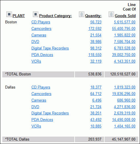
The report shows Quantity and Line Cost
of Goods Sold sorted by plant and product category, with a subtotal
at each sort break.
You want to create
a report column that shows the percent of total sales for each plant.
- Click the square
icon next to PLANT to open the OLAP Control Panel.
- Click Line
Cost of Goods Sold in the Measures pane.
The sort
pane opens.
- Select the Sort check
box, and select the High to Low option button
to specify the sort order.
- Under Measure
Calculations, choose Percent from the drop-down
list, as shown in the following image.
- Click Ok to
see the calculation as a prefix for the measure in the Measures
pane as shown in the following image.
- Click Run at
the bottom of the OLAP Control Panel.
The report now breaks down
sales for each product at each plant as a percentage of total sales,
as shown in the following image.
Notice
that the subtotals have been removed from the report because the
breakdown by plant is no longer suitable for the data.
xIn this section: How to: Reference: |
An OLAP report is limited to values belonging to the parent categories
in the dimensions hierarchy. There are several ways to further limit
the data that appears in the report.
- From the Selections
panel or the OLAP Control Panel, you can explicitly limit the data
in an OLAP report by selecting dimension values and relational operators
(such as =, >, <). For a list of the relational operators,
see Selection Criteria Relational Operators.
The Selections panel provides
the easiest approach since you can choose both dimension values
and relational operators with a few mouse clicks, while the report
is fully exposed to view.
Changes
made in the Selections panel are implemented immediately in the
OLAP Control Panel (even if the Control Panel is closed), and changes
made in the OLAP Control Panel are reflected immediately in the
Selections panel.
- From the report,
you can limit data indirectly by drilling down on measures and dimensions
to hone in on a subset of information. For details, see Drilling Down On Dimensions and Measures.
x
Reference: Selection Criteria Relational Operators
You
can define selection criteria in the Selections panel or in the OLAP
Control Panel using several relational operators, which are shown
in the following tables. The first column displays the operator
and the second column provides a description of the operator.
|
Operator
|
Icon
|
Displays Records That...
|
|---|
|
Is Equal To
|

|
Are equal to the criteria you specified.
This
is the default operator.
|
|
Is Not Equal To
|

|
Are not equal to the criteria you specified.
|
|
Is Greater Than
|

|
Are greater than, but not equal to, the
criteria you specified.
|
|
Is Greater Than or Equal To
|

|
Are greater than or equal to the criteria
you specified.
|
|
Is Less Than
|

|
Are less than, but not equal to, the criteria
you specified.
|
|
Is Less Than or Equal To
|

|
Are less than or equal to the criteria you
specified.
|
|
Contains
|

|
Contain the criteria you specified.
Note: This
operator is available only for alphanumeric fields.
|
|
Does Not Contain
|

|
Do not contain the criteria you specified.
Note: This
operator is available only for alphanumeric fields.
|
Note: You can select more than one value
using the same relational operator.
The
following table lists and describes relational operators for selecting
a range of dates.
|
Operator
|
Icon
|
Displays Records Where...
|
|---|
|
From (within range)
|

|
The value in the indicated date field falls
within the specified range.
Note: To use this relational
operator, you must select the Range check box in the Date Selection
panel.
|
|
Not From (not within range)
|

|
The value in the indicated date field does not fall
within the specified range.
Note: To use this relational
operator, you must select the Range check box in the Date Selection
panel.
|
x
Procedure: How to Apply Selection Criteria From the Selections Panel
When
the Selections panel is turned on, there is one control (drop-down
list) for every dimension in the OLAP hierarchy. Note that the name
of the dimension field appears as defined in the Master File, even
if an alternate column title has been specified.
To
limit data for the dimensions that are included in the report:
-
Click
the arrow to the right of the dimension to open the list of values.
-
Select
one or more values from the list. (All is the
default value.)
To select multiple values, click the desired values while
holding the Ctrl key on the keyboard.
-
Select
a relational operator from the button to the left of the dimension to
indicate the basis for selection. Equal (=) is the default.
You can toggle through a list of operators. See Selection Criteria Relational Operators.
-
Repeat
steps 1-3 for each dimension whose values you wish to limit.
-
Click Run on
the band below the Selections panel.
Tip: To
change or eliminate selection criteria, reopen the values list and
choose another value or choose All.
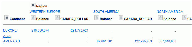
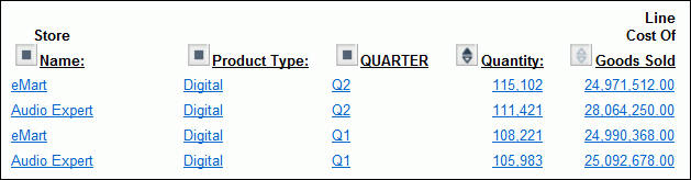
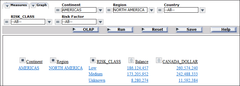
Example: Limiting Continents and Regions From the Selections Panel
- Run OLAPREP7.
The
Selections panel above the report shows that the controls for Continent
and Region are set to All to show all values
of each dimension.
You wish to focus on the data for one continent
and one region.
- In the Selections
panel, click the arrow to the right of Continent and select AMERICAS from
the list of values. Use the default operator (=) to limit the data.
- Next, click
the arrow to the right of Region and select NORTH AMERICA.
Once again, accept the default operator (=).
- Click Run on
the band below the Selections panel.
The output is now limited
to data for the selected continent and region, as shown in the following
image.
x
Procedure: How to Apply Selection Criteria from the OLAP Control Panel
-
Open
the OLAP Control Panel.
-
Click
the Selection Criteria button at the bottom
right of the window.
The Selection Criteria pane opens.
-
In the
Dimensions pane above the Selection Criteria pane, expand a dimension
and click Values.
A secondary window opens. Select one or more values (press
the Ctrl key to multiselect).
-
Click Ok to
return to the Selection Criteria pane, where the selected values
appear in the drop-down lists.
- If a Developer
has applied selection criteria to the Reporting Object from which
you create an OLAP report, you only see the selected acceptable values
of the field.
- If no selection
criteria have been applied, you see all the values of the field
in the drop-down lists.
-
In the Selection
Criteria pane, click a relational operator next to the
dimension to specify the relationship that you want to base selection
on. For example, =, >, or <. For a complete list, see Selection Criteria Relational Operators.
-
Repeat
the process for other dimensions whose values you wish to limit.
-
Click Run to
execute your report.
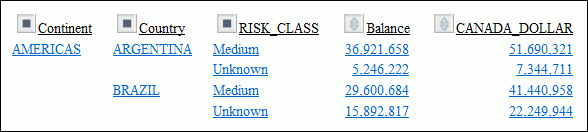
Example: Limiting Continents and Countries from the OLAP Control Panel
Tip: If you have access to the
Selections panel, it provides the quickest way to limit data. For
an illustration, see Limiting Continents and Regions From the Selections Panel.
- Run OLAPREP8.
The
report shows data for continents and countries. You want to restrict
the information to the Countries ARGENTINA and BRAZIL in the Continent
AMERICAS.
- Click the square
icon next to Continent to open the OLAP Control
Panel.
- Click the Selection
Criteria button at the bottom right to open the Selection
Criteria pane.
- In the Dimensions
pane above the Selection Criteria pane, expand the Geographic
Area dimension and click Values under
Country.
A secondary window lists the acceptable values.
- In this window,
choose ARGENTINA and BRAZIL,
as shown in the following image. (Hold down the Ctrl key to multiselect
values.)
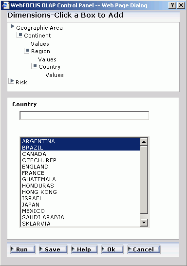
- Click Ok to
return to the Selection Criteria pane.
- In the Dimensions
pane, click Values under Continent and choose AMERICAS,
then click Ok.
The selected values now
appear in the drop-down lists in the Selection Criteria pane, as
shown in the following image.
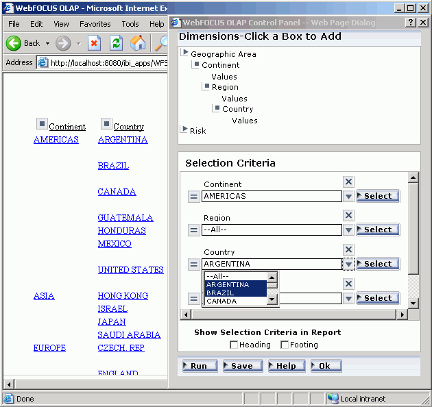
- Verify that
you want to use the default operator (=), then click Run at
the bottom of the OLAP Control Panel.
The new report displays
the data by Continent, AMERICAS followed by Country, as shown in
the following image.
x
Procedure: How to Change Selection Criteria from the OLAP Control Panel
Tip: If
you have access to the Selections panel, it provides the easiest
way to adjust or remove selection criteria. See How to Apply Selection Criteria From the Selections Panel.
From the OLAP Control Panel:
-
Click the Selection
Criteria button at the bottom right.
The Selection Criteria pane opens.
-
Click
the Select button next to the dimension value
you wish to modify.
A secondary pane opens.
-
To change a value: Type the new value in the text pane
or select one or more values from the list. (The value you type
must be in the same case as the value in the data source.)
You can input only one value in the text pane. If you select
more than one value from the list, only the first value appears.
However, all values appear in your report.
-
To deselect a value: Hold down the Ctrl key while clicking
the value.
-
Click Ok to
return to the Selection Criteria pane where you can verify the revised
value and/or change the relational operator if required.
-
Click Ok again
to confirm your choice and return to the main OLAP Control Panel
window.
-
Click Run to
execute your report.
x
Procedure: How to Remove Selection Criteria from the OLAP Control Panel
To change a value: Type
the new value in the text pane or select one or more values from
the list. (The value you type must be in the same case as the value
in the data source.)
You can input only one value in the text
pane. If you select more than one value from the list, only the
first value appears. However, all values appear in your report.
Tip: If
you have access to the Selections panel, it provides the easiest
way to adjust or remove selection criteria. See How to Apply Selection Criteria From the Selections Panel.
From the OLAP Control
Panel:
-
Click the Selection
Criteria button at the bottom right.
The Selection Criteria pane opens.
-
Select
the criterion you want to remove.
-
Click
the Delete
 button.
The selection category is removed from the list.
-
Click Run to
execute your report with all values.
x
Applying Selection Criteria to Date Elements
You can apply selection criteria to date elements just as you
apply them to other types of elements. The results are limited by
the dates you select. For example, you can select to view data associated
with a particular date or to exclude data from the specified date.
Note: Like other dimension elements, date fields must
have been defined in the Master File by a Managed Reporting developer.
The Master File specifies the date formats available for selection
criteria.
In the OLAP Control Panel, you can choose the selection criteria
from a Date selection pane that contains the appropriate controls
for the date format.
You can also select a range of dates
in a designated year by specifying a From and To date. Two relational operators
are available for selecting a range of dates:
- The From (within
range)
operator
displays records when the value in the indicated date field falls
within the specified range.
- The Not From (not within
range)
operator
displays records when the value in the indicated date field does not fall
within the specified range.
For more information on supported date
formats, see Date Format Limitations. For more information on specifying date
formats, see the Describing Data With WebFOCUS Language
manual.
x
Procedure: How to Apply Selection Criteria to a Date Field
Note: The
Date selection pane appears only when a supported date format is
provided. See Date Format Limitations.
From
the OLAP Control Panel:
-
Click
the Selection Criteria button.
The Selection Criteria pane opens.
-
In the
Dimensions pane above the Selection Criteria pane, expand a dimension
that includes a date field, and click Values directly below
that field.
A secondary window displays controls for the date format
of the dimension. For example, if the date format is YYM, only the
year and month controls appear. If the format is YYMD, year, month,
and day controls appear.
-
Specify
a date using the spin controls, drop-down lists, or by typing the value.
If your date format includes edit masking, such as Y.M.D,
the date appears with forward slashes (/) in the Date selection
list pane, the Selection Criteria pane, and the drop-down list at
the bottom of the report. However, the date edit mask appears as specified
within the body of the report.
-
Click Add to
display the date in the Selections listpane.
-
Click Ok to
return to the Selection Criteria pane and verify the selected date.
-
In
the Selection Criteria pane, click a relations button to the left
of the date field (for example, =, >, or <) to indicate a
basis for record selection.
-
Optionally,
define additional date selection criteria by repeating steps 2-7.
-
Click Run to
execute your report.
Example: Applying Selection Criteria to a Date Field
- Run OLAPREP9.
As
shown in the following images, the multi-page OLAP report includes
several years of data about reported problems falling into five
categories: incorrect labeling, missing components, physical damage,
power failure, and remote failure.
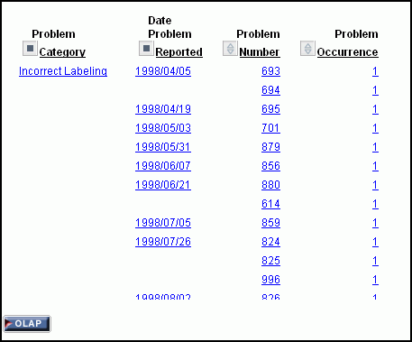
You
want to investigate problems reported on June 6, 2001. You can limit
data based on a single date from the OLAP Control Panel.
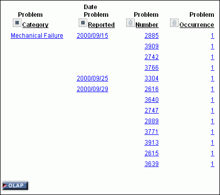
Note: To
show the selection of a particular date, a dimension component has
been added to the procedure. This dimension places Date Problem
Reported in the Time Period dimension hierarchy directly below the
root.
- Click the OLAP button
below the report to open the OLAP Control Panel.
Note: The
OLAP button appears at the bottom of this report because the OLAP
CONTROL setting was selected. For details, see Setting OLAP Reporting Options.
- Click the Selection
Criteria button at the bottom of the OLAP Control Panel.
The
Selection Criteria pane opens.
- In the Dimensions
pane above the Selection Criteria pane, expand the Time
Period hierarchy.
- Click Values under
Date Problem Reported.
A new pane appears for Date Problem Reported,
replacing the Selection Criteria pane. The pane includes a drop-down
list for each selectable value (Year, Month, and Date), as shown
in the following image.

- Select values. For example:
- Change the year to 2010 in the Year
field by using the spin controls or typing the value.
- Select April from the Months drop-down
list.
- Select 21 from the Days drop-down list.
- Click Add to
enter these criteria in the input pane.
- Click Ok to
return to the Selection Criteria pane, which now reflects your entries,
as shown in the following image.
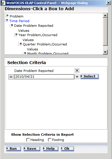
The
relational operator to the left of the Date pane indicates that
your report will contain data only for those rows where date is
equal to (=) the values you entered. This default operator is correct
for this example.
- Click Run to
see the problem report for the specified date.
Your selection
criteria are listed beside the OLAP button at
the bottom of the report, as shown in the following image.
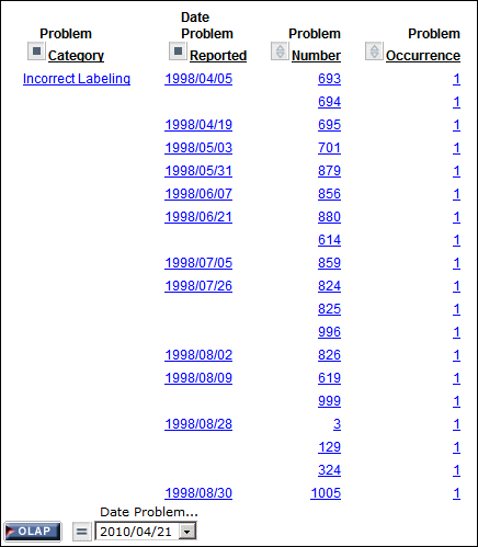
x
Procedure: How to Apply Selection Criteria to a Date Range
-
Open
the OLAP Control Panel.
-
Click
the Selection Criteria button.
The Selection Criteria pane opens.
-
In the
Dimensions pane above the Selection Criteria pane, expand the dimension
that includes the date field, and click Values directly
under the desired field.
A secondary window displays controls for the date
format of a dimension. For example, if the date format is YYM, only
the year and month controls appear. If the format is YYMD, year,
month, and day controls appear.
Note: The Date selection
pane appears only when a supported date format is provided. See Date Format Limitations.
-
Click the Range check
box.
Inclusive and Exclusive option
buttons appear:
- Choose Inclusive to
show the range including the dates specified.
- Choose Exclusive to
show the range excluding the dates specified.
Note:
- You can select
only one range of dates at a time.
- You can apply
selection criteria to a range of dates only if the date format contains a
year. See Date Format Limitations.
From
and To drop-down lists open for all selectable options. By default,
the current date appears.
-
Specify
a From date and a To date
by using the spin controls and drop-down lists.
-
Click Ok to
return to the Selection Criteria pane.
-
To view
both the From and To dates of the range selected, click the down
arrow on the drop-down list.
-
Click
a relational operator to the left of the date element in the Selection
Criteria pane:
- Choose the From
(within range)
operator
to display records when the value falls within the specified range.
- Choose the Not
From (not within range)
operator
to display records when the value does not fall within the
specified range.
-
Click Run to
execute your report.
Example: Applying Selection Criteria to a Range of Date Fields
- Run OLAPREP9.
As shown in the following images, the
report shows problem information reported over the course of several
years.
The information falls into the following
categories: incorrect labeling, missing components, physical damage,
power failure, and remote failure.
You
want to restrict the information to problems reported between June
6, 2001 and July 6, 2001. From the OLAP Control Panel, you can limit
data based on a range of dates.
- Click the OLAP button
below the report to open the OLAP Control Panel.
- Click the Selection
Criteria button at the bottom-right of the OLAP Control
Panel.
The Selection Criteria pane opens.
- In the Dimensions
pane above the Selection Criteria pane, expand the Time
Period hierarchy.
- Click Values under
Date Problem Reported.
A new pane appears for Date Problem Reported,
replacing the Selection Criteria pane. The pane includes a drop-down
list for each selectable value (Year, Month, and Date).
- Select the Range check
box:
- Inclusive and
Exclusive option buttons appear. To show the range including the
dates specified, choose Inclusive (the default).
- From and To drop-down lists open for
all selectable options. By default, the current date appears.
- Specify values for the From date. For
example:
- Change the current year to 2001 by using
the spin controls or by typing in the text box.
- Select June from
the Months drop-down list to change the current calendar month.
- Select 6 from
the Days drop-down list to change the calendar day.
- Specify values
for the To date. For example:
- Change the
current year to 2001 by using the spin controls or by typing in
the text box.
- Select July from
the Months drop-down list to change the current calendar month.
- Select 6 from
the Days drop-down list to change the calendar day.
The following
image shows the selections.
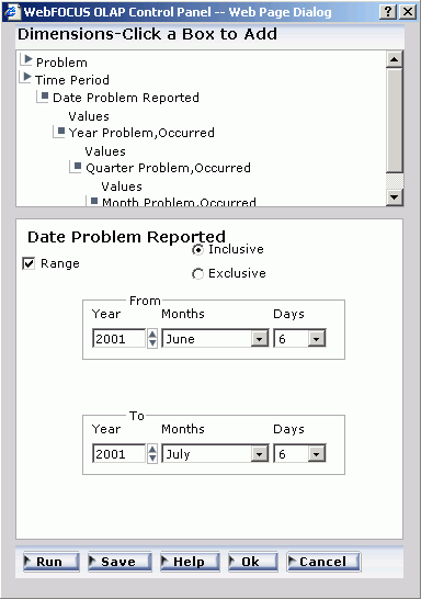
- Click Ok to return
to the Selection Criteria pane.
- To view the range of dates, click the
down arrow in the drop-down list, then click Ok again.
- To report on information within the
specified range of dates, accept the default (the From
(within range)
operator).
- Click Run to
execute the report, which now only displays problem information
from June 6, 2001 to July 6, 2001, as shown in the following image.
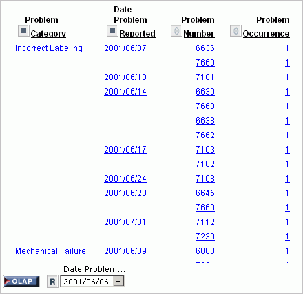
The
date element appears at the bottom of the window.
- To view the
range of dates, click the arrow in the drop-down list.

x
Procedure: How to Add Dates to the Selections List Pane
From
the OLAP Control Panel:
-
Click Selection
Criteria.
The Selection Criteria pane opens.
-
In the
Dimensions pane above the Selection Criteria pane, expand the dimension
that includes the date field, and click Values under the
desired field.
-
Specify
the date you want to add by using the spin controls, drop-down lists,
or by typing the value.
-
Click Add.
The date appears inside the Selections list pane.
-
Click Ok to
return to the Selection Criteria pane.
x
Procedure: How to Delete Dates From the Selections List pane
From the
OLAP Control Panel:
-
Click Selection
Criteria.
The Selection Criteria pane opens.
-
In the Dimensions
pane above the Selection Criteria pane, expand the dimension that
includes the date field, and click Values under the
desired field.
-
Select
one or more dates that you want to remove from the Selections list
pane.
-
Click Delete to
remove the date.
-
Click Ok to
return to the Selection Criteria pane.
x
Reference: Date Format Limitations
Note
the following limitations when applying selection criteria to date elements:
- The Date selection
pane does not support Julian dates. However, if you are using Julian
dates, the Date controls still open.
- Dates containing
only a day format (D, I2D, A2D) are not supported from the Date selection
pane. Instead, the data source provides a list of values.
- The Range check
box is enabled on the Date selection pane when the date format contains
one of the following formats:
- Any smart date
format. For example, YMD, MDY, YYMD, MDYY, Q, M
- A4YY
- I4YY
- I8YYMD
- A8YYMD
- I6YYM
- A6YYM
x
To make your reports more powerful, you can insert visual
representations of selected data directly into the report output.
These visual representations, which appear as a column of vertical
or horizontal bar graphs adjacent to the numeric data, make relationships
and trends among data more obvious.
You can apply data visualization graphs to selected measures
from:
x
Procedure: How to Add a Column of Bar Graphs for a Numeric Measure
The
quickest way to apply data visualization graphics is from the report
itself:
-
Right-click
the title of a measure column.
-
Choose Visualize from
the menu.
The
report runs automatically, displaying a column of bar graphs following
the selected measures column.
Tip: To remove the bar
graphs, right-click the measure column title and choose Remove
Visualize from the menu.
xDisplaying Graphs and Reports
When you graph a measure in an OLAP report, you select the specific
data elements to include and then view the tabular report and a
graphical representation of the identical information simultaneously
in a split window. The graph appears in a frame in the top half of
the window to facilitate comparison.
To create a graph, the data in the report must include at least
one numeric measure and one sort field (By or Across). The Graph
control is activated in the Selections panel or the OLAP Control
Panel when these basic requirements are met.
The following image includes three sort fields (Store Name, Manufacturing
Plant, and PRODCAT) and three numeric measures (Quantity, Our Cost,
and Price), displayed as horizontal bar charts for quick comparison.
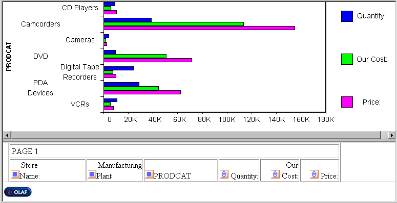
You can request a graph from an OLAP
report, from the Selections panel, or from the OLAP Control Panel:
- From an OLAP report, you can create
a vertical bar chart to represent the data in a selected measure.
- From the Selections
panel or the OLAP Control Panel, you can create seven different
types of graphs and apply them to one or more measures:
- Vertical Bar
(This is the default graph type.)
- Vertical Line
- Vertical Area
- Horizontal
Bar
- Horizontal
Line
- Horizontal
Area
- Pie
If you choose to graph more than one
measure, you can employ different graph types to suit the data in
each column, with the following restrictions:
- When you select Vertical or Horizontal
Bar, Line, or Area as the controlling graph style for a measure,
you can apply any combination of these styles to other measures.
For example, the first measure can appear as bars, the second measure
as lines, and the third measure as areas. All measures must have
the same orientation (vertical or horizontal).
- When you choose Pie as the controlling
graph style, you can use only pie charts for other measures.
For details about supported combinations, see Combining Graph Styles and Measure Styles in OLAP Graphs.
Note: If drill-down capability has been enabled for the
dimensions in a report, the same functionality is automatically
enabled for graphs. You can drill down from one graphical representation
of your data to another.
x
Reference: Combining Graph Styles and Measure Styles in OLAP Graphs
The following
table lists the available style combinations in the second column
for each graph style in the first column.
|
Controlling Graph Style
|
Potential Measure Styles
|
|---|
|
Vertical Bar (default)
|
Vertical Bar (default)
|
|
Vertical Line
|
|
Vertical Area
|
|
Vertical Line
|
Vertical Line (default)
|
|
Vertical Bar
|
|
Vertical Area
|
|
Vertical Area
|
Vertical Area (default)
|
|
Vertical Bar
|
|
Vertical Line
|
|
Horizontal Bar
|
Horizontal Bar (default)
|
|
Horizontal Line
|
|
Horizontal Area
|
|
Horizontal Line
|
Horizontal Line (default)
|
|
Horizontal Bar
|
|
Horizontal Area
|
|
Horizontal Area
|
Horizontal Area (default)
|
|
Horizontal Line
|
|
Horizontal Area
|
|
Pie
|
Pie
|
x
Procedure: How to Graph a Measure From the Selections Panel
-
Click
the down arrow to the left of the Graph control to open a drop-down
pane containing all the numeric measures in the current report.
There is a check box to the left of each measure and a
graph button to the right of each measure. All check boxes are unchecked
by default and all graph buttons are grayed (inactive) by default.
-
Select
a check box associated with a measure.
The graph button to the right of the measure becomes active.
The default graph style is Vertical bar.
-
Toggle
through the seven graph style icons until you reach the one you want
to apply to the selected measure.
-
Repeat
steps 2 and 3 for any other measures you want to graph.
For a list of graph types that can be defined, see Combining Graph Styles and Measure Styles in OLAP Graphs.
-
Click Run on
the band below the Selections panel.
The graph opens in a separate frame above the report and
Selections panel.
Example: Graphing Multiple Measures From the Selections Panel
This
example contains two measures, Balance and CANADA_DOLLAR, sorted
by Continent. You would like to see graphical representations of
both measures. To contrast the graphical information, you use a
different graph type for each one.
- Run OLAPREP4.
- Right-click
the Region field and select Delete from
the menu to limit the report to the fields you want to graph (one
dimension, Continent, and two measures, Balance and CANADA_DOLLAR).
- In the Selections
panel above the report, click the arrow to the left of the Graph control
to list the measures.
- Click the Balance measure
check box, then choose the vertical bar icon
to the right of the measure. (This is the default graph type.)
- Click the CANADA_DOLLAR measure
check box, then toggle through the graph icons until you see the vertical area graph
 .
.
As
shown in the following image, the Selections panel has the Graph
control listing Balance represented as a vertical bar and CANADA_DOLLAR
represented as a vertical area.
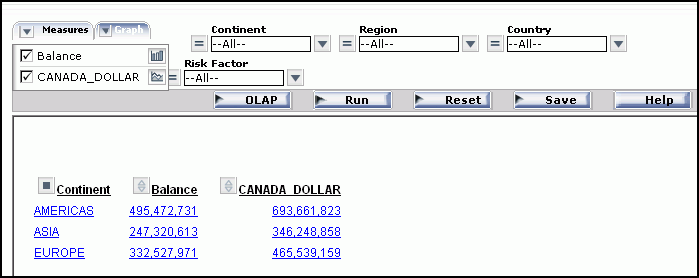
- Click Run on
the band below the Selections panel to generate the graphs.
The
following image shows the results of the graph selections.
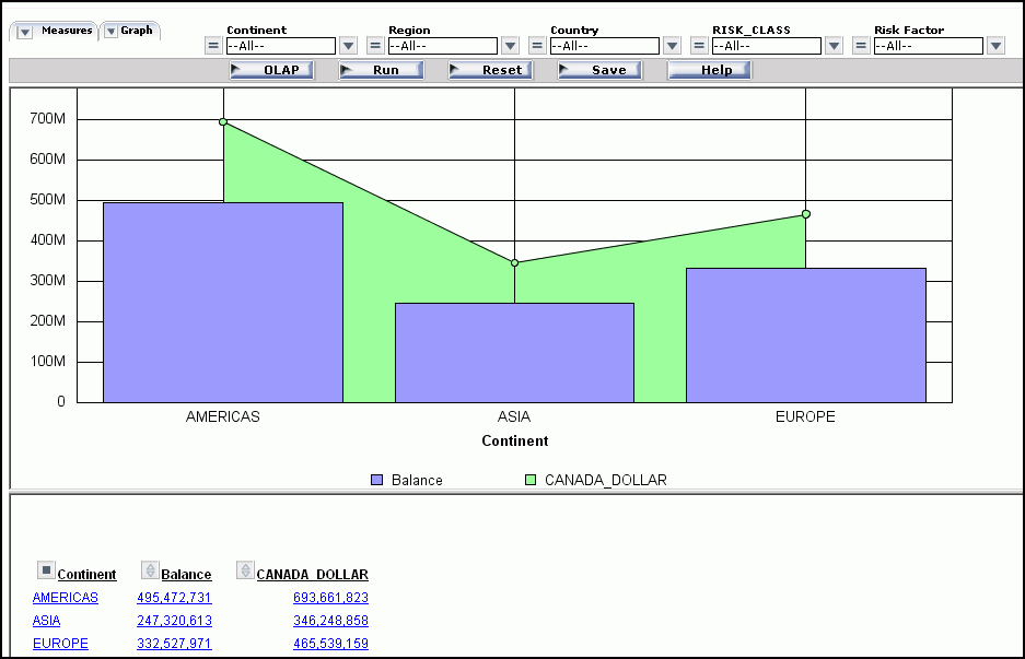
x
Procedure: How to Create a Pie Chart From the Selections Panel
-
Run OLAPREP2.
The report shows order information for stores that sell
electronic products from Century Corporation. Audio Expert shows
the highest numbers, with orders of digital products significantly
exceeding analog.
You want a clearer picture of how the digital
orders break down by product so you decide to create a pie chart.
-
Click Digital for
Audio Expert in Q2 to hone in on the data you want to graph.
The report now shows the Quantity and Line Cost of
Goods Sold for several digital products sold at Audio Expert in
Q2, as shown in the following image.
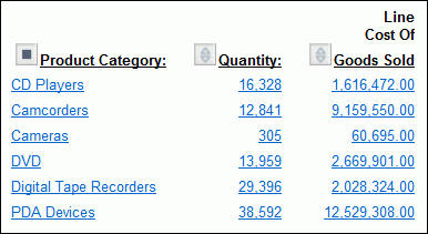
-
Right-click Quantity and
choose Show Panel to open the Selections
panel.
-
In the
Selections panel, click the arrow to the left of the Graph control, then
click the check box for Quantity and toggle
through the graph options until you reach the pie icon,
as shown in the following image.
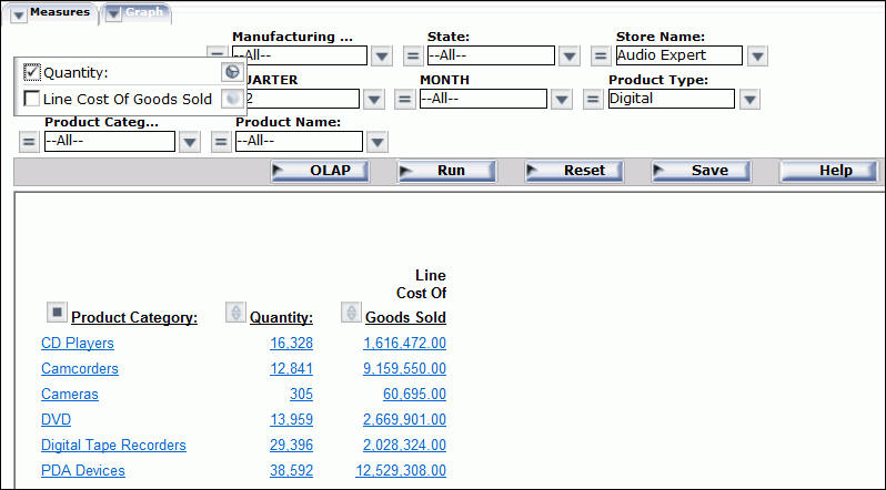
-
Click Run on
the band below the Selections panel.
As shown in the following image, the graph appears in a
pane above the report. You can see at a glance that PDA Devices
constituted about 1/3 of digital sales at the Audio Expert store
in Q2.
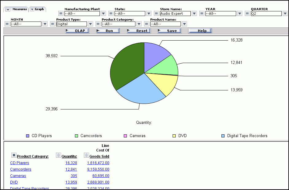
x
Procedure: How to Graph a Measure from the OLAP Control Panel
-
Run OLAPREP4.
-
Open
the OLAP Control Panel.
-
Select
the Show Graph check box located below the
Measures pane.
Note that the contents of the Drill Down and Drill Across
panes determine the X-axis fields. When there are multiple drill
(X-axis) fields, multiple graphs appear vertically stacked in the
same frame. The measures appear as Y-axis fields on the graphs you
display.
-
Click
the Graph icon adjacent to the Show Graph
check box.
The Measures and Graph-Style pane opens.
Check boxes
associated with the available measures are checked by default.
-
Click
one of the seven icons at the bottom of the window to set a controlling
graph style.
-
Select
the check boxes for the measures you wish to graph.
The graph icon corresponding to the controlling graph style
appears next to each selected measure.
-
Click
the icon next to a measure to choose a different graph style from the
supported combinations, as shown in the following image.
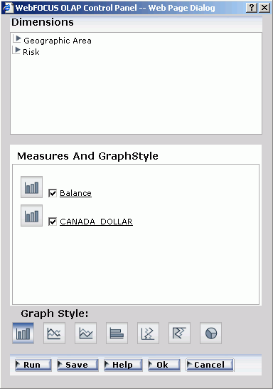
-
Click Ok to
return to the main OLAP Control Panel window with all the graph
settings retained.
-
Click Run to
display the graphs and the tabular report in a split window.
Note:
- If you select the Show Graph check box
and click Run without selecting a controlling
graph style, the default style (Vertical Bar) is applied.
- If you click Run without
selecting the Show Graph check box, a tabular report appears without
a graph.
- If you select at least one measure in
the Measures and GraphStyle pane without selecting the Show Graph
check box, when you click Ok, the system
automatically selects the Show Graph check box. The tabular report
appears with a graph.
- You cannot choose to graph alphanumeric
or date fields. If there are no numeric measures, the Show Graph
check box and the Graph button are disabled.
xControlling the Display of Measures in a Report
While you cannot add new measures to an OLAP report
without returning to the original report request, you can adjust
the display of the measures in the report in several ways. You can:
- Stack measures
in rows.
- Change the
order of measure columns.
- Hide and expose
measures.
- Add a column
of data visualization bar graphs following any numeric measure.
x
When you have more than one
measure in an OLAP report, you can stack the measures in separate
rows within the same column to reduce the width of the report.
You cannot apply data visualization bar
graphs to stacked measures.
x
Procedure: How to Display Stacked Measures
-
Open
the OLAP Control Panel.
-
Select
the Stack Measures check box to display measures
in separate rows under one column.
-
Click Run to
execute your report.
Tip: To
restore the standard display, deselect the Stack Measures check
box and rerun the report.
Example: Displaying Stacked Measures
- Run OLAPREP4.
Initially,
this report is sorted vertically by Continent and Risk_Class and
horizontally by Region, and the measures (Balance and CANADA_DOLLAR)
appear as separate columns.
- For this example,
you will not need the Region dimension, but you will need the Country
dimension. You can quickly make these changes to the report:
- Right-click Region and
select Delete from the menu.
- Right-click Continent and
select Unhide from the menu, then select Country from
the secondary menu.
The report now displays data by Continent
followed by Country, as shown in the following image.
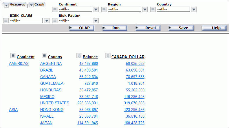
You
wish to show the measure titles and data values in rows.
- Click the OLAP button
on the band below the Selections panel to open the OLAP Control
Panel.
- Click the Stack
Measures check box below the Measures pane.
- Click Run to
execute the report and display the titles and values of the measures
stacked over each other in separate rows, as shown in the following
image.
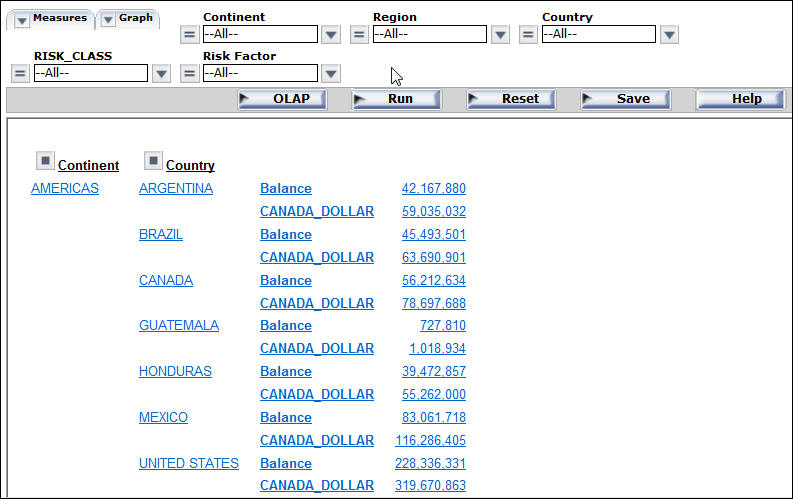
x
Changing the Order of Measure Columns
You can change the order in which measure columns are
presented in the report.
x
Procedure: How to Reposition Measure Columns in an OLAP Report
To
reposition a numeric column, drop the field into a new column position.
The
cursor changes to a plus sign (+) to indicate acceptable places
into which you can drop the field. (Unacceptable positions are indicated
by a circle with a slash cross the center.)
Example: Repositioning Measure Columns
- Run OLAPREP2.
As
shown in the following image, the column for the Quantity measure
precedes the column for the Line Cost of Goods Sold measure.
- To change the
order of columns, drop Line Cost of Goods Sold before Quantity.
The
cursor changes to a plus sign (+) to designate where you can drop
the field. The report, as shown in the following image, now displays
Quantity as the last column.
x
Hiding and Displaying Measures
You can hide and expose measures from an OLAP report,
the Selections panel, or the OLAP Control Panel.
x
Procedure: How to Hide or Expose a Measure From the Report
Tip: If
you want to add a new measure to the report, you must return to
the original request and add the field there.
Example: Hiding and Exposing a Measure From the Report
- Run OLAPREP2.
The
report includes two measures: Quantity and Line Cost of Goods Sold.
- Right-click
the Line Cost of Goods Sold and choose Hide from
the menu, as shown in the following image.

Note: The options available may
vary, depending on your OLAP format settings. For more information,
see Setting OLAP Reporting Options.
The report runs and displays
only the Quantity measure.
- Right-click Quantity and
select Unhide.
A secondary menu displays
the hidden measure.
- Select Line,Cost
Of,Goods Sold to redisplay Line Cost of Goods Sold,
as shown in the following image.
Note: The options available may
vary, depending on your OLAP format settings. For more information,
see Setting OLAP Reporting Options.
The report now displays the
Line Cost of Goods Sold column.
x
Procedure: How to Hide or Display a Measure From the Selections Panel
-
Click
the down arrow to the left of the Measures control to display a
list of the measures in the report.
-
Click
the check box next to a measure to display or hide it.
The check box toggles through three positions:
-
Unchecked: To
hide a measure, deselect its check box.
-
Checked: To
expose a hidden measure, select its check box.
-
Graph: You
can use the same check box to display a column of data visualization
bar graphs for numeric measures. This setting is represented as
a graph symbol in the check box. For details, see Visualizing Trends.
Example: Hiding and Exposing a Measure Column From the Selections Panel
- Run OLAPREP2.
Because
of the OLAP settings selected for this report, the Selections panel
is hidden. For this example, you will need to expose it.
- Right-click QUARTER and
select Show Panel from the menu.
As shown
in the following image, two measures (Quantity and Line Cost of
Goods Sold) appear in the report.
- In the Selections
panel, click the arrow to the left of the Measures control to list the
measures in the report. Notice that both measures are checked.
- To hide Line
Cost of Goods Sold, deselect the check box next to this
field.
- Click Run on
the band below the Selections panel.
Only Quantity now appears,
as shown in the following image.
- Open the Measures
control again and recheck Line Cost of Goods Sold,
as shown in the following image.
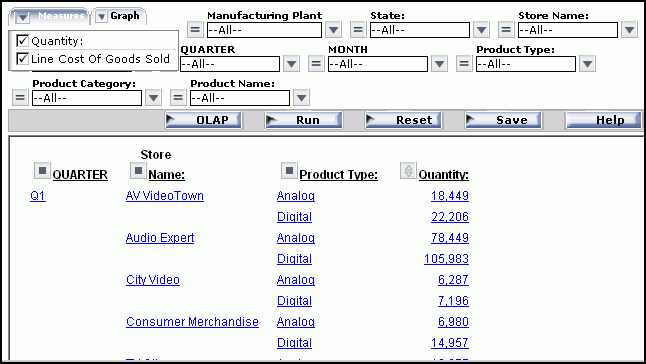
- Run the report
again.
The output now looks as it originally did.
x
Procedure: How to Display or Hide a Measure from the OLAP Control Panel
-
Open
the OLAP Control Panel.
-
In the
Measures pane, click the check box next to a measure to display or
hide it.
The check box toggles through three positions:
-
Unchecked: To
hide a measure, deselect its check box.
-
Checked: To
expose a hidden measure, select its check box.
-
Graph: You
can use the same check box to display a column of data visualization
bar graphs for numeric measures. This setting is represented as
a graph symbol in the check box. For details, see Visualizing Trends.
-
Click Run to
execute your report.
xAdding and Removing Dimensions
Since all of the values in a dimensions hierarchy are
available in an OLAP report, you can add dimensions to the OLAP
report at any time, without returning to the original report request.
You can add dimensions from an OLAP report and from the OLAP Control
Pane.
x
Procedure: How to Add a Dimension Element from the OLAP Control Panel
-
Open
the OLAP Control Panel.
-
Select
a report layout pane (Drill Down or Drill Across) to indicate how you
want the new sort dimension to be used in the report.
-
Expand
a dimension in the Dimensions pane at the top of the window, then
click the dimension element you want to add to the designated layout
pane. The new dimension is added to the bottom of the list.
-
If you
wish to change the position of the new sort field, click the up arrow
to reposition it.
-
Click Run to
execute your report with the new settings.
Example: Adding a Dimension Element from the OLAP Control Panel
- Run REP2.
Initially,
the report is sorted by quarter, store, and Product Type, as shown
in the following image.
You
want to sort by month within each quarter.
- Click the square
icon next to QUARTER to open the OLAP Control Panel.
- In the OLAP Control Panel:
- Expand the Time
Period dimension and click MONTH.
It is added to the bottom of the Drill Down list.
- Click the Shift
Up arrow twice to move MONTH below QUARTER, as shown
in the following image.
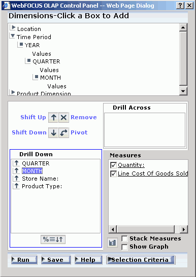
- Click Run at
the bottom of the OLAP Control Panel.
The report is now sorted
by quarter, month, store, and Product Type, as shown in the following
image.

x
Procedure: How to Delete a Dimension Element From the Report
Right-click
the dimension column you wish to remove and choose Delete from
the menu.
The report runs automatically.
Example: Deleting a Dimension Element From the Report
- Run OLAPREP2.
Initially,
the report is sorted by quarter, store, and Product Type. You wish
to remove Product Type as a sort category.
- Right-click
the Product Type column and choose Delete from
the menu, as shown in the following image.

Note: The options available may
vary, depending on your OLAP format settings. For more information,
see Setting OLAP Reporting Options.
The report runs automatically.
The new report is sorted by quarter and store, as shown in the following
image.
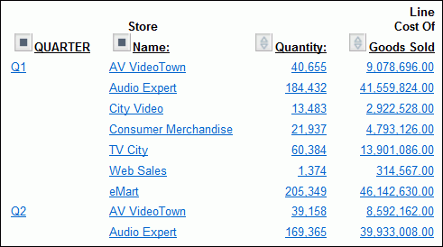
x
Procedure: How to Delete a Dimension Element from the OLAP Control Panel
-
Select
the element in the Drill Down or Drill Across pane. The buttons
above the pane become active.
-
Click Remove
.
The element is deleted from the Drill Down or Drill Across pane.
-
Click Run to
see the new report.
Example: Deleting a Dimension Element from the OLAP Control Panel
The
following is an example of deleting a dimension element from the
OLAP Control Panel.
- Run OLAPREP2.
Initially,
the report is sorted by quarter, store, and Product Type. You wish
to remove Product Type as a sort category.
- Click the square
icon next to QUARTER to open the OLAP Control Panel.
- Select Product
Type in the Drill Down pane, as shown in the following
image.
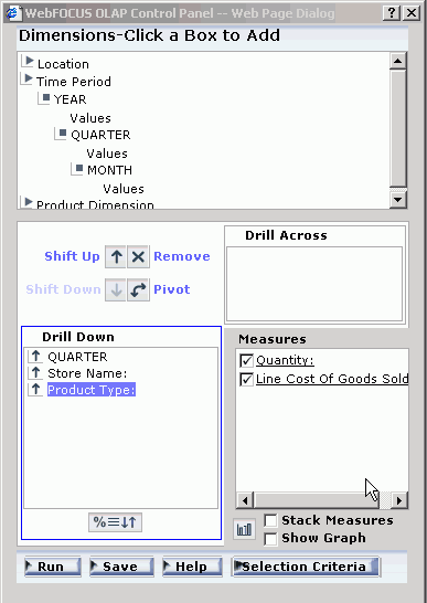
- Click the Remove
button.
- Click Run at
the bottom of the OLAP Control Panel.
The new report is sorted
by quarter and store, as shown in the following image.
x
The following are related to saving OLAP reports:
- Administrators,
users, and developers can save their reports in Excel, PDF, or
active report format.
- Field name
referencing is uniform throughout the OLAP product. For example,
the AS or TITLE phrases will appear in reports generated using the
OLAP Selections panel or the OLAP Control Panel (OCP).
- When saving
OLAP reports to Managed Reporting, you must refresh the Domain to see
the newly saved reports. Otherwise, the new reports will not be
listed in the Managed Reporting tree.
x
Uniform Field Name Referencing in OLAP
The manner in which a developer designs a report with
regard to field referencing carries through to both the OCP and
the OLAP Selections panel. Field referencing does not differ between
the report and the OCP and OLAP Selections panel. Field references by
AS, TITLE, or field name, are uniform in the report output and OLAP controls.
xSaving and Displaying OLAP Reports and Graphs in Other Formats
OLAP reports and graphs appear in your browser in HTML format.
You can display the report and corresponding graph in PDF, Excel,
and active report formats, and in folders within Managed Reporting.
The following save and/or display options
are available:
In Managed Reporting:
- A user can
save the HTML output in the private content folder.
- A developer can save the HTML output in
the Others folder, where it can be distributed to users as published
content.
x
Procedure: How to Display an OLAP Report and Graph in PDF Format
-
Open
the OLAP Control Panel.
-
Click Save at
the bottom of the window.
-
Select Display
as a PDF Report.
The graph appears in the browser above the report, while
a second browser opens and launches the report output in Adobe Acrobat,
as shown in the following image.

Tip: If
you wish, you can save and print the PDF report from Adobe Acrobat.
x
Procedure: How to Save an OLAP Report and Graph as an Excel File
-
Open
the OLAP Control Panel.
-
Click Save at
the bottom of the panel.
-
Select Save
the data in an Excel file or Save the data
in an Excel 2000 file.
-
Follow
the instructions to export the data.
x
Procedure: How to Display an OLAP Report and Graph as an HTML Active Technologies Report
-
Open
the OLAP Control Panel.
-
Click Save at
the bottom of the panel.
-
Select Display
as Active Report (Offline Analysis).
-
The report
and graph appear in a separate window as an HTML active report.
x
Saving OLAP Reports and Graphs in the Private Content Folder
In Managed Reporting, you can save an OLAP report and
graph in your private content folder.
- Open the OLAP
Control Panel.
- Click Save at
the bottom of the panel.
- Select Save as private content.
A secondary window opens.
- Enter a descriptive name and click Ok to
save the graph and the tabular report. If the domain of the OLAP
report is restricted not to allow the creation of private content,
select a domain from the Save in drop-down
menu in the Save dialog box. If there are no domains listed, contact
your Managed Reporting Administrator to obtain authorization to
save private content to a domain.
Note: There is no limit to the
number of characters in the label legend of a graph, but long labels
may appear truncated.
xTroubleshooting OLAP Reports
This topic describes common problems that you might
encounter when working with OLAP-enabled reports.
The report is not OLAP enabled. Ensure that Run
with OLAP is selected in the Properties window for the
report
The OLAP Control Panel does not display dimensions. Ensure
that the metadata for the report uses the WITHIN attribute to create
one or more hierarchical dimensions.
You cannot drill-down or roll up a dimension. Ensure that
the metadata for the report uses the WITHIN attribute to create
one or more hierarchical dimensions.
You cannot include additional measures in the report. You
cannot use the OLAP Control Panel to include measures that are not
included in the original report request.
Tip:
- You can specify
NOPRINT in the report procedure to make measures available but not
visible in the original report. Deselect the Visible check box
on the General tab of the Field Properties dialog pane accessible
from the Properties menu in Report Painter, thereby including the
measure as a NOPRINT field in the report procedure. Then, the measure
does not appear when you first run the report, but you can select
to include the measure and run the report again.
- To print all
fields in a report you must specify each field. The PRINT * command (which
prints the entire contents) is not recognized by OLAP.
When you click the OLAP button in a graph, the OLAP Control Panel does not open. OLAP
currently is not implemented for GRAPH requests. Deselect Run
with OLAP in the Report Properties window.
If you use Print *, an error occurs. If you create a procedure
that uses Print *, and you then OLAP enable and run the procedure
(selecting Save output as PDF file from the
OLAP Control Panel), an error is returned. OLAP does not support
Print *. Instead, it prints the entire contents.