In this section: |
|
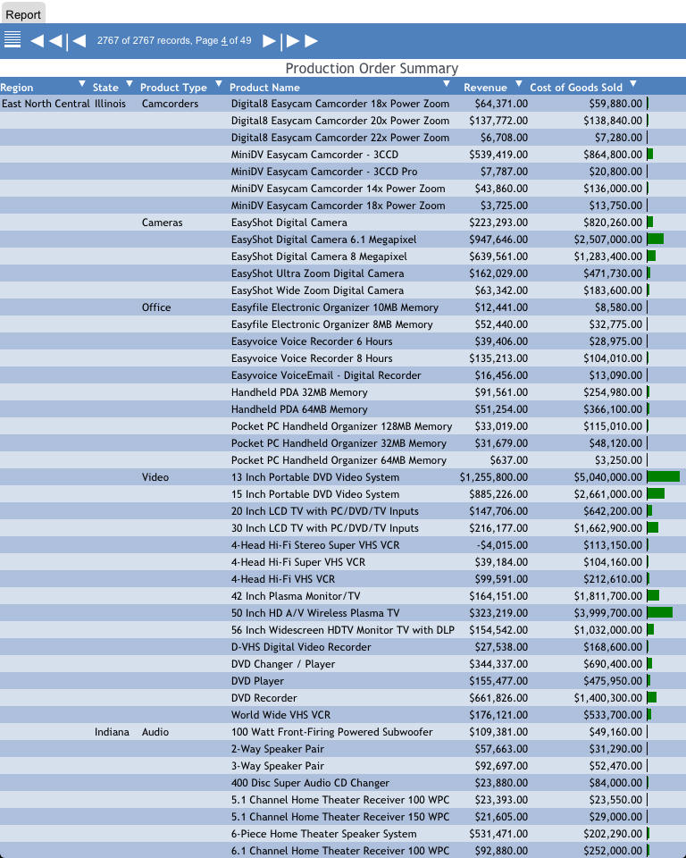
The following image shows a sample active report that is running on an iPad in full-screen web app view.
You can use the icons on the pagination bar of the grid in an active report to:
By tapping the column title of a report, you can access the report column drop-down menu to refine the data in different ways and manipulate the way that you present it.
You can also use the icons on the chart, rollup, or pivot tool bar of an active report to adjust the viewing mode, which can be either full-screen web app view or original active report view.
Tap the Full Screen View
 icon
to display the report in full-screen web app view mode. Full-screen
web app view means that the report is presented as a gesture-enabled
web app with the features and functionalities customized for mobile
and touch-screen devices. This is the default view for the display
of a report on mobile and multi-touch devices.
icon
to display the report in full-screen web app view mode. Full-screen
web app view means that the report is presented as a gesture-enabled
web app with the features and functionalities customized for mobile
and touch-screen devices. This is the default view for the display
of a report on mobile and multi-touch devices.
In full-screen web app view, tap the Original View
![]() icon
to restore the report to its original active report view. Original
active report view means that the report is presented as a regular
active report running inside the browser. All the functionalities
of active reports in the desktop browser are intact in this mode,
except the window display option, which is set to Tabs instead of
Cascade by default to accommodate devices with small screen sizes.
icon
to restore the report to its original active report view. Original
active report view means that the report is presented as a regular
active report running inside the browser. All the functionalities
of active reports in the desktop browser are intact in this mode,
except the window display option, which is set to Tabs instead of
Cascade by default to accommodate devices with small screen sizes.
For easy access, you can add an active report or dashboard to the Home screen of your device. When an active report or dashboard is added to the Home screen, it will create an icon of the report or dashboard. The user can tap the icon to access the active report or dashboard instead of entering its URL in the device browser. When the active report or the dashboard is opened from the Home screen, it will connect to WebFOCUS to retrieve the most up-to-date information. Accessing active reports and dashboards from the icon provides more space to view reports or dashboards on devices with small screen sizes. There will be no browser toolbars to take up screen space.
To add an active report or dashboard to the Home screen on the iPhone and iPad, open an active report or dashboard in the browser and then tap the Action icon at the bottom of the screen. Tap the Add to Home Screen option.
To add an active report or dashboard to the Home screen on Android devices, open an active report or dashboard in the browser and open the menu options. Tap Add shortcut to Home. Depending on your device, you may need to tap Add bookmark first. In this case, go to the Bookmarks list and touch and hold the bookmark you just added to bring up the Add shortcut to Home option.
In full-screen web app view, you can hide the pagination bar and the top and bottom toolbars of the grid and chart. This is done so that there is more space to view the active reports and charts on devices with small screen sizes.
To do this:
Click the Full Screen View icon to display the report in full-screen web app view, if it is not already in that view.
In the grid cell data area or in a chart, double tap to hide the pagination bar and the top and bottom toolbars.
In the grid cell data area or in a chart, double tap to show the pagination bar and the top and bottom toolbars.
To navigate between the pages of an active report:
How to: |
The following image shows a sample report column drop-down menu for a numeric data column in full-screen web app view.
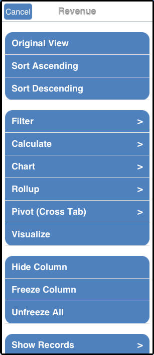
The menu option Visualize is available only for numeric data. The menu options Show Columns and Show All are available only when there are hidden columns in the report. The menu options Freeze Column and Unfreeze All are available only in full-screen web app view.
You can sort data in any column of an active report in ascending or descending order.
Tap Sort Ascending to sort the data in ascending order.
Tap Sort Descending to sort the data in descending order.
In this section: |
On a run-time active report, locate and tap the title of the column that you wish to filter. From the report column drop-down menu, tap Filter or touch the right arrow for the Filter menu option. The Filter menu is displayed, specifying the default filter condition and default values for the selected column in the existing report.
The following image shows a sample Filter menu. In this example, the default condition is Equals and the default value is Alabama. Alabama is the first value in the existing report for the selected column.
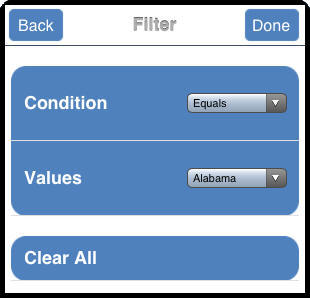
The menu retains any previous filters that were applied to this column of the report.
You can:
The following image shows a sample Filter tab for an active report (grid).
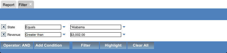
The Filter tab shows all the filters that are applied to the report.
An individual filter applies only to the specific report from which the filter was created or to which the filter was added. You can scroll up and down the list to view all the individual filters.
From the Filter tab, you can do the following.
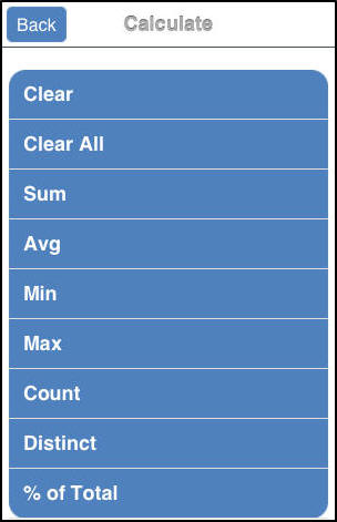
From the report column drop-down menu, tap Calculate or touch the right arrow for the Calculate menu option to display a menu from which you can apply a calculation to the selected column.
The following image shows the Calculate menu for a numeric data column. The calculations that are available on the menu depend on the data type of the selected column: numeric, alphanumeric, or date.
You can do the following:
In this section: |
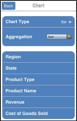
When you run an active report on an iPad, you can tap Chart or touch the right arrow for the Chart menu option to display a menu that specifies the default value for the type of chart that will be displayed and the default aggregation (calculation) that will be used to draw the chart. Also listed are the columns that are available for display on the X-axis of the chart (the Group By columns).
The following image shows a sample Chart menu. In this example, the default chart type is Bar and the default aggregation is Sum, for the selected numeric data column. Columns that can be displayed on the X-axis (Group By columns) are listed on the menu.
You can access the same menu from the Advanced Chart icon at the bottom of the screen if you are already in a chart in full-screen web app view. This menu and icon apply to the WebFOCUS HTML5 chart engine (ARGRAPHENGINE=JSCHART). The ARGRAPHENGINE setting specifies the chart engine used for rendering charts in Active Technologies. For more information on the ARGRAPHENGINE syntax and settings for the chart engine, see Switching the Chart Engine.
Tap a Group By column for the X-axis to automatically generate a chart that is the result of the default values and the selected X-axis column. The chart is displayed in tab view, with a new Chart tab appended after the Report tab and any other existing tabs.
The chart is generated in full-screen web app view by default, if you are in that view.
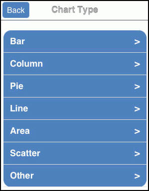
Alternatively, you can tap the Chart Type menu to change the chart type or tap the Aggregation drop-down menu to change the calculation type, before selecting the Group By column to generate the new chart.
Tapping the Chart Type menu displays the Chart Type options, as shown in the following image.
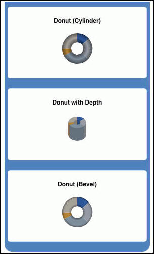
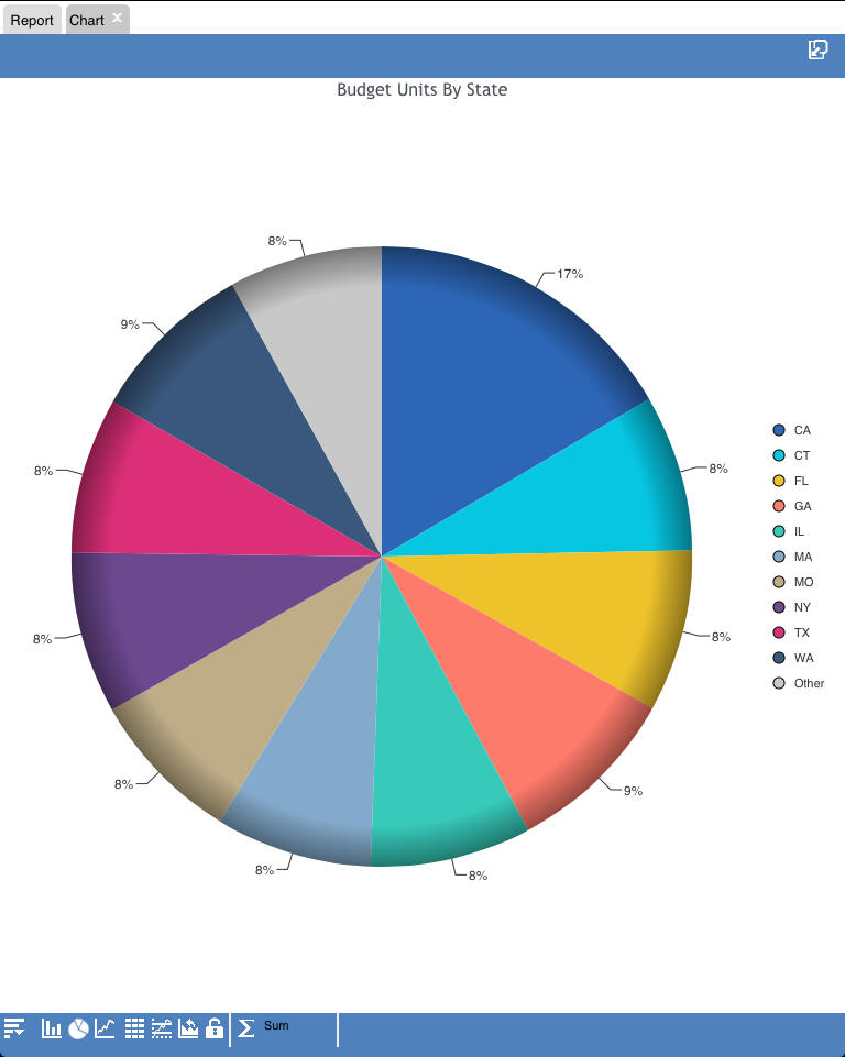
You can now tap a category, such as Pie, and then tap the Donut chart type that will be used to display the chart. The following image shows some of the charts in the Pie category.
If you are using the WebFOCUS Mobile Faves for iOS app, it may take a moment for the chart types in a chart category to be displayed. There is no JavaScript engine that renders JavaScript faster inside the iOS app, and JavaScript cannot take advantage of features such as hardware acceleration.
On the new Chart tab, you can change the values to customize the chart for your reporting needs. You can also manipulate the way that you present the data.
The following image shows a sample Chart tab.
Beneath the chart is the active chart or rollup tool bar, which contains the icons described in the following table.
|
Icon |
Name |
Description |
|---|---|---|
|
|
Menu |
Displays the active chart or rollup menu. For details, see Using the Active Technologies Chart Menu. |
|
|
Column |
Changes the chart type to column. |
|
|
Pie |
Changes the chart type to pie. |
|
|
Line |
Changes the chart type to line. |
|
|
Scatter |
Changes the chart type to scatter. Scatter charts are available for numeric columns. |
|
|
Rollup |
Displays the chart as a rollup table. |
|
|
Advanced Chart |
Opens the chart tool to change the chart type. Applies when ARGRAPHENGINE=JSCHART. |
|
|
Original Chart |
Restores the current chart type to the initial chart type that was displayed. |
|
|
Lock/Unlock |
Freezes the chart or rollup table. You can link or unlink a chart or rollup table to the filters that you have applied in your report using the Freeze Chart or Freeze Rollup icon. The icon indicates whether the report is linked to the filter (Freeze Chart or Freeze Rollup) or not (Unfreeze Chart or Unfreeze Rollup). |
|
|
Aggregation |
Changes the aggregation method. |
The active chart menu and its submenus allow you to change the columns used in the chart or rollup table or select multiple columns from those available in the report, including hidden and NOPRINT columns.
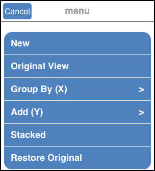
The following image shows the active chart menu.
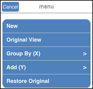
You can:
For a bar chart, tap Stacked to create a stacked AHTML bar chart.
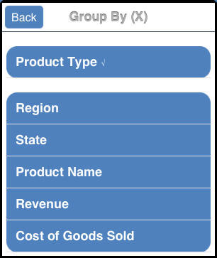
The following image shows a sample Group By (X) submenu. The column Product Type is used as the X-axis in the existing chart.
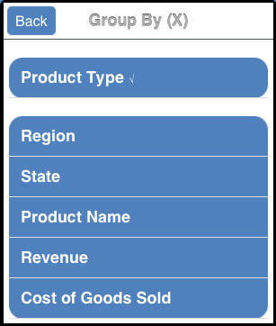
Tap once to select an additional column, or tap again to deselect the column. Once you select or deselect a column, the Chart tab displays the modified chart, reflecting all the changes.
The following image shows a sample Add (Y) submenu. The column Cost of Goods Sold is used as the Y-axis in the existing chart.
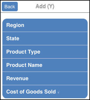
Tap once to select an additional column, or tap again to deselect the column. Once you select or deselect a column, the Chart tab displays the modified chart, reflecting all the changes.
In this section: |
Tap Rollup or touch the right arrow for the Rollup menu option to display a menu that specifies the default aggregation (calculation) that will be used to generate the rollup table. Also listed are the Group By columns that are available for display in the rollup table.
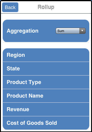
The following image shows a sample Rollup menu. In this example, the default aggregation is Sum for a numeric data column. The available Group By columns are listed on the menu.
Tap a Group By column to automatically generate a rollup table that is the result of the default aggregation value and the selected column. You must select at least one Group By column. After you select a column, the rollup table is displayed in tab view, with a new Rollup tab appended after the Report tab and any other existing tabs.
The rollup table is generated in full-screen web app view by default, if you are in that view.
You can also tap the Aggregation drop-down menu to change the calculation type before selecting the Group By field to generate the new rollup.
On the new Rollup tab, you can change the values to customize the rollup table for your reporting needs, making it more complex as required for analysis. You can also manipulate the way that you present the data.
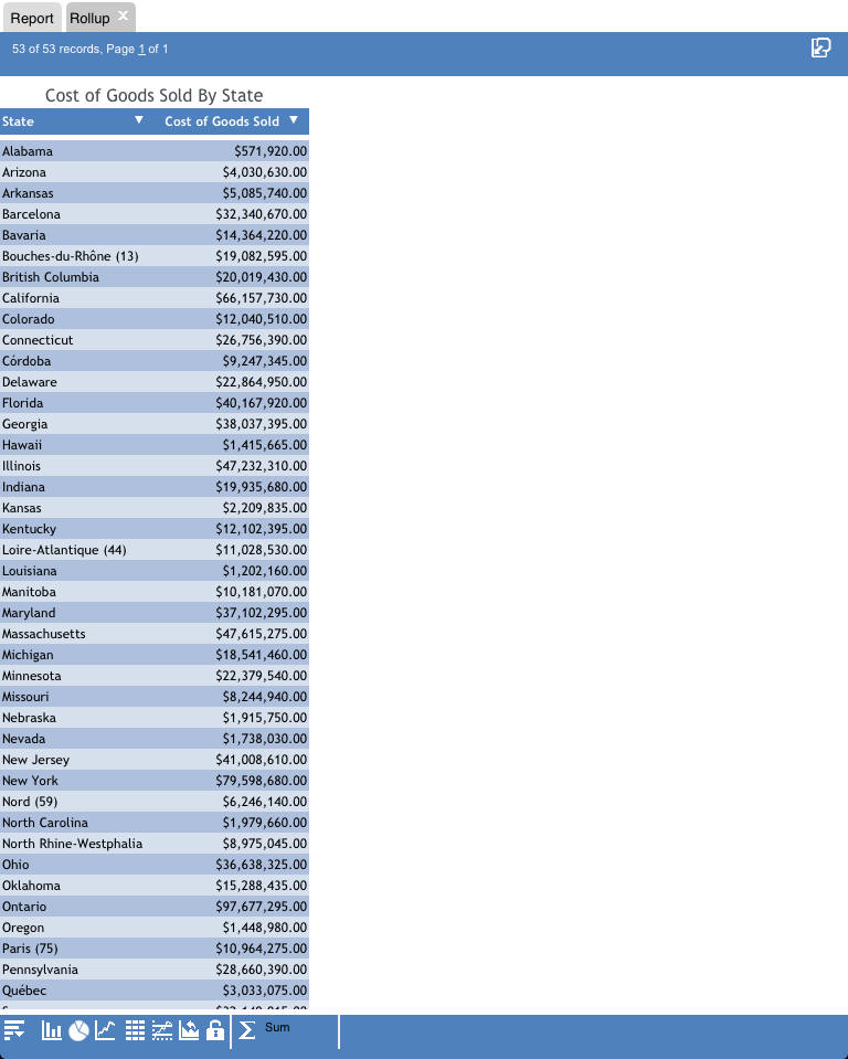
The following image shows a sample Rollup tab.
Beneath the rollup table is the chart or rollup tool bar, which contains the icons described in the following table.
|
Icon |
Name |
Description |
|---|---|---|
|
|
Menu |
Displays the active chart or rollup menu. For details, see Using the Rollup Menu. |
|
|
Column |
Changes the report to a column chart. |
|
|
Pie |
Changes the report to a pie chart. |
|
|
Line |
Changes the report to a line chart. |
|
|
Scatter |
Changes the chart type to scatter. Scatter charts are available for numeric columns. |
|
|
Rollup |
Displays the chart as a rollup table. |
|
|
Advanced Chart |
Opens the chart tool to change the chart type. Applies when ARGRAPHENGINE=JSCHART. |
|
|
Original Chart |
Restores the current chart type to the initial chart type that was displayed. |
|
|
Lock/Unlock |
Freezes the chart or rollup table. You can link or unlink a chart or rollup table to the filters that you have applied in your report using the Freeze Chart or Freeze Rollup icon. The icon indicates whether the report is linked to the filter (Freeze Chart or Freeze Rollup) or not (Unfreeze Chart or Unfreeze Rollup). |
|
|
Aggregation |
Changes the aggregation method. |
The rollup menu and its submenus allow you to select multiple columns from those available in the report, including hidden and NOPRINT columns.
The following image shows the rollup menu.

To access the Rollup menu, tap the menu  icon
with a rollup table open.
icon
with a rollup table open.
You can:
The following image shows a sample Group By (X) submenu. The column Product Type is the Group By column for the existing rollup table.
Tap once to select an additional column, or tap again to deselect the column. Once you select or deselect a column, the Rollup tab displays the modified rollup table, reflecting all the changes.
The following image shows a sample Add (Y) submenu. The column Cost of Goods Sold is the Y-axis column for the existing report.
Tap once to select an additional column, or tap again to deselect the column. Once you select or deselect a column, the Rollup tab displays the modified rollup table, reflecting all the changes.
In this section: |
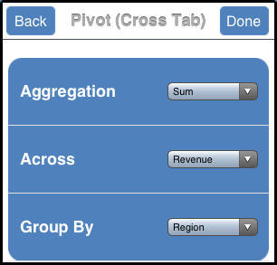
Tap Pivot (Cross Tab) or touch the right arrow for the Pivot (Cross Tab) menu option to display a menu that specifies default values for the aggregation (calculation) that will be used to generate the pivot table, the column that will be displayed across the pivot table, and the Group By column that will be used to generate the table.
The following image shows a sample Pivot (Cross Tab) menu. In this example, the default aggregation is Sum for a numeric column, the default across column is Revenue, and the default Group By column is Region. A pivot table requires at least one across column and one Group By column. The first value for the column in the report is displayed by default.
Tap Done once to see the result of the default values. The pivot table is automatically generated in tab view, and a new Pivot tab is appended after the Report tab and any other existing tabs.
The pivot table is generated in full-screen web app view by default, if you are already in that view.
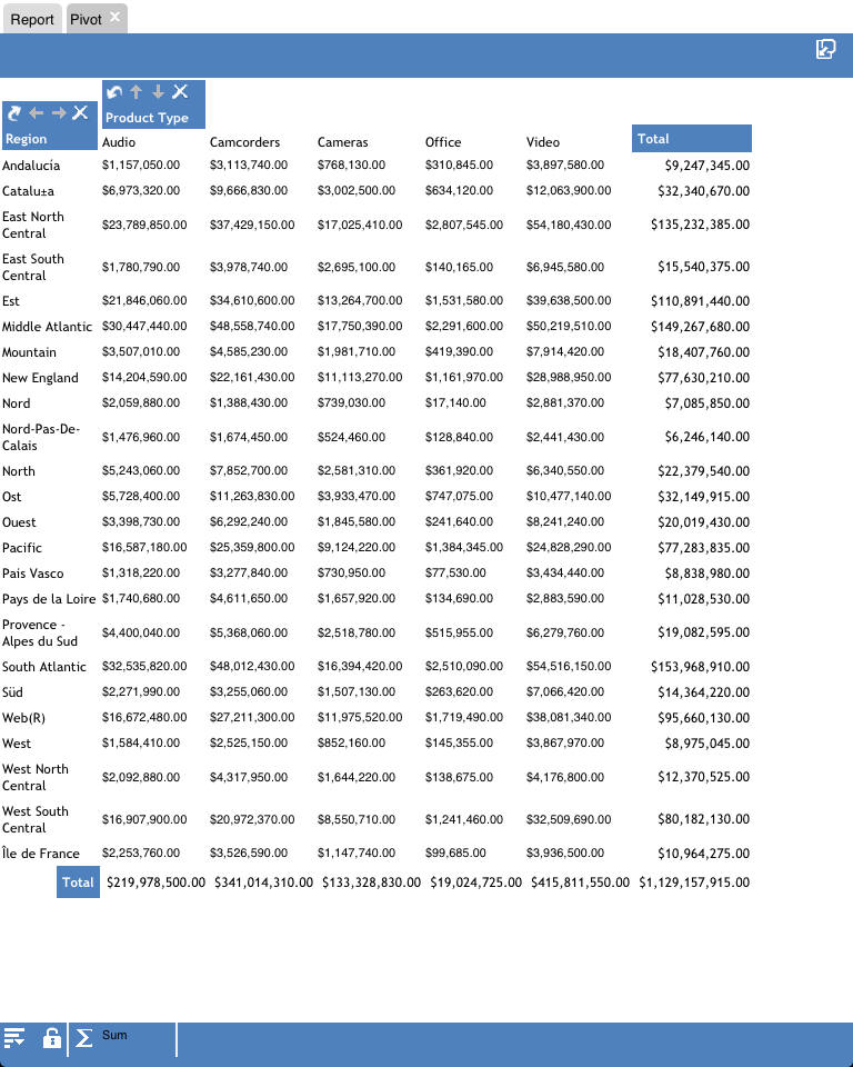
On the new Pivot tab, you can change the default values to customize the pivot table for your reporting needs, making it more complex as required for analysis.
The following image shows a sample Pivot tab.
Beneath the pivot table is the active pivot tool bar, which contains the icons described in the following table.
|
Icon |
Description |
|---|---|
|
|
Displays the active pivot menu. For details, see Using the Pivot Menu. |
|
|
Freezes the pivot table. You can link or unlink a pivot table to the filters that you have applied in your report using the Freeze Pivot icon. The icon indicates whether the report is linked to the filter (Freeze Pivot) or not (Unfreeze Pivot). |
|
|
Changes the aggregation method. |
The pivot menu and its submenus allow you to select multiple columns from those available in the report, including hidden and NOPRINT columns.
The following image shows the pivot menu.
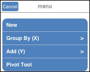
You can:
The following image shows a sample Group By (X) submenu. The Product Type column is used for the Across column and the Region column is used for the Group By column in the existing pivot table.
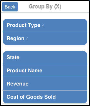
Tap once to select an additional column, or tap again to deselect the column. Once you select or deselect a column, the Pivot tab displays the modified pivot table, reflecting all the changes.
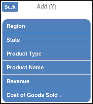
The following image shows a sample Add (Y) submenu. The column Cost of Goods Sold is the measure field for the existing report.
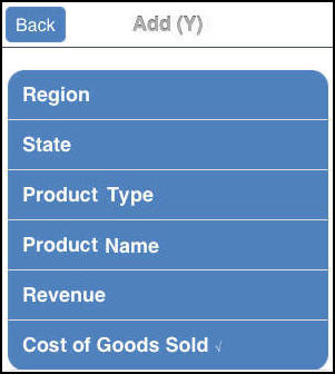
Tap once to select a column, or tap again to deselect the column. Once you select or deselect a column, the Pivot tab displays the modified pivot table, reflecting all the changes.
Tap Visualize to add or remove visualization bars to the selected column. The Visualize option is available for numeric data columns.
Tap Hide Column to suppress the display of the selected column in the report.
Tap Show All to restore all the hidden columns to the report.
Tap Show Columns to list the names of the columns that are hidden in the report, allowing you to individually restore a column.
Tap the name of a specific column in the hidden columns list to restore that column to the report.
The Show All and Show Columns options are available only when there are hidden columns in the report.
Tap Freeze Column to freeze the selected column and all the columns to the left of it. You cannot scroll left or right within the frozen part of the report, but you can scroll up and down within the frozen part. You can scroll in any direction in the unfrozen part of the report.
Tap Unfreeze All to unfreeze all the frozen columns in the report.
In full-screen Web app view, the column titles and report headings will stay fixed as you scroll through the report when the Freeze Column option is turned on.
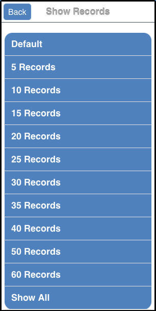
Tap Show Records or touch the right arrow for the Show Records menu option to list the groups of records available for display per page in the report. On the Show Records menu, you can:
Tap Restore Original to restore the active report to its default state specified in the WebFOCUS report procedure.
The following menu options are not supported by Active Technologies for mobile web apps.
Note: Active cell menu options are not supported (for example, Highlight Value, Highlight Row, Unhighlight All, and Filter Cell).
| WebFOCUS |


