InfoAssist Chart Enhancements
The following new features apply to InfoAssist charts.
x
The HTML5 output format allows you to render a chart
in the browser using a built-in JavaScript engine. This output format
is only available for charts. Charts with this output format utilize
the latest capabilities of the HTML5 web standard, including animation, high-quality
vector output, and attractive alpha-channel and gradient effects.
The HTML5 JavaScript engine creates charts and dashboards that are
automatically Mobile-ready. The HTML5 button is shown in the following
image.

x
Bar, Line, and Area chart types can have multiple axis
charts, such as dual-axis charts and multi-y charts, meaning that
you can compare one X-axis value with up to five Y-axis measures.
InfoAssist allows you to assign each individual series to the Y1
axis and Y2 axis for dual-axis charts. For more information, see How
to Use Axis Assignment in Multiple-Axis Charts in the WebFOCUS
InfoAssist User’s Manual.
x
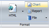
You can use the File menu to create an image file from
a chart. When you select the File menu or if you choose Select
a location and format from the File drop-down menu,
you will be able to name the file and select the output type. The
available output types are PNG, GIF, SVG, and JPEG. Once you select
the File menu, the output type selection is disabled. If you do
not wish to disable the File menu, click the File menu again.
Note: In order to create the image file, you
will need to execute the procedure.
When you select Chart from the Format group, the File menu is
available from either the Format group under the Home tab or the
Destination group under the Format tab, as shown in the following
image.
x
There are additional output formats available in InfoAssist
that are only available for charts. These output formats include
PNG, GIF, JPEG, SVG, and PDF/GIF. These output types do not appear
by default. You can enable them by opening the WebFOCUS Administration
console and selecting Utilities and then InfoAssist
Properties. For more information, see Using the Format
Tab in the WebFOCUS InfoAssist User’s Manual.
xReversing the Order of a Series
When All Series is selected in the Select group, the
Reverse Order button allows you to reverse the order of the entire
series of your chart. The Display group, under the Series tab, provides
access to the Reverse Order button and is available for all chart types.
The Reverse Order button is shown in the following image.

xAdvanced Chart Dialog Boxes
Multiple advanced dialog boxes have been added to customize
and style charts. These dialog boxes can be found under the Legend,
Grid Line, Axes, Gauge, Frame and Background, Data Labels, and Series
options. To access the dialog boxes, either select the drop-down
arrow from the Ribbon and select More Options,
or right-click the option in the Results panel and select More Options.
xCustom Chart Size and AutoFit
The AutoFit button allows you to make chart size dynamic.
This means that other applications can override the size of the
chart when the chart is embedded. The AutoFit button, in the Size
and Arrange group, is only available for charts. For more information,
see How to Resize a Component in the WebFOCUS InfoAssist
User’s Manual.
xAdditional HTML5 Chart Types (Candidate for Release)
HTML5 is the new web standard for constructing and viewing
interactive content on the web and is supported by all the major
browsers. WebFOCUS Release 8.0 Version 02 introduces the following
Candidate for Release HTML5 chart types:
- Mekko
- Tag Cloud
- Parabox
- Streamgraph
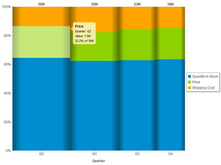
A Mekko chart is a variant of a stacked bar chart that adjusts
the width of each stack relative to its total value for the entire
data set. These graphs are very popular in the management consultancy
industry.
When to use: Use a Mekko chart when you want to show the
relative width (contribution) of each category at the same time
you examine the percentage breakdown within the category.
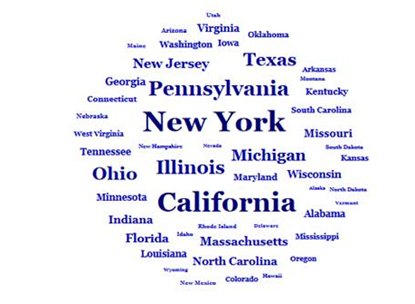
When to use: Use a Tag Cloud to display the relative prominence
of terms.
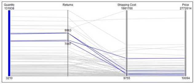
A Parabox, or parallel coordinates graph, is a common way of
visualizing high-dimensional geometry and analyzing multivariate
data. WebFOCUS Parabox graphs are single-dimension and multi-measure
graphs. They are highly interactive with each vertex becoming an
interactive slider enabling ad hoc filtering. As elements are filtered,
the non-selected lines are automatically grayed-out, indicating
that they are no longer in the active data set.
When to use: Use a Parabox when you wish to show many
dimensions, limited only by horizontal space.
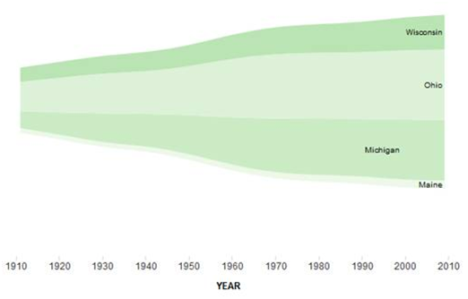
A Streamgraph is a form of stacked area chart that is particularly
useful for visualizing data with a fluid timescale format.
When to use: Use a Streamgraph when you wish to show the
relative magnitude over time of multiple entities.
xAdvanced Graph Assistant Functionality Not Available in InfoAssist
The following topics list all properties, features,
and functionality available in Advanced Graph Assistant, but not
implemented in InfoAssist Charting mode for WebFOCUS 8. Based on
our experience, many of them are seldom used in customer environments.
Chart-based Properties
- 3D Chart
- Zoom factor (global
scaling factor for zooming in and out in a 3D chart)
- Panning 3D chart
in horizontal and vertical directions
- Custom styling of
individual walls in a 3D chart
- Riser width
- Riser group spacing
- Dual-axis chart
- Dual-Axis line display
- Dual-Axis split position
- Styling of the frame
separator: line width, style, and color
- Error-bar chart
- Error-bar type
- Error-bar width percentage
- Pareto chart
- Data sort type
- Connect Pareto bars
- Styling of Pareto
line and marker
- Pie chart
- Pies per row (number
of pies to draw in a single row)
- Pie ring size
- Pie rotate
- Pie bar series
- Pie other features:
other percentage, other slice, and so on
- Box-plot chart
- Box-plot type
(with whiskers or without)
- Whisker width percentage
- Extra box-plot points
- Funnel chart
- Stock chart
- Styling of stock
volume riser
- Close split display
- Close and open tick
display
- Waterfall chart
- Display waterfall
line
- Show last group total
- Stack color mode
- Setting positive and negative colors
- General
- Styling of the frame
border: color and shadow
- Styling of the side and bottom frames
- Riser width
- Beveled risers
- Extend to frame edge
- Styling of stack connect line
- Align multi-Y bars
Legend
- Beveled legend display
- Legend markers per row (specifies number of legend markers to
draw in a single row)
- Legend text styling
for strikethrough
- Extra legend markers
and text
Ordinal Axis
- Border color
on nested ordinal label
- Ordinal label styling
for underline
- Skipping options
for ordinal label (skip begin and skip count)
- Step count on ordinal
major grid
- Major tick styling: line width, tick length, and perpendicular
ticks
- Minor tick styling:
line width, tick length, and perpendicular ticks
- Reference line text
styling
- Off scale display
for numeric axis (X axis)
Secondary Ordinal Axis (3D Charts)
- Skipping options
for labels (skip begin and skip count)
- Text rotation and
text wrap of O2Title
- Display and style
of grid lines
Numeric Axis (Y Axis)
- Off scale display
- Front zero line display
- Skipping options
for y-axis label
- Text rotation for y-axis title
- Step count on y-axis
major grid
- Y-axis major tick
styling: tick length and perpendicular ticks
- Y-axis minor tick
styling: tick length and perpendicular ticks
- Custom setting of minor grid step
- Quadrant lines
- Reference line text
styling
Secondary Numeric Axis (Y2 Axis)
Series
- Line width and stroke
style for all and individual series
- Series looping
- Beveled risers
- Marker size
- Data line width (line
charts with 3D effect)
- Trendline styling:
line color, style, and width
- Styling of trendline equation: color, position, and text styling
- Absolute series
- Connect line step
- Cube data text line
display
- Data text rotation
- Formatting gauge
needle
Other Reference Objects
- Reference line XY
- Reference rectangle
- Reference markers
Annotations
- Styling of annotation
text: color, font name, size, style, text justification, and rotation
- Styling of annotation box: border, color, shadows
Miscellaneous/Advanced
- Text antialiasing
- Exact color by height
- Series are rows
- Adjust scale for
reference lines
- Styling of all text
- Styling of all lines