App Studio is the new WebFOCUS
desktop product. The features that are described in this chapter
highlight specific functions that are only available in App Studio.
xAdding an Image From a BLOB Field to a PDF, DHTML, or HTML Report
As of Release 8.0 Version 09, using the Object Inspector
in the Report canvas, you can add images stored within a data source
BLOB data type (Microsoft SQL Server, DB2, Oracle, Informix, and
PostgreSQL, using its BYTEA data type) to a PDF, HTML, and DHTML
formatted report. Images of different formats (GIF, JPEG, PNG) can
be mixed within the same BLOB field. WebFOCUS can determine the
image format from the header of the image.
The image can be inserted in report columns, headings, footings,
subheadings, and subfootings. You can drag or double-click the BLOB
field to add it to your report. The Style Sheet syntax required
for the BLOB field will be automatically generated and the image stored
in the BLOB field will display in the report.
The Images tab displays the image stored in the BLOB field, allowing
you to change the image size or select additional options.
x
As of Release 8.0 Version 09, while in the HTML canvas,
you can access the Save display value property, from the Properties
panel, to save the display values of a report to a save selection
file.
You can choose:
-
<Not Set>. You
have not set the Save display values property.
-
Yes. Display
values will be saved to a save selection file.
-
No. Display
values will not be saved to a save selection file. This is the default
functionality.
Note: Saving the display values of a report will increase
the size of the save selection file.
x
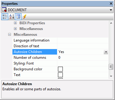
Autosize Children is an option you can access from the
Properties panel, in the Miscellaneous section, in the HTML canvas.
Autosize Children changes the size of any component added to the
canvas to fit the maximum size of your available screen space. For
example, one component will take up one hundred percent of the available
space, while two components will take up fifty percent each. This
option is used so that when your HTML page is run on different devices,
components and controls do not appear off the screen and have to
be scrolled to in order to use them. Depending on the available
space, components may move to accommodate this. If a report and
chart are side by side when run on a computer, they may appear stacked
on top of each other when run on a tablet.
Note: When Autosize Children is turned on, the components
you add to the canvas will be positioned and ordered differently,
depending on the available space. When your HTML page is run at
full screen, using the Autosize Children option, that HTML page will
appear differently on 24-inch monitor than a 26-inch monitor.
The Autosize Children option is turned off, by default. The following
image is an example of the Autosize Children option turned on.
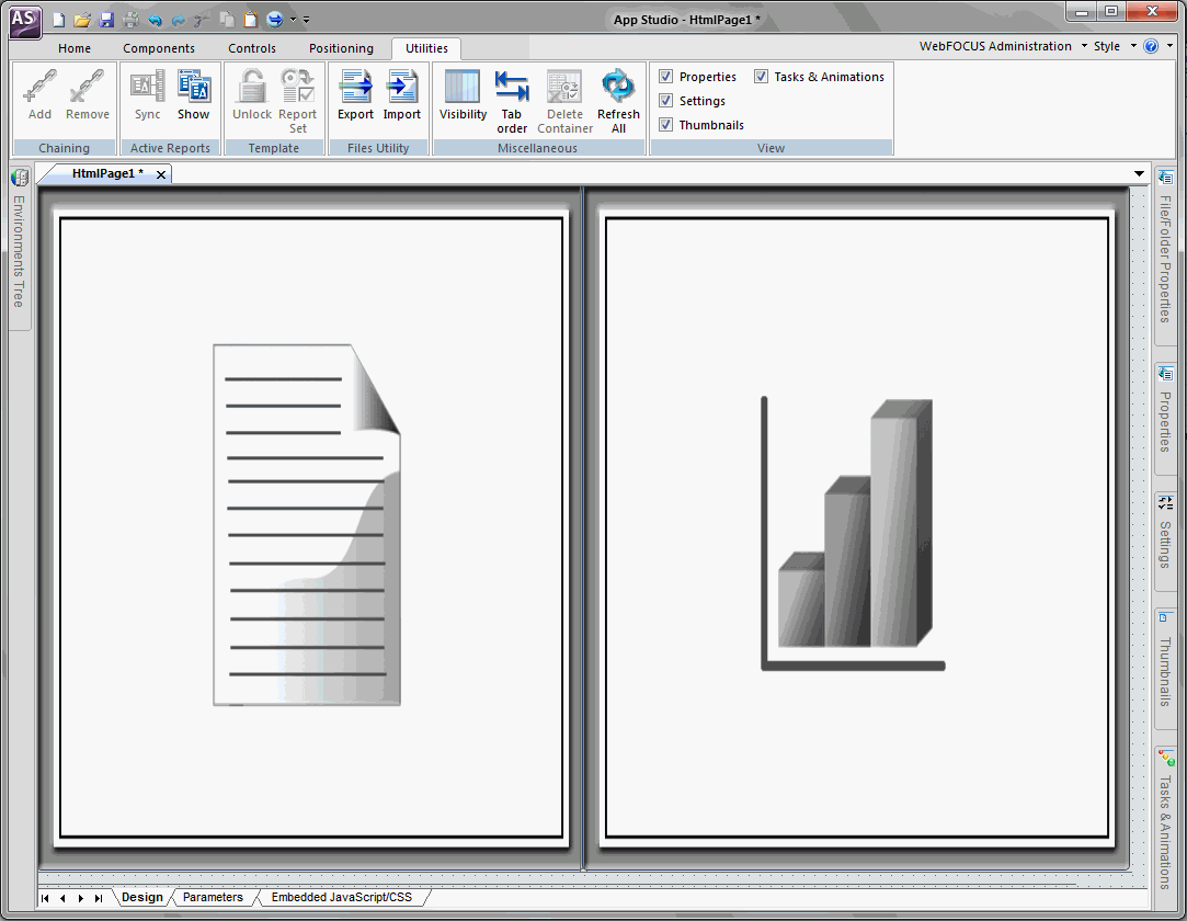
The following image shows a report component and a chart component
on the HTML canvas while Autosize Children is enabled. Both components
share the available space evenly.
Autosize Children is available for any container object, such
as a form, tab, window, accordion, panel, or group box. With multi-page
containers, such as a tab container, Autosize Children is available
for each page, so that each page can have this option on or off,
independent of the rest.
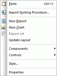
While Autosize Children is turned on for a container object,
there is a small amount of canvas space shown to the bottom and
right of the canvas or object. This is so you can use the canvas
shortcut options. This extra canvas space is not shown at run time.
The following image shows the canvas shortcut options when you right-click
on the canvas.
Each component or control you add to the canvas has a Core attribute
named Autosize options. Autosize options contains four selections
that are used to set how you want that object to be handled in the
HTML page. The following image shows the Autosize options property
and selections.
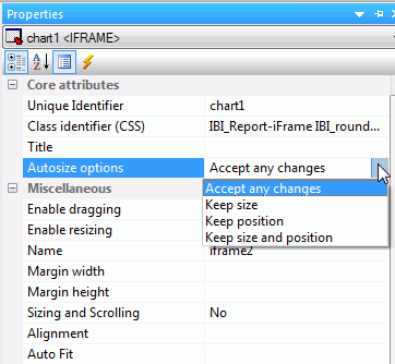
The four selections you can choose are:
-
Accept any changes
-
The object can change in size and position when the HTML
page adjusts to fill the available space.
-
Keep size
-
The object can change in position, but not in size, when
the HTML page adjusts to fill the available space.
-
Keep position
-
The object can change in size, but not in position, when
the HTML page adjusts to fill the available space.
-
Keep size and position
-
The object cannot change in size or position when the HTML
page adjusts to fill the available space.
Which objects are rendered first when a page is run depends on
which option is set from the Autosize options property. The rendering
order is shown below.
- Objects with Keep
size and position set.
- Objects with Keep
position set.
- Objects with Keep
size set.
- Objects with Accept
any changes set.
You can move objects around the canvas at design time. However,
objects with the Autosize options property set to Accept any changes,
need to be moved by holding down the Alt key and dragging to the
desired position. Once you are done moving objects around the canvas,
right-click the canvas and select Update Layout to
refresh the canvas and view the new layout positioning.
Note:
- Whether Autosize
Children is on or not, the Autosize options property is available
for any object.
- If you place an object
that has Autosize Children set to No inside a container that has
Autosize Children set to Yes and the Autosize options property set
to Accept any changes, the object will move to the upper-left corner
of the container.
- When a container
has Autosize Children set to Yes, and a report or chart is added to
that container, the Autosize options property for the report or
chart is set to Accept any changes.
- If an object has
the Autosize options property set to Keep size and position, and you
would like that object to take up the entire width of available
space, you must set the width property to 100%.
- On mobile devices,
Autosize Children will recalculate whenever the orientation of the
device changes from portrait to landscape or landscape to portrait.
- Reports and charts
do not automatically re-execute once the page loads and the screen
size changes. You will need to re-execute reports and charts to
display them properly. If the output format of a chart is HTML5,
the chart content will refresh automatically and you will not have
to re-execute.
xMobile Design for HTML Pages
Mobile Design is an option you can access from the Properties
panel, in the HTML canvas. You can also enable this option from
the HTML/Document wizard.
You can create HTML pages that are formatted specifically to
be used on a mobile phone. When an HTML page is formatted for a
mobile phone, components and controls are presented differently
so that they can be used in conjunction with touch-screen technology.
When an HTML page is converted and used on a mobile phone, it
will have one home page and multiple output pages depending on how
many components you have. You can set which page you want as your
home screen by using the HTML canvas shortcut menu on that particular
page and clicking Use current page as home page.
When viewed on a mobile phone, each frame of output becomes its
own screen. For example, if you have a report and chart on a mobile-enabled
HTML page, these will both be on their own separate screen when
viewed on a mobile phone. The more output frames you have, the more
screens your HTML page will have on a mobile phone. The order of
these outputs, when used on a mobile phone, is determined by the
way they are ordered in the Tasks section of the Tasks & Animations
panel.
All single-select controls become drop-down boxes, when viewed
on a mobile phone. All multi-select controls become list boxes,
when viewed on a mobile phone. This allows users the ability to
select options using a touch-screen. Textbox controls, map controls,
tree controls, slider controls, and calendar controls do not change
when converted to mobile layout.
If you are using multiple frames in your HTML page, when you
enable mobile layout, these forms will be consolidated to one form.
While in the HTML canvas, you can preview how your HTML page
will look on a mobile phone. To do this, ensure that the Enable
mobile property is set to Yes in the Properties panel, and then
click Show Mobile Layout using the HTML canvas shortcut
menu. To return to the desktop view, use the HTML canvas shortcut
menu and click Back to desktop.
You must save your HTML page in order to run the page in mobile layout.
x
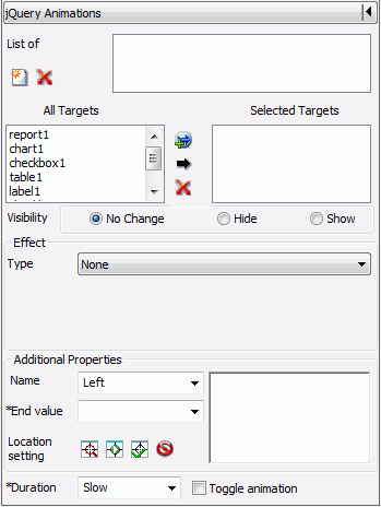
jQuery Animations is a section in the Tasks & Animations
panel that you can access in the HTML canvas. The Animations section,
in the Tasks & Animations panel, allows you to execute jQuery
animations on your HTML page. The animation effects in the Animations
section can be used individually or in conjunction with each other
to create more complex animations. The Animations section is shown
in the following image.
-
List of
-
A list of all animations present in the HTML page. This list
will change when animations are added or deleted.
-
New
-
Adds a new animation to the HTML page. The newly added animation appears
in the List of area.
-
Delete
-
Removes an animation from the HTML page. The deleted animation
is removed from the List of area.
-
All Targets
-
A list of all possible targets that can be used in the current
animation being defined.
-
Selected Targets
-
A list of all targets that will be used in the current animation.
-
Add canvas selection
-
Adds the currently selected object on the canvas to the Selected
Targets list. Multiple objects can be selected and added at the
same time.
-
Add from list
-
Adds a selected object from the All Targets list to the Selected
Targets list. Multiple objects can be selected and added at the
same time.
-
Remove
-
Removes an object from the Select Targets list when that
object is selected. Multiple objects can be selected and removed
at the same time.
-
Visibility
-
You can select whether or not to animate the target so that
it is hidden or displayed. You can also select not to animate the
target for visibility. The options are No Change, Hide, and Show.
-
Effect
-
The Effect group contains animation effects and the options
you can use to customize those animations. Animation effects can
make the target bounce, shake, pulsate, and much more. You can also
customize the options associated with that animation effect. The
options correlate to the effect used. Such options can be how many
times the target bounces after you specify that you want the bounce effect.
-
-
Type
-
A drop-down list where you can select the animation effect
you want to use.
-
Option
-
You can select which option value you would like to edit,
if available. For example, selecting the Bounce animation type allows
you to select Distance and Times in the Option drop-down list. When
you select Distance or Times, you can then edit the value of either
of those options in the Value area. If you select Times and then
enter 3 into the Value area, your object will bounce 3 times. The
options available are different depending on the effect type you
choose.
-
Value
-
You can enter a number that pertains to the currently selected
option and that affects the animation. For example, if you select
the Slide type and the Distance option, the number
you enter in the Value area will be the distance the object will
slide when it is animated. The value options available are different
depending on the effect type you choose.
-
Effect text area
-
As the options for the effect are set, the syntax for that
effect are displayed here. You can manually adjust this syntax to
affect the animation.
-
Additional Properties
-
The Additional Properties group contains animations that
change the location and size of the target and the components of
that target (text size, text width, border size).
-
-
Name
-
A drop-down list where you can select different properties
that can be animated. Such properties include height, opacity, font
size, and others.
-
End value
-
The value for the property you choose from the Name field.
For example, if you chose Left and enter 10, the object you are
animating would move 10 pixels to the left. The reason you do not
need to specify a start value is because the currently location of
the object is the start value.
-
Location setting
-
You can animate the target so that the location and size
of that target is changed once the animation is activated.
-
-
Use location of selected target
-
This will use the location of the currently selected target.
Coordinates, height, and width of the object are entered automatically
into the Location setting box. This is used when the developer plans
to move the selected target object and the animation will move it
back.
-
Start location’s setting
-
Inserts an adjustable placeholder object into the canvas,
at the location of the selected target. You can move and resize
this placeholder object. This object represents where the animation
will move and what size it will be when the animation is complete.
-
Set locations’ settings
-
Sets the adjustable object location and size. This will
be where the animated object moves and what size it will be. It
is the ending location of the selected target.
-
Cancel setting
-
Cancels the setting of the location for the animation.
-
Additional Properties text area
-
Once the location has been determined using the Location
setting commands, the syntax for that location is displayed here.
You can manually adjust this syntax to affect the animation.
-
Duration
-
How quickly the animation will execute. You can choose either
Slow or Fast.
-
Toggle animation
-
Allows you to revert to the pre-animation state. For example,
if the target moves from right to left, the next invocation of the
trigger will move the target back to the original position at the
right.
x
Smart Context is a feature you can use in the Report
canvas. The Report canvas uses smart context functionality to determine
the column type a field should be, given the metadata of the field
and/or the position of the field on the canvas.
If smart context is on, and the metadata indicates that a field
should be a measure or dimension, when you add that field to the
canvas, it will automatically be added as an aggregate or sort down
field type, respectively.
If smart context is on, but the metadata does not indicate whether
a field is a measure or dimension, then alphanumeric fields and
date fields are added as BY fields, while numeric fields are added
as SUM fields.
If smart context is off, all fields are added as DETAIL fields.
x
In App Studio, wizards assist you in streamlining the
creation of content. A series of panes provide you with options
relevant to the type of content that you want to create. They are
accessed from the Home tab and from the Environments Tree panel shortcut
menus, when you are creating content.
x
The Report Wizard allows you to create a new report
procedure or SQL report procedure, and open an existing report.
To open the Report Wizard:
- On the Home tab,
in the Content group, click Report.
- In the Environments
Tree panel, right-click an application folder, point to New,
and click Report.
Note: If you choose
to create a new report using the shortcut menu in the Environments
Tree panel, you will skip the first screen of the Report Wizard.
You will not have to specify whether you are creating a report or
SQL report. You will instead be brought to the Select a Data Source
screen, with the location for your report already selected.
The Report Wizard opens, as shown in the following image.
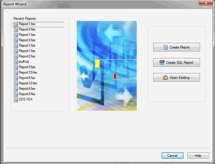
From the Report Wizard, you can open a recent procedure, search
for an existing procedure, create a new report or SQL report procedure,
and access documentation resources.
x
The HTML/Document wizard allows you to create a new
HTML Page, Guided Report Page, Document, and Active Dashboard, and
open a recent procedure.
To open the HTML/Document wizard:
- On the Home tab,
in the Content group, click HTML/Document.
- In the Application
Menu, click New, and from the New dialog
box, select either HtmlPage or Document and
then click OK.
- In the Environments
Tree panel, right-click an application folder, point to New,
and click HTML/Document.
The HTML/Document wizard opens, as shown in the following image.
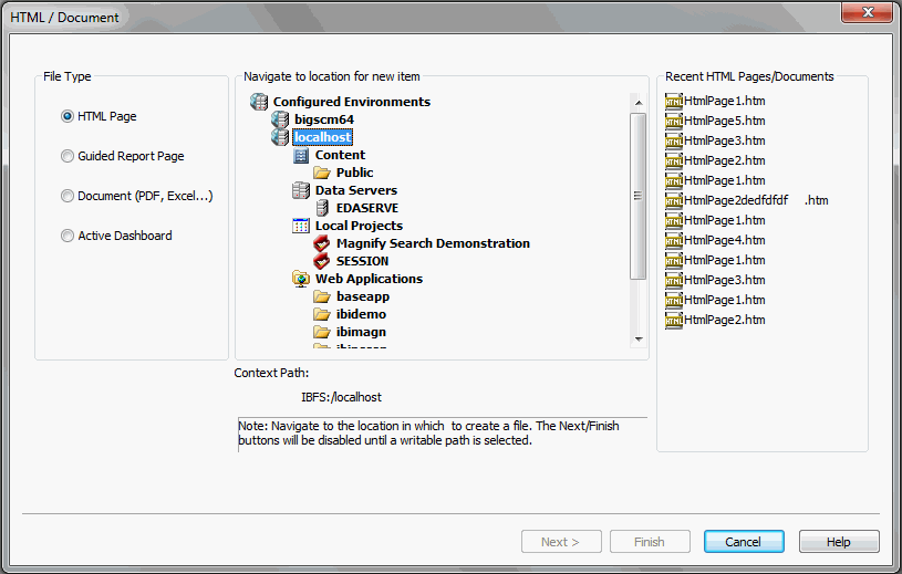
From the HTML/Document wizard, you can open a recent procedure
or create a new one.
x
The Chart Wizard allows you to create a new chart procedure
or SQL chart procedure, and open an existing report.
To open the Chart Wizard:
- On the Home tab,
in the Content group, click Chart.
- In the Environments
Tree panel, right-click an application folder, point to New,
and click Chart.
Note: If you choose
to create a new chart using the shortcut menu in the Environments
Tree panel, you will skip the first screen of the Chart Wizard.
You will not have to specify whether you are creating a chart or
SQL chart. You will instead be brought to the Select a Data Source
screen, with the location for your chart already selected.
The Chart Wizard opens, as shown in the following image.
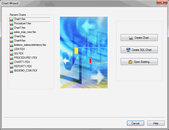
From the Chart Wizard, you can open a recent procedure, search
for an existing procedure, create a new chart or SQL chart procedure,
and access documentation resources.
x
Data Source Definition Wizard
The Data Source Definition Wizard allows you to open
recently used Master Files, create a new Master File, or edit an
existing Master File.
To open the Data Source Definition Wizard, on the Home tab, in
the Content group, click Data,
and then click Synonym via Metadata Canvas.
The Data Source Definition Wizard opens, as shown in the following
image.
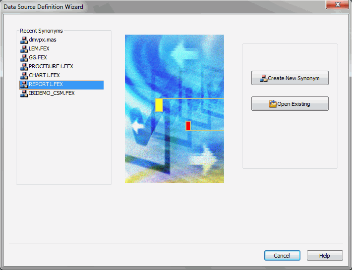
From the Data Source Definition Wizard, you can open a recent
Master File, create a new Master File, or open and edit an existing
Master File.
xDouble-Head Slider Control
A double-head slider control is a new control you can
access from the HTML canvas. A double-head slider control is a type
of slider control in which you can select a range of values for
displaying data in a report or chart. Rather than having one slider
head, you have two. In order to use a double-head slider control,
you must have two variables in the report or chart that will be
controlled by the double-head slider control. One variable will be
controlled by one head of the double-head slider control and the
other variable will be controlled by the other head of the double-head
slider control. The variables need to be specified in the procedure
as FROM and TO.
Note: You can use the Report canvas to create a parameter
that accepts a range of values using the Expression Builder dialog
box. The Chart canvas requires you to manually create a parameter
that accepts a range of values.
x
The JavaScript canvas is a new facility for creating JavaScript
functions. You can access the JavaScript canvas from the New dialog
box. The JavaScript canvas allows you to create JavaScript code.
Here you can create your own API code to be used later. To access the
JavaScript canvas, click the Application button,
and then click New. In the New dialog box,
select JavaScript File, and click OK.
xCascading Style Sheet Canvas
The Cascading Style Sheet canvas is a new facility for creating
cascading style sheets. You can access the Cascading Style Sheet
canvas from the New dialog box. The Cascading Style Sheet canvas
allows you to create a cascading style sheet. The Cascading Style
Sheet canvas uses the Microsoft IntelliSense® feature to assist
in the creation of code segments. To access the Cascading Style
Sheet canvas, click the Application button,
and then click New. In the New dialog box,
select Cascading Style Sheet, and click OK.
Note: Browser specific extensions, not provided by Intellisense,
may be typed into the Cascading Style Sheet canvas. However, some
vendor prefixes may be harmful and should be thoroughly researched
before being used. For more information on vendor prefixes, see: