Chart Type Notes and Sample Charts
This section shows simple WebFOCUS requests that create
different chart types. Subsequent chapters describe the JSON methods
and properties available for each type of chart.
x
Line charts are useful for emphasizing the movement
or trend of numeric data over time, since they allow a viewer to
trace the evolution of a particular point by working backwards or
interpolating. Highs and lows, rapid or slow movement, or a tendency toward
stability are all types of trends that are well suited to a line
chart.
Line charts can also be plotted with two or more scales to suggest
a comparison of the same value, or set of values, in different time
periods. The number of scales your chart has depends on the type
of chart you select.
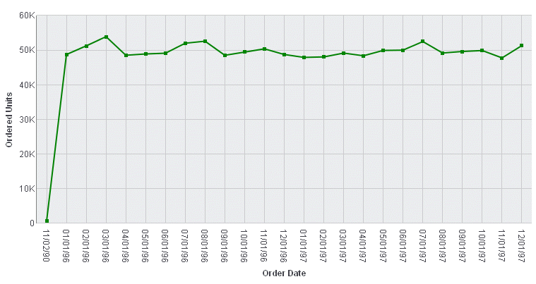
Example: Sample Line Chart
The following request against the GGORDER
data source creates a line chart (ON GRAPH SET LOOKGRAPH LINE).
The y-axis represents quantity sold (QUANTITY), and the x-axis represents
the order date. The JSON block of the style section sets the series
color to green:
GRAPH FILE GGORDER
SUM QUANTITY
ACROSS ORDER_DATE
ON GRAPH PCHOLD FORMAT JSCHART
ON GRAPH SET LOOKGRAPH LINE
ON GRAPH SET STYLE *
*GRAPH_JS
series: [{series:0, color: 'green'}]
*END
INCLUDE=ENIADefault_combine.sty,$
ENDSTYLE
END
Since there is only one
display field in the request, it represents series 0 and it is displayed
in green:
For more information about
setting color properties, see Introduction to JSON Properties for HTML5 Charts.
x
A bar chart plots numeric data by displaying rectangular
blocks against a scale. The length of a bar corresponds to a value
or amount. Viewers can develop a clear mental image of comparisons
among data series by distinguishing the relative heights of the
bars. Use a bar chart to display numeric data when you want to present
comparisons of data.
WebFOCUS supports a variety of bar chart styles. For a list of
bar chart styles available, see Bar Chart Styles and Three-Dimensional Chart Styles.
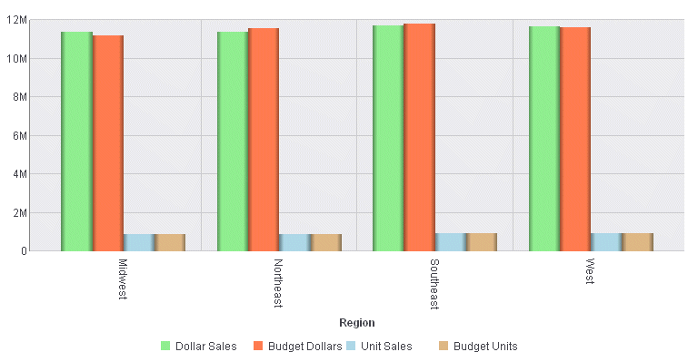
Example: Sample Bar Chart
The following request against the GGSALES
data source creates a vertical bar chart (ON GRAPH SET LOOKGRAPH
VBAR). The JSON block in the style section of the request sets the series
colors:
GRAPH FILE GGSALES
SUM DOLLARS BUDDOLLARS UNITS BUDUNITS
ACROSS REGION
ON GRAPH PCHOLD FORMAT JSCHART
ON GRAPH SET LOOKGRAPH VBAR
ON GRAPH SET STYLE *
*GRAPH_JS
series: [
    {series: 0, color: 'lightgreen'},
    {series: 1, color: 'coral'},
    {series: 2, color: 'lightblue'},
    {series: 3, color: 'burlywood'},
]
*END
INCLUDE=ENIADefault_combine.sty,$
ENDSTYLE
END
The output is:
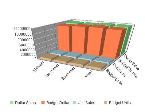
Example: Sample 3D Bar Chart
The following request against the GGSALES
data source creates a 3D bar chart (ON GRAPH SET LOOKGRAPH 3D_BAR).
The JSON block in the style section of the request sets the series
colors:
GRAPH FILE GGSALES
SUM DOLLARS BUDDOLLARS UNITS BUDUNITS
ACROSS REGION
ON GRAPH PCHOLD FORMAT JSCHART
ON GRAPH SET LOOKGRAPH 3D_BAR
ON GRAPH SET STYLE *
*GRAPH_JS
legend: {visible: true},
series: [
    {series: 0, color: 'lightgreen'},
    {series: 1, color: 'coral'},
    {series: 2, color: 'lightblue'},
    {series: 3, color: 'burlywood'},
]
*END
INCLUDE=ENIADefault_combine.sty,$
ENDSTYLE
END
The output is:
x
A pie chart emphasizes where your data fits in relation
to a larger whole. Each slice represents a percentage of the whole.
Keep in mind that pie charts work best when your data falls into
a limited number of groups. Too many groups divide the pie into small
segments that are difficult to see. Use color or texture on individual
segments to create visual contrast.
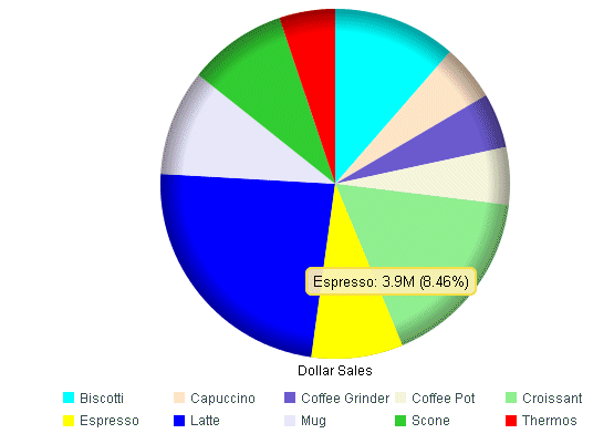
Example: Sample Pie Chart
The following request against the GGSALES
data source creates a pie chart (ON GRAPH SET LOOKGRAPH PIE). Each
slice of the pie shows the percentage of dollar sales contributed by
each product. The JSON block in the style section of the request
sets the slice colors:
GRAPH FILE GGSALES
SUM DOLLARS
ACROSS PRODUCT
ON GRAPH PCHOLD FORMAT JSCHART
ON GRAPH SET LOOKGRAPH PIE
ON GRAPH SET STYLE *
*GRAPH_JS
mouseOverIndicator: {enabled: true,color: ' '},
series: [
   {series: 0, color: 'cyan'},
   {series: 1, color: 'bisque'},
   {series: 2, color: 'slateblue'},
   {series: 3, color: 'beige'},
   {series: 4, color: 'lightgreen'},
   {series: 5, color: 'yellow'},
   {series: 6, color: 'blue'},
   {series: 7, color: 'lavender'},
   {series: 8, color: 'limegreen'},
   {series: 9, color: 'red'}
]
*END
INCLUDE=ENIADefault_combine.sty,$
ENDSTYLE
END
The output shows the default
labels displayed when the mouse hovers over a pie slice:
x
Scatter charts show the relationship between two different
numeric measures. Use a scatter plot to visualize the density of
individual data values around particular points or to demonstrate
patterns in your data.
A scatter chart has a numeric x-axis, or sort field. Scatter
charts and line charts are distinguishable from one another only
by virtue of their x-axis data type. Line charts can appear without
connecting lines (making them look like scatter charts) and scatter
charts can appear with connecting lines (making them look like line
charts).
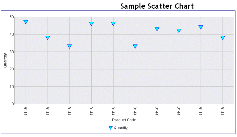
Example: Sample Scatter Chart
The following request against the GGORDER
data source creates a scatter chart (ON GRAPH SET LOOKGRAPH SCATTER).
The HEADING phrase in the request creates a heading for the chart.
The JSON block in the style section of the request sets the chart
border color and the marker shape, border, and color:
GRAPH FILE GGORDER
HEADING CENTER
"Sample Scatter Chart"
PRINT QUANTITY AS 'Quantity'
ACROSS PRODUCT_CODE
WHERE PRODUCT_CODE EQ 'B144'
WHERE QUANTITY LT 51
ON GRAPH PCHOLD FORMAT JSCHART
ON GRAPH SET LOOKGRAPH SCATTER
ON GRAPH SET STYLE *
*GRAPH_JS
border: {color: 'navy’},
series: [
   {series: 0, color: 'cyan', marker: {shape: 'triangle', size: 12,
border: {width: 1, color:'blue'}}}
]
*END
INCLUDE=ENIADefault_combine.sty,$
ENDSTYLE
END
The output is:
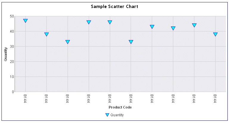
Note
that the heading is positioned on the HTML page outside of the chart
frame. It is also centered on the HTML page. If you want to place
the heading inside of the chart and have it centered on the chart,
add the ON GRAPH SET EMBEDHEADING ON command to your request:
GRAPH FILE GGORDER
HEADING CENTER
"Sample Scatter Chart"
PRINT QUANTITY AS 'Quantity'
ACROSS PRODUCT_CODE
WHERE PRODUCT_CODE EQ 'B144'
WHERE QUANTITY LT 51
ON GRAPH PCHOLD FORMAT JSCHART
ON GRAPH SET EMBEDHEADING ON
ON GRAPH SET STYLE *
*GRAPH_JS
border: {color: 'navy'},
series: [
   {series: 0, color: 'cyan', marker: {shape: 'triangle', size: 12,
border: {width: 1, color:'blue'}}},
   {series: 1, color: 'bisque', marker: {shape: 'square', size: 13,
border: {width: 1, color:'brown'}}},
   {series: 2, color: 'slateblue', marker: {shape: 'circle', size: 14,
border: {width: 1, color:'blue'}}},
   {series: 3, color: 'beige', marker: {shape: 'diamond', size: 15,
border: {width: 1, color:'brown'}}},
   {series: 4, color: 'lightgreen', marker: {shape: 'triangle', size: 16,
border: {width: 1, color:'green'}}}
]
*END
INCLUDE=ENIADefault_combine.sty,$
ENDSTYLE
END
The output is:
x
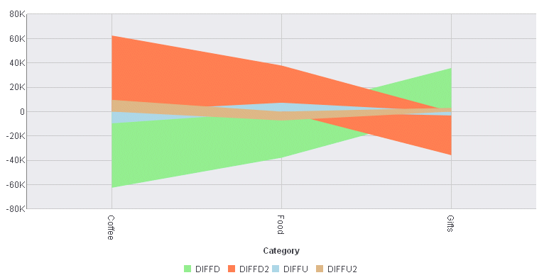
Area charts are similar to line charts, except that
the area between the data line and the zero line (or axis) is usually
colored or textured. Area charts allow you to stack data on top
of each other. Stacking allows you to highlight the relationship
between data series, showing how some data series approach or shadow
a second series.
Example: Sample Area Chart
The following request against the GGSALES
data source creates four virtual fields and then uses them to produce
a vertical area chart (ON GRAPH SET LOOKGRAPH VAREA). The JSON block
in the style section of the request sets the series colors:
DEFINE FILE GGSALES
DIFFD = DOLLARS-BUDDOLLARS;
DIFFU = UNITS-BUDUNITS;
DIFFD2 = BUDDOLLARS-DOLLARS;
DIFFU2 = BUDUNITS-UNITS;
END
GRAPH FILE GGSALES
SUM DIFFD DIFFD2 DIFFU DIFFU2
BY CATEGORY
ON GRAPH PCHOLD FORMAT JSCHART
ON GRAPH SET LOOKGRAPH VAREA
ON GRAPH SET STYLE *
*GRAPH_JS
series: [
    {series: 0, color: 'lightgreen'},
   {series: 1, color: 'coral'},
    {series: 2, color: 'lightblue'},
    {series: 3, color: 'burlywood'},
],
*END
INCLUDE=ENIADefault_combine.sty,$
ENDSTYLE
END
The output is:
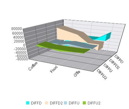
Example: Sample 3D Area Chart
The following request against the GGSALES
data source creates four virtual fields and uses them to produce
a 3D area chart (ON GRAPH SET LOOKGRAPH 3DAREAS). The JSON block
in the style section of the request sets the legend position and
the series colors:
DEFINE FILE GGSALES
DIFFD = DOLLARS-BUDDOLLARS;
DIFFU = UNITS-BUDUNITS;
DIFFD2 = BUDDOLLARS-DOLLARS;
DIFFU2 = BUDUNITS-UNITS;
END
GRAPH FILE GGSALES
SUM DIFFD DIFFD2 DIFFU DIFFU2
BY CATEGORY
ON GRAPH PCHOLD FORMAT JSCHART
ON GRAPH SET LOOKGRAPH 3DAREAS
ON GRAPH SET STYLE *
*GRAPH_JS
legend: {visible: true, position: 'bottom'},
series: [
    {series: 0, color: 'cyan'},
    {series: 1, color: 'bisque'},
    {series: 2, color: 'lightblue'},
]
*END
INCLUDE=ENIADefault_combine.sty,$
ENDSTYLE
END
The output is:
x
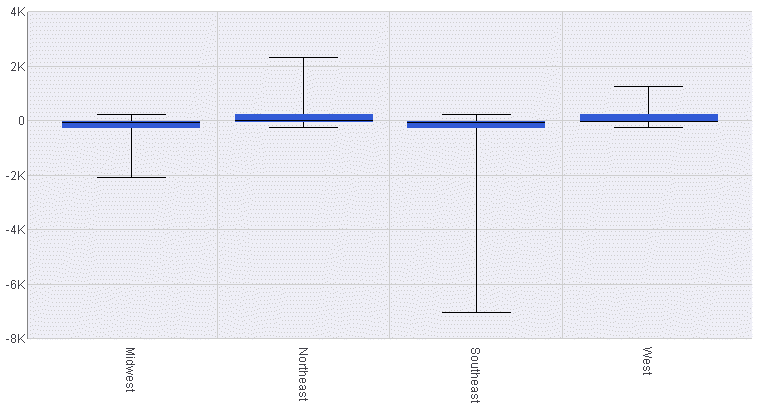
In a boxplot, each series and group requires five values.
For a given series and group box, the first value is the minimum
(lower hat), the second defines the box bottom,
the third value is median line, the fourth value defines the box
top, and the fifth value defines the location of the top hat. Values
must be in ascending order. Box plot fill color and border are defined
by the series color and border.
Example: Sample Boxplot
The following request against the GGSALES
data source calculates the five values needed for a boxplot and
then generates a boxplot (ON GRAPH SET LOOKGRAPH BOXPLOT). The JSON
block in the style section of the request sets the series colors
and border width.
DEFINE FILE GGSALES
DIFF = UNITS-BUDUNITS;
END

GRAPH FILE GGSALES
SUM DOLLARS NOPRINT AND COMPUTE
MIN1 = MIN.DIFF;
HAT1 = MIN1 +200;
MED1 =MDN.DIFF;
HAT2 =DIFF;
MAX2 = MAX.DIFF;

BY REGION
ON GRAPH PCHOLD FORMAT JSCHART
ON GRAPH SET LOOKGRAPH BOXPLOT
ON GRAPH SET STYLE *
*GRAPH_JS
Series: [ {series: 0, color: 'lightblue', border: {width: 1}} ]
*END
INCLUDE=ENIADefault_combine.sty,$
ENDSTYLE
END
The output is:
x
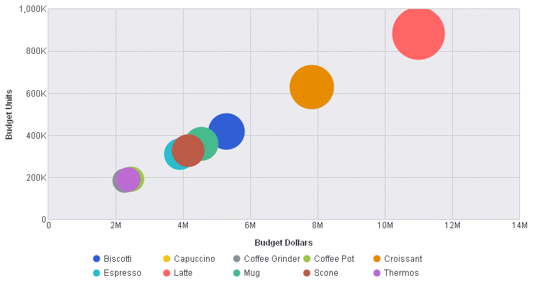
A bubble chart is an enhanced scatter plot in which
the size of each marker is proportional to the value of a third
measure. Therefore, a bubble chart requires three values, (x-position,
y-position, and size) to draw each bubble marker.
A negative size value is treated as positive (that is, it uses
the absolute value of the data). A null, undefined, or zero size
will eliminate the marker. Sizes are proportional according to the
range of size values in the data set. Disparate marker size values
will draw a large marker that exceeds the draw area.
Example: Sample Bubble Chart
The following request against the GGSALES
data source generates a bubble chart (ON GRAPH SET LOOKGRAPH BUBBLE).
The chart uses the included StyleSheet and default settings, so
the style section of the request does not include a JSON block.
GRAPH FILE GGSALES
SUM  BUDDOLLARS BUDUNITS DOLLARS
BY PRODUCT
ON GRAPH PCHOLD FORMAT JSCHART
ON GRAPH SET LOOKGRAPH BUBBLE
ON GRAPH SET STYLE *
INCLUDE=ENIADefault_combine.sty,$
ENDSTYLE
END
On the output, the bubble
size depends on dollar sales, while the axes show the budgeted dollars
and budgeted units:
x
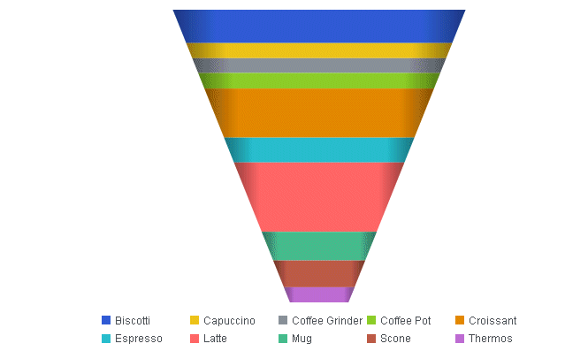
A funnel chart is basically a pie chart that shows
only one group of data at a time. The series in the group are stacked
in the funnel with the first series at the top and the last series
at the bottom. In the funnel chart, the display field functions
as the group, and the sort fields function as the series.
Series-specific properties control the color of funnel segments.
Example: Sample Funnel Chart
The following request against the GGSALES
data source generates a funnel chart (ON GRAPH SET LOOKGRAPH FUNNEL).
The output uses the included StyleSheet file and accepts all other
defaults, so there is no JSON block in the style section:
GRAPH FILE GGSALES
SUM DOLLARS
BY PRODUCT
ON GRAPH PCHOLD FORMAT JSCHART
ON GRAPH SET LOOKGRAPH FUNNEL
ON GRAPH SET STYLE *
INCLUDE=ENIADefault_combine.sty,$
ENDSTYLE
END
The output is:
x
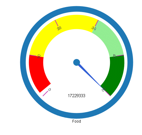
Gauges identify a single value along an axis that is
usually displayed in a circle. They are often used in dashboards
to display progress or quantity.
The numeric y-axis properties control scaling, tick marks, and
colors assigned to segments of the gauge axis.
Example: Sample Gauge Chart
The following request against the GGSALES
data source generates a gauge chart (ON GRAPH SET LOOKGRAPH GAUGE1).
The JSON block in the style section of the request sets the color
bands and line styles using y-axis properties:
GRAPH FILE GGSALES
SUM DOLLARS
BY CATEGORY
WHERE CATEGORY EQ 'Food'
ON GRAPH PCHOLD FORMAT JSCHART
ON GRAPH SET LOOKGRAPH GAUGE1
ON GRAPH SET STYLE *
*GRAPH_JS
yaxis: {
    min: 0,
    max: 50,
    colorBands: [
       {start: 1,stop: 10,color: 'red'},
       {start: 10,stop: 30,color: 'yellow'},
       {start: 30,stop: 40,color: 'lightgreen'},
       {start: 40,stop: 50,color: 'green'},
    ],
    majorGrid: {
       lineStyle: {width: 2,color: 'rgb(196,48,178)'},
    }
}
*END
INCLUDE=ENIADefault_combine.sty,$
ENDSTYLE
END
The output is:
x
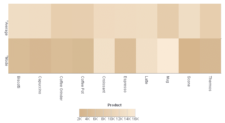
Heatmaps (or spectral charts) contain a row or column
matrix of rectangles that are displayed in different colors depending
on the data values. They use the same kind of data as bar, line,
and area charts (an array of arrays). Each internal array forms
a row in the heatmap table.
Series labels are plotted on the left edge according to settings
in z-axis properties. Group labels are plotted on the bottom edge
according to x-axis properties. The yaxis: {colorScale:color} property
controls the color of the cells in the heatmap table.
Example: Sample Heatmap
The following request against the GGSALES
data source generates a heatmap (ON GRAPH SET LOOKGRAPH SPECTRAL).
The JSON block in the style section of the request sets the color
scale using the y-axis properties.
GRAPH FILE GGSALES
SUM AVE.DOLLARS AS 'Average'
 MDE.DOLLARS AS 'Mode'
BY PRODUCT
ON GRAPH PCHOLD FORMAT JSCHART
ON GRAPH SET LOOKGRAPH SPECTRAL
ON GRAPH SET STYLE *
*GRAPH_JS
yaxis: {colorScale: {colors: ['tan', 'antiquewhite'] }}
*END
INCLUDE=ENIADefault_combine.sty,$
ENDSTYLE
END
The output is:
x
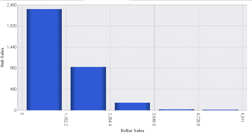
A histogram is a graphical representation that visually
depicts the distribution of data. The sort field for a histogram
is numeric, while for bar chart, it is usually categorical.
In a vertical histogram, the y-axis is on the left side of the
chart and the x-axis is drawn on the bottom of the chart. In a horizontal
histogram, the x-axis is on the left side of the chart and the y-axis
axis is drawn on the bottom of the chart.
Example: Sample Histogram
The following request against the GGSALES
data source generates a vertical histogram (ON GRAPH SET LOOKGRAPH
VHISTOGR). The JSON block in the style section of the request sets
the number of x-axis groups to use and makes the legend not visible.
GRAPH FILE GGSALES
SUM UNITS
BY DOLLARS
ON GRAPH PCHOLD FORMAT JSCHART
ON GRAPH SET LOOKGRAPH VHISTOGR
ON GRAPH SET STYLE *
*GRAPH_JS
histogramProperties: {
   binCount: 5,
},
legend: {visible: false},
*END
INCLUDE=ENIADefault_combine.sty,$
ENDSTYLE
END
The output is:
x
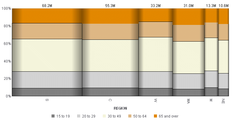
A mekko (also called marimekko) chart is a percent bar
chart, except that the width of each bar riser is based on the overall
value of the stack. You can use any data set that works for a regular
or stacked bar chart.
Example: Sample Mekko Chart
The following request against the GGDEMOG
data source creates a mekko chart (ON GRAPH SET LOOKGRAPH MEKKO).
The virtual field REGION groups the data into a reasonable number
of categories. The JSON block in the style section of the request
sets the series colors and borders:
DEFINE FILE GGDEMOG
REGION/A2 = IF ST EQ 'CT' OR 'MA' OR 'ME' OR 'NH' OR 'RI' OR 'VT' THEN 'NE'
              ELSE IF ST EQ 'NJ' OR 'NY' OR 'PA' THEN 'MA'
              ELSE IF ST EQ 'IA' OR 'ID' OR  'IN' OR 'IL' OR 'OK' OR  'KS'
                                 OR 'OH' OR 'MI' OR 'MN'
                                  OR 'OK' OR 'MO' OR  'MS' OR  'ND' OR 'NE'
                                 OR  'SD' OR  'WI' THEN 'C'
              ELSE IF ST EQ 'AR' OR 'AZ' OR 'CO' OR 'MN' OR  'MT' OR 'ID'
                                 OR 'NM' OR 'WY'
                                 OR 'NV' OR 'UT' OR 'WY' THEN 'M'
              ELSE IF ST EQ 'AL' OR 'DC' OR 'DE' OR 'FL' OR 'GA' OR 'KY'
                                 OR 'LA' OR 'MD' OR 'NC' OR 'SC' OR 'TN'
                                 OR 'TX' OR 'VA' OR 'WV' THEN 'S'
              ELSE IF ST EQ 'CA' OR 'OR' OR 'WA' THEN 'W';
END
GRAPH FILE GGDEMOG
SUM P15TO1998 P20TO2998 P30TO4998 P50TO6498 P65OVR98
BY REGION
ON GRAPH PCHOLD FORMAT JSCHART
ON GRAPH SET LOOKGRAPH MEKKO
ON GRAPH SET STYLE *
*GRAPH_JS
series: [{series: 0, color: 'grey',border: {width: 1, color: 'black'}},
{series: 1, color: 'lightgrey',border: {width: 1, color: 'black'}},
{series: 2, color: 'beige',border: {width: 1, color: 'black'}},
{series: 3, color: 'burlywood',border: {width: 1, color: 'black'}}, ]
*END
INCLUDE=ENIADefault_combine.sty,$
ENDSTYLE
END The output is:
x
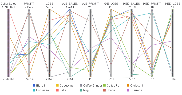
Parallel coordinates is a popular method of visualizing
high-dimensional data using dynamic queries. The parabox chart type
is similar to a regular line chart, except that each group in the
line chart has a unique and interactive numeric axis.
Each colored line represents one series of data. Each vertical
bar represents a numeric axis. You can click first, then you can
drag along each of the axes to select (filter) the lines that pass
through that part of the axis.
FORMAT JSCHART also supports categorical (alphanumeric) vertical
axes. These are drawn with a bubble marker on the vertical axis.
The size of the bubble corresponds to the number of lines passing
through it. Whether an axis is numeric or categorical is defined
by the first series of data. If a value in the first array is a
number, that axis is numeric. If a value in the first array is a
string, that axis is categorical. Categorical axes are sorted automatically,
such that the biggest bubble is on top and bubble size descends
from there.
Example: Sample Parabox Chart
The following request against the GGSALES
data source creates a parabox chart (ON GRAPH PCHOLD FORMAT PARABOX).
The JSON block of the style section makes the legend visible:
DEFINE FILE GGSALES
PROFIT = DOLLARS-BUDDOLLARS;
LOSS = BUDDOLLARS-DOLLARS;
END

GRAPH FILE GGSALES
SUM DOLLARS PROFIT LOSS
AND COMPUTE
AVE_SALES = AVE.DOLLARS;
AVE_PROFIT = AVE.PROFIT;
AVE_LOSS = AVE.LOSS;
MED_SALES = MDN.DOLLARS;
MED_PROFIT = MDN.PROFIT;
MED_LOSS = MDN.LOSS;
BY PRODUCT
ON GRAPH PCHOLD FORMAT JSCHART
ON GRAPH SET LOOKGRAPH PARABOX
ON GRAPH SET STYLE *
*GRAPH_JS
legend: {visible: true}
*END
INCLUDE=ENIADefault_combine.sty,$
ENDSTYLE
END
The output is:
x
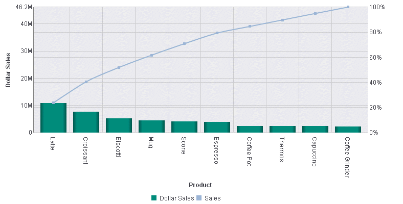
A pareto chart is similar to a combo chart. The first
series (series zero) draws as an absolute bar chart on the y-axis.
The second series (series one, derived using the same field as series
0) draws as a cumulative percent line on the y2-axis. This enables you
to see not only the amount contributed by each group, but also which
groups contribute the highest percentage to the total.
Example: Sample Pareto Chart
The following request against the GGSALES
data source creates a pareto chart (ON GRAPH SET LOOKGRAPH PARETO).
Both the bars and the line are generated from the single display
field, DOLLARS. The JSON block in the style section sets the series
colors and marker shapes and labels:
GRAPH FILE GGSALES
SUM DOLLARS
ACROSS PRODUCT
ON GRAPH PCHOLD FORMAT JSCHART
ON GRAPH SET LOOKGRAPH PARETO
ON GRAPH SET STYLE *
*GRAPH_JS
mouseOverIndicator: {enabled: true,color: ' '},
legend: {visible: true},
blaProperties: {orientation: 'vertical',lineConnection: 'curved'},
series: [
 {series: 0, color:'rgb(0,142,126)', marker: {visible: true}},
 {series: 1, color:'rgb(152,181,211)', marker: {visible: true}, label: 'Sales'},
]
*END
INCLUDE=ENIADefault_combine.sty,$
ENDSTYLE
END
The output is:
x
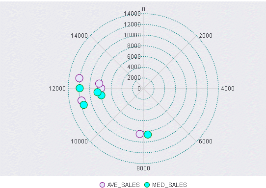
A polar chart is a circular scatter chart. Like scatter
charts, a polar chart requires two values to draw each marker.
Example: Sample Polar Chart
The following request creates a polar
chart (ON GRAPH SET LOOKGRAPH POLAR). The JSON block in the style
section sets the series colors and line styles for the major gridlines of
the y-axis:
GRAPH FILE GGSALES
SUM DOLLARS NOPRINT AND COMPUTE
AVE_SALES = AVE.DOLLARS;
MED_SALES = MDN.DOLLARS;
ACROSS PRODUCT
ON GRAPH PCHOLD FORMAT JSCHART
ON GRAPH SET LOOKGRAPH POLAR
ON GRAPH SET STYLE *
*GRAPH_JS
mouseOverIndicator: {enabled: true,color: ' '},
legend: {visible: true},
yaxis: {
   majorGrid: {
   lineStyle: {width: 1,color: 'teal',dash: '2 2'},
   }
},
series: [
   {series: 0, color: 'lavender', marker:{size: 15, shape: 'circle',
border: {width: 1, color: 'purple'}}},
   {series: 1, color: 'cyan', marker:{size: 15, shape: 'circle', border:
{width: 1, color: 'green'}}},
]
*END
INCLUDE=ENIADefault_combine.sty,$
ENDSTYLE
END
The output is:
x
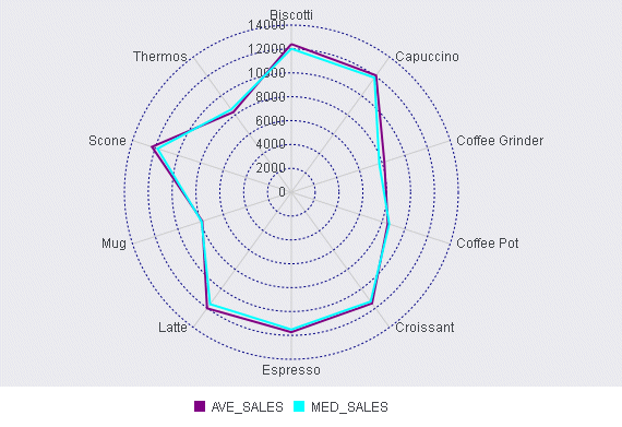
A radar chart is a circular line chart. Radar charts
require one value for each line segment (and marker if shown).
Example: Sample Radar Chart
The following request creates a radar
chart (ON GRAPH SET LOOKGRAPH RADARL). The JSON block in the style
section sets the color and style for the y-axis major grid lines,
and sets the series colors and borders:
GRAPH FILE GGSALES
SUM DOLLARS NOPRINT
AND COMPUTE
AVE_SALES = AVE.DOLLARS;
MED_SALES = MDN.DOLLARS;
ACROSS PRODUCT
ON GRAPH PCHOLD FORMAT JSCHART
ON GRAPH SET LOOKGRAPH RADARL
ON GRAPH SET STYLE *
*GRAPH_JS
legend: {visible: true},
yaxis: {
   majorGrid: {
      lineStyle: {width: 1,color: 'navy',dash: '2 2'},
      }
   },
series: [
   {series: 0, color: 'purple', border: {width: 2}},
   {series: 1, color: 'cyan', border: {width: 2}},
  ]
*END
INCLUDE=ENIADefault_combine.sty,$
ENDSTYLE
END
The output is:
x
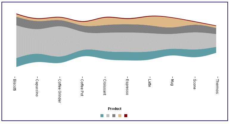
A streamgraph is a simplified version of a stacked area
chart. In a streamgraph, there are no axes or gridlines. The baseline
is free, which makes it easier to perceive the thickness of any
given layer across the data. A streamgraph does not use data text
labels. The data required to draw a streamgraph is the same format
required to draw an area chart. However, streamgraphs are normally
given many series (10 or more), each with many data point points
(100 or more). A typical streamgraph would include 20 series with
400 data points in each series.
Example: Sample Streamgraph
The following request against the GGSALES
data source creates a streamgraph (ON GRAPH SET LOOKGRAPH STREAM).
The JSON block in the style section sets the border and series colors
and widths:
GRAPH FILE GGSALES
SUM AVE.DOLLARS MAX.DOLLARS MDN.DOLLARS MDE.DOLLARS MIN.DOLLARS
BY PRODUCT
ON GRAPH PCHOLD FORMAT JSCHART

ON GRAPH SET LOOKGRAPH STREAM
ON GRAPH SET STYLE *
*GRAPH_JS
border: {width: 2, color: 'navy'},
series: [
{series: 0, color: 'cadetblue',label: ' '},
{series: 1, color: 'silver',label: ' '},
{series: 2, color: 'grey',label: ' '},
{series: 3, color: 'burlywood',label: ' '},
{series: 4, color: 'maroon',label: ' '}
]
*END
ENDSTYLE
END
The output is:
x
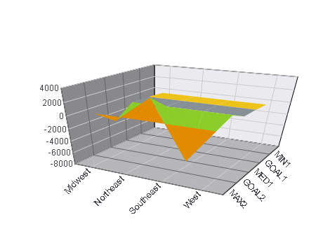
A Surface3D chart shows a three dimensional surface
that connects a set of data points. The colors on the chart represent
similar values, rather than different series.
Example: Sample Surface3D Chart
The following request against the GGSALES
data source creates a Surface3D chart (ON GRAPH SET LOOKGRAPH 3DSURFCE).
The JSON block in the style section hides the legend. For all other
properties, the defaults are used:
DEFINE FILE GGSALES
DIFF = UNITS-BUDUNITS;
END
GRAPH FILE GGSALES
SUM DIFF NOPRINT AND COMPUTE
MIN1 = MIN.DIFF;
GOAL1 = MIN1 +200;
MED1 =MDN.DIFF;
GOAL2 =DIFF;
MAX2 = MAX.DIFF;
BY REGION
ON GRAPH PCHOLD FORMAT JSCHART
ON GRAPH SET LOOKGRAPH 3DSURFCE
ON GRAPH SET STYLE *
*GRAPH_JS
legend: {visible:false}
*END
INCLUDE=ENIADefault_combine.sty,$
ENDSTYLE
END
The output is:
x
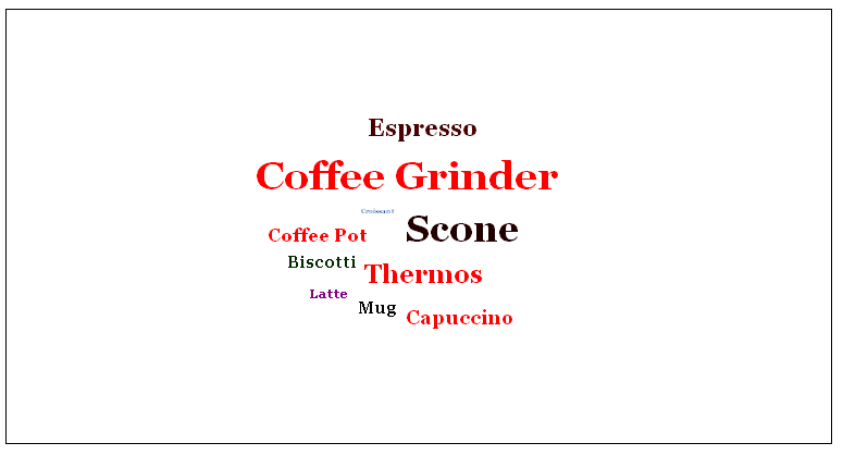
A tagcloud chart is a visual representation of group
labels. The size of each label is proportional to its data value.
Tagclouds are used by social media to measure the frequency of words
in order to quantify sentiments.
The tagcloud chart also supports an optional second series of
data, which is used to drive the color of each label. Colors are
chosen from the yaxis:colorScale property.
Example: Sample Tagcloud
The following request against the GGSALES
data source creates a tagcloud chart (ON GRAPH SET LOOKGRAPH TAGCLOUD).
Each product label is sized depending on how much its dollar sales
exceeded its budgeted sales, and is colored depending on the value
of its unit sales. The JSON block in the style section sets the
y-axis color scale:
DEFINE FILE GGSALES
PROFIT/D12.2= DOLLARS-BUDDOLLARS ;
END
GRAPH FILE GGSALES
SUM PROFIT UNITS
BY PRODUCT
ON GRAPH PCHOLD FORMAT JSCHART
ON GRAPH SET LOOKGRAPH TAGCLOUD
ON GRAPH SET STYLE *
*GRAPH_JS
yaxis: {colorScale: {
colors: ['red', 'black', 'green', 'blue', 'purple']
}
}
*END
ENDSTYLE
END
The output is:
x
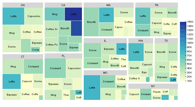
A treemap chart displays hierarchical data as a set
of nested rectangles.
An object can be nested arbitrarily deep. Any properties in the
data object with numeric values are drawn as a single rectangle
in the treemap.
Example: Sample Treemap
The following request references a join
between the GGSALES and GGSTORES data sources to generate a treemap
chart (ON GRAPH SET LOOKGRAPH TREEMAP). The JSON block in the style
section sets the color mode and colors for the treemap:
JOIN STCD IN GGSALES TO STORE_CODE IN GGSTORES AS J1
DEFINE FILE GGSALES
PROFIT/D12.2= DOLLARS-BUDDOLLARS ;
END

GRAPH FILE GGSALES
SUM PROFIT UNITS
BY ST
BY PRODUCT
ON GRAPH PCHOLD FORMAT JSCHART
ON GRAPH SET LOOKGRAPH TREEMAP
ON GRAPH SET STYLE *
*GRAPH_JS
colorMode:'byInterpolation',
colorModecolors: ['teal','cyan', 'beige',  'burlywood', 'yellow', 'cream']
*END
ENDSTYLE
END
The output is:
x
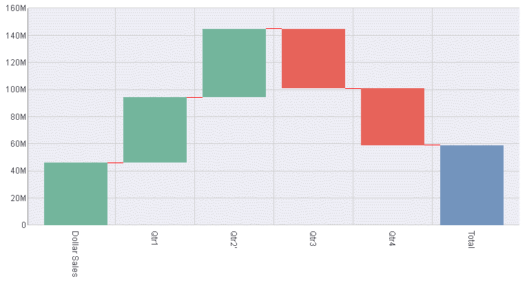
Waterfall charts illustrate the cumulative effect of
sequentially introducing positive or negative values to an initial
value. The initial and final (or total) values are represented by
whole columns drawn from the ordinal (x) axis baseline. Intermediate positive
and negative values are drawn as floating columns.
A waterfall chart does not require a sort phrase.
Example: Sample Waterfall Chart
The
following request against the GGSALES data source creates a waterfall
chart (ON GRAPH SET LOOKGRAPH VWATERFL). The JSON block in the style
section sets the riser colors, generates a riser for the total,
and sets the connector line properties:
DEFINE FILE GGSALES
INCR1 = DOLLARS + 500;
INCR2 = DOLLARS+1000;
DECR1 = -(DOLLARS- 500);
DECR2 = -(DOLLARS-1000);
END
GRAPH FILE GGSALES
SUM DOLLARS
INCR1 AS 'Qtr1'
INCR2 AS Qtr2'
DECR1  AS 'Qtr3'
DECR2 AS 'Qtr4'
ON GRAPH PCHOLD FORMAT JSCHART
ON GRAPH SET LOOKGRAPH VWATERFL
ON GRAPH SET STYLE *
*GRAPH_JS
legend: {visible:false},
waterfallProperties: {
   appendTotalRiser: true,
   positiveRiserColor: '#77b39a',
   negativeRiserColor: '#e2675b',
   zeroRiserColor: '#7593bd',
   connectorLine: {
      width: 1,
      color: 'red',
      dash: ''
   }
}
*END
INCLUDE=ENIADefault_combine.sty,$
ENDSTYLE
END
The output is:
x
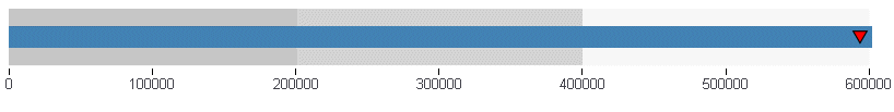
A bullet chart is a microchart that is a variation of
the bar chart and is sometimes used as a replacement for a gauge
chart. It is designed to show a quantitative measure against qualitative
ranges. For example, a quantitative measure such as profit or revenue
could be visualized against quality (good, better, best) to show
progress toward a target.
Example: Sample Bullet Chart
The following request against the GGORDER
data source creates a bullet chart. It charts the quantity ordered
for the years 1996 and 1997. There is no LOOKGRAPH value for a bullet
chart, so the LOOKGRAPH value is set to CUSTOM, and the JSON block
in the style section of the request contains the chartType: ‘bullet’
property. It also sets the color bands for the y-axis and the colors
for each year (group):
DEFINE FILE GGORDER
YEAR1/YY = ORDER_DATE;
END
GRAPH FILE GGORDER
SUM QUANTITY
BY YEAR1
WHERE YEAR1 GT 1990
ON GRAPH SET VAXIS 80
ON GRAPH PCHOLD FORMAT JSCHART
ON GRAPH SET LOOKGRAPH CUSTOM
ON GRAPH SET STYLE *
*GRAPH_JS
chartType: 'bullet',
yaxis: {
   colorBands: [
       {start: 0,stop: 200000,color: 'silver'},
       {start: 2100000,stop: 400000,color: 'lightgrey'},
       {start: 400000,stop: 600000,color: 'whitesmoke'},
       ],
},
series: [
    {series: 0, group: 0, color: 'steelblue'},
     {series: 0, group: 1, color: 'red'},
]
*END
INCLUDE=ENIADefault_combine.sty,$
ENDSTYLE
END
On the output, the blue
bar represents the quantity for 1996, and the red triangle represents
the quantity for 1997:
x
Sparkline is a microchart that has no titles, labels,
or legends. It is a single line chart that is intended to be drawn
in a very small area to show the shape of the variation without
axes or coordinates. A sparkline can be embedded in text or tables.
Example: Sample Sparkline Chart
The following request against the GGSALES
data source creates a sparkline chart. Since there is no LOOKGRAPH
value for a sparkline chart, the LOOKGRAPH parameter is set to CUSTOM,
and the JSON block in the style section of the request contains
the chartType: ‘sparkline’ property. It also sets the border color
and width. The GRAPH parameters HAXIS and VAXIS set the height and
width of the chart:
GRAPH FILE GGSALES
SUM DOLLARS
ACROSS PRODUCT
ON GRAPH SET HAXIS 50
ON GRAPH SET VAXIS 20
ON GRAPH PCHOLD FORMAT JSCHART
ON GRAPH SET LOOKGRAPH CUSTOM
ON GRAPH SET STYLE *
*GRAPH_JS
chartType: 'sparkline',
border: {
   width: 2,
   color: 'green',
},
*END
INCLUDE=ENIADefault_combine.sty,$
ENDSTYLE
END
The output is:
