mouseOverIndicator: {
   enabled: boolean,
   color: 'cstring',
   marker: {
      color: 'mcstring',
      size: snumber,
      shape: 'sstring',
      rotation: rnumber,
       border: {
         width: bwnumber,
         color: 'bcstring',
         dash: 'bdstring'
      }
   }
},
where:
- boolean
Enables or disables the mouse over indicator. Valid values are:
- true, which enables the mouse over indicator. This is the default value.
- false, which disables the mouse over indicator.
- 'cstring'
Defines a color to apply when the mouse hovers over a riser. A color can be defined by a color name or numeric specification string. It can also be defined as a percentage string in the range '100%' to '100%', to lighten or darken the series color by the specified percentage. The default value is undefined or the string ''.
- 'mcstring'
Defines the marker color for a line riser (in line, combo or pareto charts). It can be a color defined by a color name or numeric specification string. The default value is 'lightblue'.
- snumber
Is a number that defines the size of the marker. The default value is 5.
- 'sstring'
Is a string that defines the shape of a marker. The default value is 'square'.
For information about marker shapes, see Series-Specific Properties.
- rnumber
Is a number between 0 and 360 that defines the angle (in degrees) of the marker. The default value is zero (0).
- bwnumber
Is a number that defines the width of the marker border in pixels. The default value is 1.
- 'bcstring'
Is a color for the marker border defined by a color name or numeric specification string. The default value is 'darkblue'.
- 'bdstring'
Is a string that defines the border dash style. Use a string of numbers that defines the width of a dash followed by the width of the gap between dashes. The default value is '' (which draws a solid line).
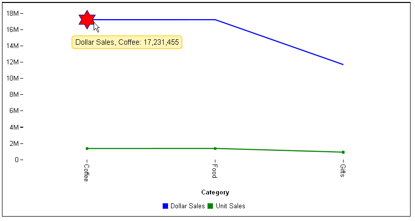
The following request against the GGSALES data source generates a vertical line chart with two series. Series 0 has no markers and series 1 has default markers. The mouse over indicator is defined as red, and the marker shape for lines with no markers is a six-pointed star with a dark blue border:
GRAPH FILE GGSALES
SUM DOLLARS UNITS
BY CATEGORY
ON GRAPH PCHOLD FORMAT JSCHART
ON GRAPH SET LOOKGRAPH VLINE
ON GRAPH SET STYLE *
*GRAPH_JS
series:[
{series:0, color:'blue', marker:{visible:false}},
{series:1, color:'green'}
],
 mouseOverIndicator: {
   enabled: true,
   marker: {
      color: 'red',
      size: 35,
      shape: 'sixStar',
      rotation: 0,
      border: {width: 1,color: 'darkblue'}
   }
}
*END
ENDSTYLE
END
The following image shows the mouse over indicator on the line that had no markers:
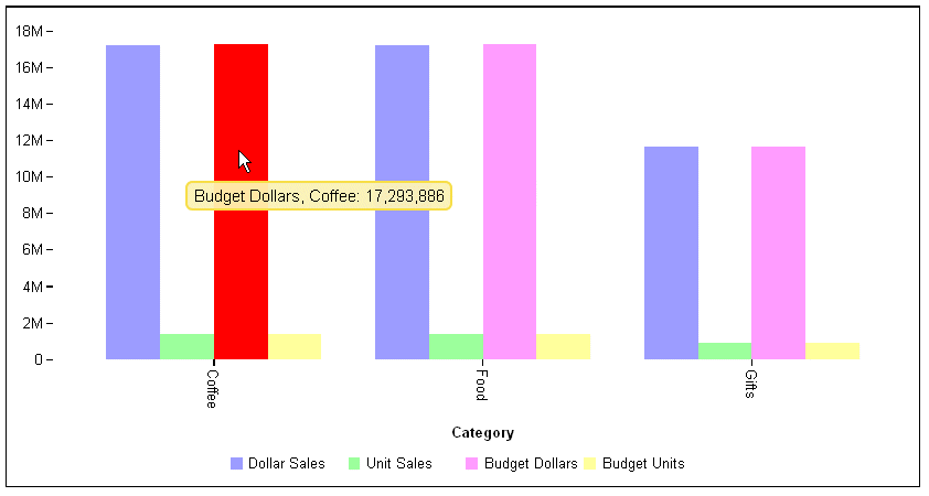
The following request generates a vertical bar chart and makes the mouse over indicator red:
GRAPH FILE GGSALES
SUM DOLLARS UNITS BUDDOLLARS BUDUNITS
BY CATEGORY
ON GRAPH PCHOLD FORMAT JSCHART
ON GRAPH SET LOOKGRAPH VBAR
ON GRAPH SET STYLE *
*GRAPH_JS
 mouseOverIndicator: {
   enabled: true, color: 'red'
}
*END
ENDSTYLE
END
The following image shows the how a riser becomes red when the mouse hovers over it: