You can run all of the examples in this chapter using OLAP-enabled published content. If the reports are not already available in your sample repository, ask your WebFOCUS administrator to provide them for your use. There are nine reports, named olaprep1.fex through olaprep9.fex, located on the Reporting Server in the \ibinccen demo directory.
Each example indicates which published content to run. After the report appears in your browser, you can perform the analytic task shown, or pursue your own line of inquiry.
Suppose that you are an analyst for Century Corporation, which manufactures electronics equipment. You need to determine which of the stores that sells your products had the highest sales in 2002, and whether there is a pattern in sales periods and/or best selling products that should be considered when planning manufacturing schedules and parts inventories.
You have created a base report that shows sales data only for 2002. You have also OLAP enabled the report to permit quick analysis of the data.
- Run OLAPREP1.
Before you begin your analysis, the OLAP report looks like the following image.
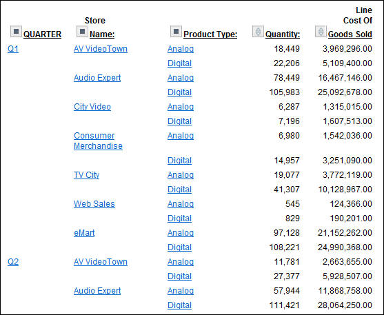
The quarterly information is spread out over the left-most column. You can try a horizontal display to make comparison easier.
- Drag QUARTER above
the report.
The report changes immediately and appears, as shown in the following image, across the top of the report with the Quantity and Line Cost of Goods Sold columns repeating for each quarter.
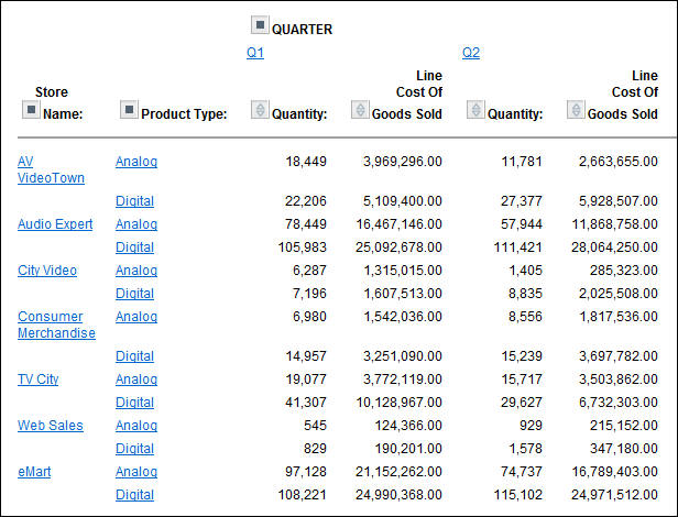
The store information is more compact, but it is not easier to identify the store with the best sales record, so drag QUARTER back to its original position.
- Right-click Line
Cost of Goods Sold and choose Visualize.
This applies a data visualization bar graph to each value in the
column.
Note: The options available may vary, depending on your OLAP format settings. For more information, see Setting OLAP Reporting Options.
The display changes, as shown in the following image.
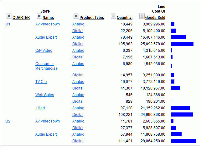
The bar graphs still do not reveal a trend.
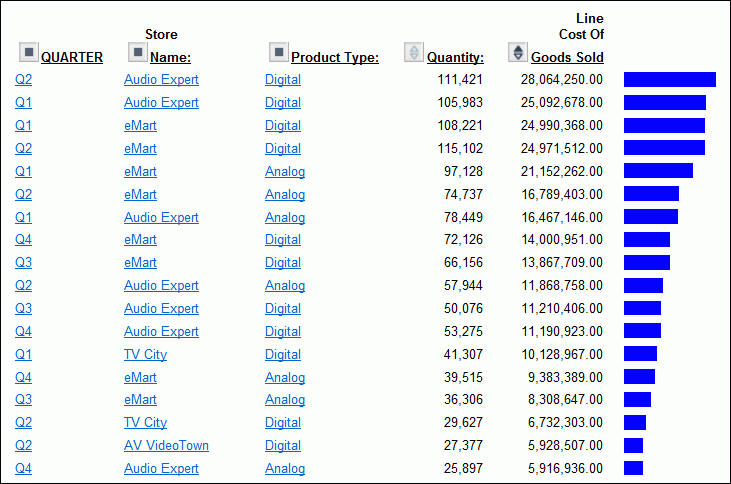
- Sort the data
by highest value by either right-clicking Line Cost of
Goods Sold and choosing Sort by Highest,
or clicking the Up arrow next to Line Cost
of Goods Sold.
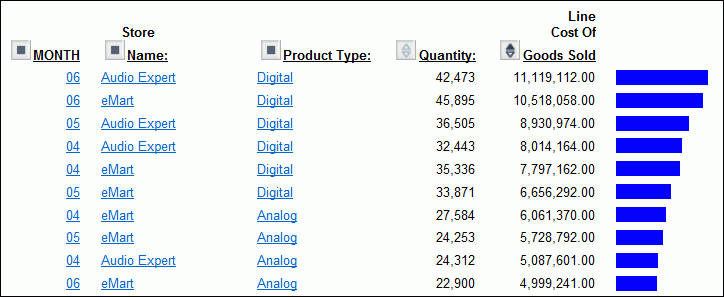
As shown in the following image, the report shows that Audio Expert has the highest sales in the digital product lines in Quarters 1 and 2, with eMart trailing slightly. Each value under the QUARTER, Store Name, and Product Type column is hyperlinked for more details.
- Click Q2 to
check the monthly breakdown.
In the monthly report, both stores recorded their highest sales in June (06), as shown in the following image.
- Click Audio
Expert on the top line, next to MONTH 06. This filters
out the other stores, showing a breakdown of Audio Expert June sales,
as shown in the following image.
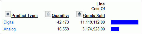
You now see information for digital and analog sales at Audio Expert. Since the significant sales for Audio Expert are in the digital area, let us see which digital products contributed to the June figures.
- Click Digital.
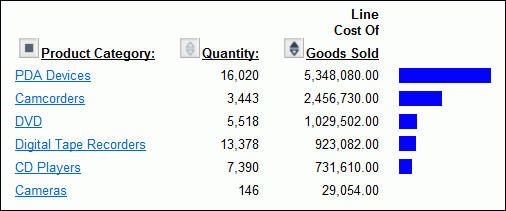
The breakdown shows clearly that PDAs drove Audio Expert digital sales.
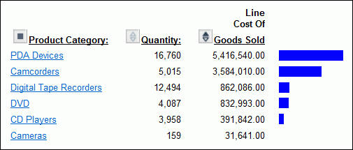
- Click PDA
Devices to see the details.
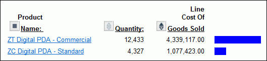
As shown in the following image, ZT Digital PDA - Commercial was by far the top selling PDA in June for Audio Expert.
Let us now see what drove digital sales at eMart, the second highest producer.
- Click Back in
your browser until you return to the following window, showing second-quarter
sales for all stores.
-
This time, click eMart next to MONTH 06, to see the June sales information for eMart.
Once again, the Digital category leads sales, as shown in the following image.
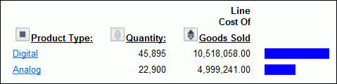
- Click Digital.
PDA is the strong seller for eMart too, as shown in the following image
- Click PDA
Devices to examine the models that compose these sales.
The report shows sales figures for the two PDA models, as shown in the following image.
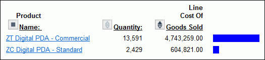
ZT Digital PDA - Commercial far outsells ZC Digital PDA - Standard.
This information from the two top selling stores suggests that Century Corporation should evaluate and adjust available parts inventories for each model and consider shifting production schedules of plants to produce more Commercial units.
You have done all of your data manipulation from the report. But, because of the options you selected when OLAP-enabling this report, it is easy to expose the OLAP Selections panel where you can review the selections that are currently in effect, and make additional selections if you like. For details on OLAP set-up options, see OLAP-Enabling a Report.
- To expose the
OLAP Selections panel, right-click Product Name and
select Show Panel from the menu.
Note: The options available may vary, depending on your OLAP format settings. For more information, see Setting OLAP Reporting Options.
The Selections panel appears above the report, as shown in the following image.
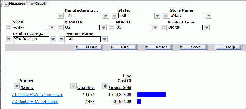
Notice that Store Name is eMart, Product Type is Digital, and Product Category is PDA Devices.