The RDF Add-on includes a number of filtering features.
Each template includes collapsible filters at the top of the page
and a sliding accordion panel that can be shown or hidden along
the left side of the page by using the filter button at the top. Additionally,
the primary filter section can be configured to collapse into a
breadcrumbs display showing only the active selections for each
control. This is controlled by adding a JavaScript variable to the
onInitialUpdate function for the HTML page, as detailed in the following
example.
Example: Adding a Filter to an RDF Page
This
example shows you how to add filters to an RDF page.
Note: In
this procedure, sample files are viewed by name in the App Studio Environments
Tree panel. However, the default in App Studio is View items by
Title. To change the default, click the View Options icon on the
Environments Tree toolbar and click View items by Name.
- In the Environments Tree panel, under the Content node, expand
the RDFTemplates folder, the Common folder, and the template folder.
- Copy the template422.htm file to a new folder or existing folder
under the Content node. This enables you to perform the steps in
the following example without overwriting the original template.
- In the Environments Tree panel, click the copied file to select
it.
- In the File/Folder Properties panel, rename the file and type
a new title, keeping the .htm extension.
The file refreshes in
the Environments Tree panel and reflects the new name.
- Double-click the renamed file, or right-click the file and click Open.
The
HTML canvas opens.
- Add content to the frames in the top row by right-clicking the
frame and clicking Reference existing procedure.
The
Open File dialog box opens.
- Expand the RDFTemplates folder, the doc folder,
the gadget folder, and the text-gadget folder, then
select the following files:
- metric_plus_three_sub_metrics.fex
- metric_trend_by_category.fex
- two_metric_with_sparkline_bar_chart_carousel.fex
- two_metric_with_sparkline_chart_carousel.fex
- Add content to the chart frames by right-clicking the frame
and clicking Reference existing procedure.
The
Open File dialog box opens.
- Expand the RDFTemplates folder, the doc folder,
the gadget folder, the chart folder, and the angular folder,
and then select the following files:
- bar.fex
- compose.fex
- donut_pie.fex
- multiple.fex
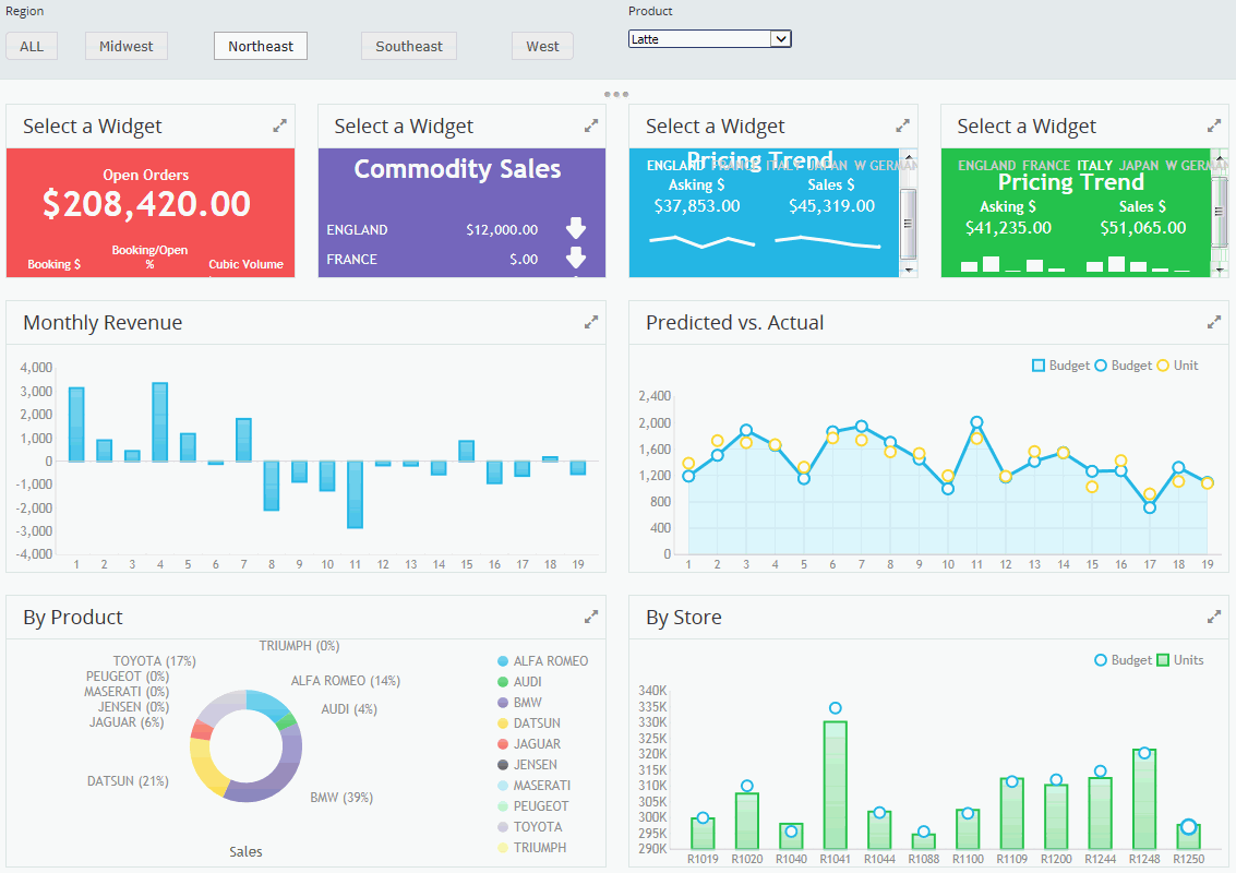
- Save the HTML file and run it. The following image shows an
example of the updated page.

- Open the file again in the HTML canvas.
- Delete the two right-most filter panels from the row above where
you have added content.
This leaves the two panels on the left.
- Select the filter panel on the right.
- In the Properties panel, make the following changes:
- For the Class identifier (CSS) property value, type panel
panel-6w.
- For the Left property value, type 50%
- Select the filter panel on the left.
- In the Properties panel, for the Class identifier (CSS) property
value, type panel panel-6w.
- On the Controls tab, in the Controls group, click Check Box.
- Add a check box control to the filter panel on the left.
- In the Properties panel, make the following changes to resize
the check box.
- For the Left property value, type 0px
- For the Top property value, type 20px
- For the Width property value, type 100%
- For the Height property value, type 30px
- In the Miscellaneous section of the Properties panel, type 5 in
the Columns property value and select Push button from the
menu for the Type property value.
- On the Components tab, in the Generic Elements group,
select Label.
- Add a label to the panel
- Double-click the label text and type Region.
- In the Properties panel, make the following changes to resize
the label.
- For the HtmlFor property value, type checkbox1
- For the Left property value, type 0px
- For the Top property value, type 0px
- For the Width property value, type 100%
- For the Height property value, type 20px
- On the Controls tab, in the Controls group, click Drop Down.
- Add a drop down menu to the second filter panel.
- In the Properties panel, make the following changes to resize
the drop down menu.
- For the Left property value, type 0px
- For the Top property value, type 25px
- For the Width property value, type 150px
- For the Overflow property value, set it to visible
- On the Components tab, in the Generic Elements group,
select Label.
- Add a label above the drop down control in the second filter
panel.
- Double-click the label text and type Product.
- In the Properties panel, make the following changes to resize
the label.
- For the HtmlFor property value, type combobox1
- For the Left property value, type 0px
- For the Top property value, type 0px
- For the Width property value, type 150px
- For the Height property value, type 20px
- In the Parameters tab, link the checkbox1 control to the REGION
parameter by dragging one on top of the other.
- Select the checkbox1 control in the Parameters tab and open
the Settings panel.
- Set the Data Type to Dynamic and Default.
- Click the ellipsis button for Data Source and select ggsales.mas.
- Click the ellipsis button for Value from to set the Value from
and Display from values to REGION.
- Select the Add “ALL” option check box
to add ALL as a filtering option.
- Link the combobox1 control to the PRODUCT parameter.
- Select the combobox1 control in the Parameters tab and open
the Settings panel.
- Set the Data Type to Dynamic and Default.
Click the ellipsis button for Data Source and select ggsales.mas,
if it is not already selected.
- Click the ellipsis button for Value from to set the Value from
and Display from values to PRODUCT.
- Select the Add “ALL” option check box
to add ALL as a filtering option.
- Save the HTML file and run it. The result is shown in the following
image.
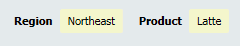
To filter the data,
use the Region and Product filters and click the Refresh button at
the top. You may not have sample data for every region/product combination.
- Return to the HTML canvas. Open the Embedded JavaScript/CSS
tab, and add the following function starting on line 11:
function onInitialUpdate() { filterToggleMode = ‘crumbs’;
}
This
function enables the filter to collapse into a breadcrumbs view
that shows the active selections for each control.
- Save the file and run it again.
- Click the three dot icon below the filter panels to collapse
the area into a breadcrumb view, as shown in the following image.
These global
filter options allow the creation of interactive HTML pages that
can also be run in a BI Portal page.
If you want to apply
a global filter on your own procedures in an HTML page, make sure that
they use the same data source and have the global filter fields
set as dynamic parameters. Make sure that the parameters in each
of the affected procedures also have the same multiselect setting.