Dashboard coloring provides an additional dimension
by which an individual can analyze data and see trends. Color is
set to a table in the dashboard and, once set, every chart on every
page of the dashboard that is linked to that table updates to display
the selected color scheme.
To set the dashboard’s color scheme select a field in the dropdown
Color By: window 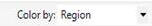 located on the top dashboard toolbar.
If your Color Toolbar is closed, you can open them by going to the
View menu and selecting Toolbars and then Color.
You have the option of coloring the dashboard by any field in the
selected color table, which is specified in the Page Toolbar.
located on the top dashboard toolbar.
If your Color Toolbar is closed, you can open them by going to the
View menu and selecting Toolbars and then Color.
You have the option of coloring the dashboard by any field in the
selected color table, which is specified in the Page Toolbar.
Once you have selected a field, use the Color Scale: drop down
window 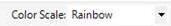 to choose the coloring scheme
(or create your own color scale using the Color Workshop: View Color
Workshop).
to choose the coloring scheme
(or create your own color scale using the Color Workshop: View Color
Workshop).
Color is mapped to match the data values in the selected field:
- Categorical fields are ordered and colors assigned to each
category in color scale order.
- Continuous fields have their range determined and this range
is mapped to the color scale; data values are mapped to colors by
finding the position of the data value in the data range and using
the corresponding position in the color scale.
Once the dashboard color is set, open up the color legend to
view the color scale.