Using Color

Color helps to distinguish data types from one another, providing an immediate understanding of the data displayed. You can use color to reveal patterns across variables.

Data fields are mapped to colors on a color scale based on their field type. For example, for categorical data, the data is ordered and colors are taken from the scale. For continuous data, the range of data is found and the colors from the color scale are mapped across the data range.

The following table lists and describes the different color options that are available.

Color Button

Description

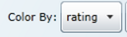
Color by. Use this drop-down list to change the field that determines the color of the displayed data.

Display Legend Panel. Shows how color is mapped to the data.


WebFOCUS