The following options are available on the Explore tab in RStat. You may also access the Explore tab through the Tools menu.
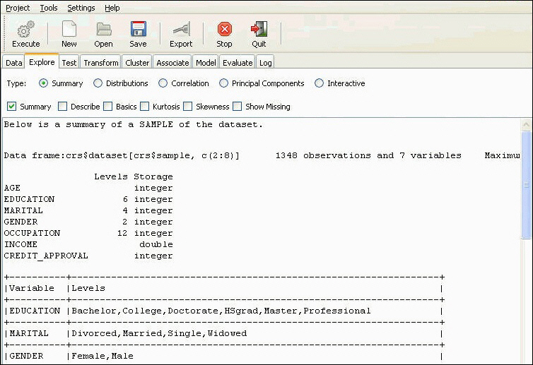
The screen that follows shows the summary statistics being executed and displayed.
Summary
Summarizes the data set and provides descriptive statistics on each variable in the data set.
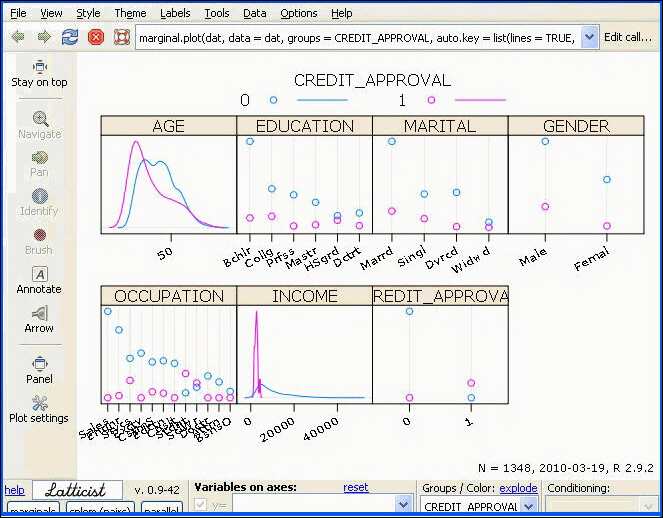
Note: To generate this chart, click Latticist and then, click Execute. Click Marginals in the Chart interactive panel and then deselect all other variables except for Age and Income. From the Groups/Color drop-down box, select the top row (Empty/Null) to remove any grouping. For more details, see the section in this chapter on Latticist.
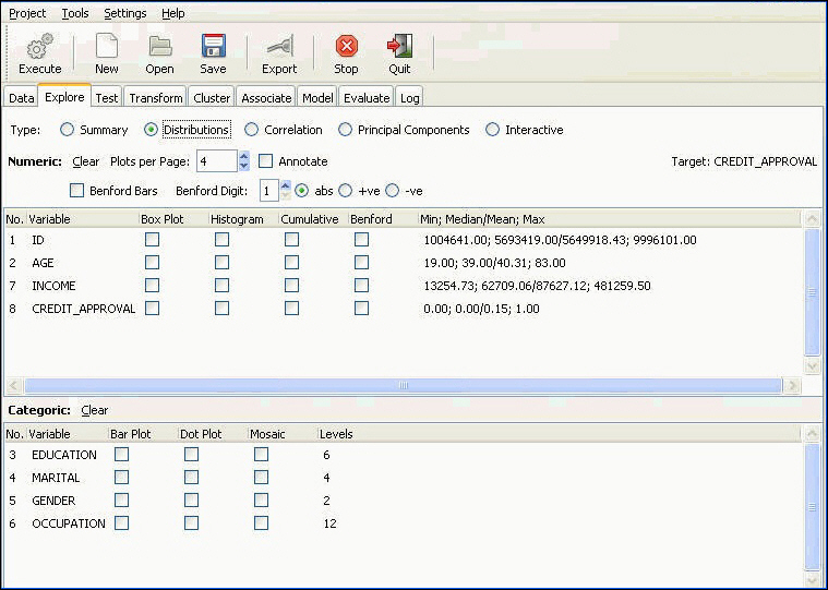
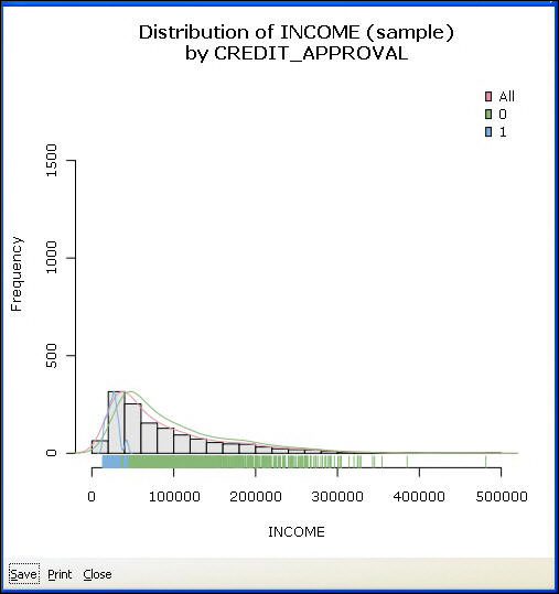
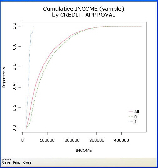
Distributions
Displays various distribution plots for numeric and categoric variables. The chart options for numeric and categoric variables are displayed separately. The chart types for numeric and categoric variables are also different, as shown in the following image.
For numeric variables, the available charts are:
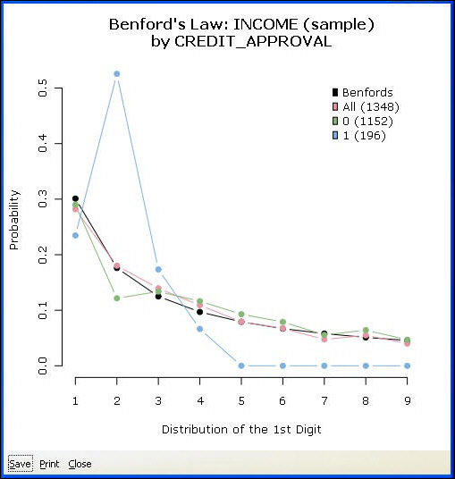
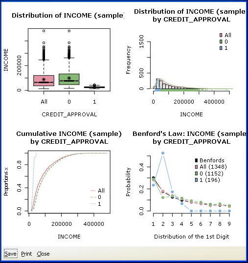
Benford Bars. According to Benford's Law, also referred to as the First Digit Law, if you draw a random number from a list of real life numbers, such as income, invoice amounts, and so on, the probability of drawing a number starting with 1 is almost one-third. The larger leading digits occur with lower and lower frequency, to the point where 9 as a first digit occurs less than one time in twenty. It is a pragmatic law.
The practical implication is that people do not know this law and thus cannot manipulate data convincingly. Hence, the law is used in fraud detection. For example, a tax authority uses Benford’s Law to see if cash disbursements on company returns follow its law. If the distribution of disbursements does not follow Benford’s Law, an investigation is triggered. Insurance claims are another typical use case.
Generate a bar plot as shown in the following image. Make sure that no dependent variable is selected on the Data tab. If a dependent variable is selected, its values will be shown on the Benford chart to compare against the other variable. The graph indicates that income follows the Benford distribution. That is, the distribution of incomes starting with 1, 2, 3, and so on, follows the distributions of 1, 2, and 3 in real life.
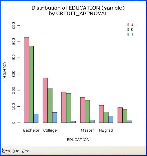
For categoric variables, the following chart types are available:
Bar Plot. Shows the counts of observations within each category. If a target variable is selected, it will plot additional bars for each category in the target. In the following example, for each Occupational Value, there are three bars: the total number of people in this occupation, the number of people with good credit, and the number of people with bad credit.
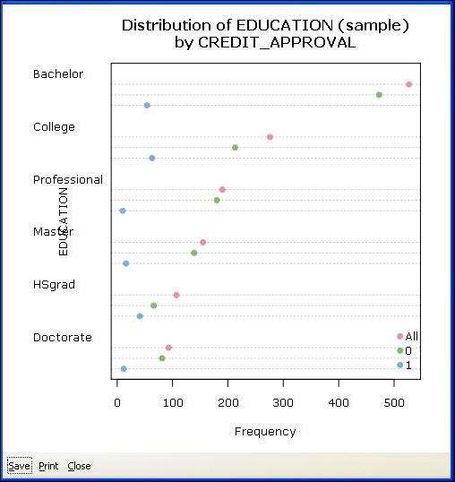
Dot Plot. A dot plot is an alternative to a bar chart. According to some analysts, they are simpler and easier to interpret, as they clearly show the distribution of data. The frequencies are displayed on the x-axis and labels are displayed on the y-axis. If a categoric target is selected, separate dots will be plotted for each category.
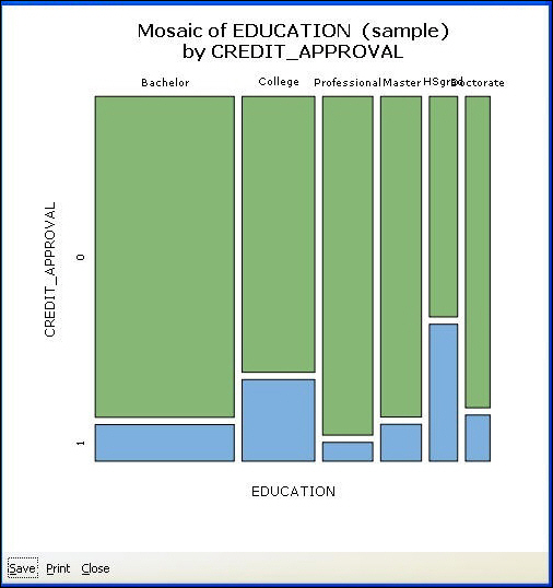
Mosaic Chart. The mosaic chart gives a real representation of the distribution of observations within categories. Each category value is displayed as a 100 percent bar. The width of the bar indicates the frequency of observations. The wider the bar, the higher the count in this category. If a categoric target variable is selected, the height of the bars will be split proportionate to the counts of the observations that fall in each category of the target.
You have a few controls that apply to all charts within the Distributions section.
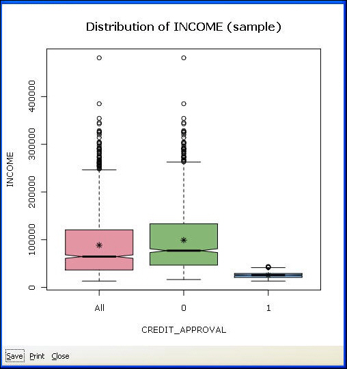
In the following image, we have chosen to display four plots per page, and we have selected all four plots for the Income variable. When multiple plots per variable are selected, the Target variable information is ignored and only the total information for the variable is plotted.
Latticist
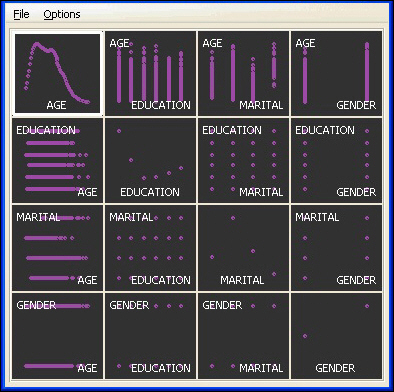
Latticist is an interactive visualization package. We will not cover all the functions and capabilities of the package here but will give you a general overview. Select the Latticist radio button and click Execute. This loads all selected variables into a matrix plot, as displayed in the following image. The target variable will be used as a grouping variable. Both numeric and categoric variables can be used as grouping variables.
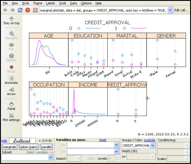
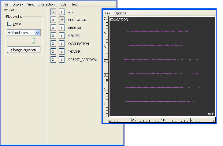
To remove a grouping variable in the Groups/Color drop-down list, select the top null row, as shown in the following image.
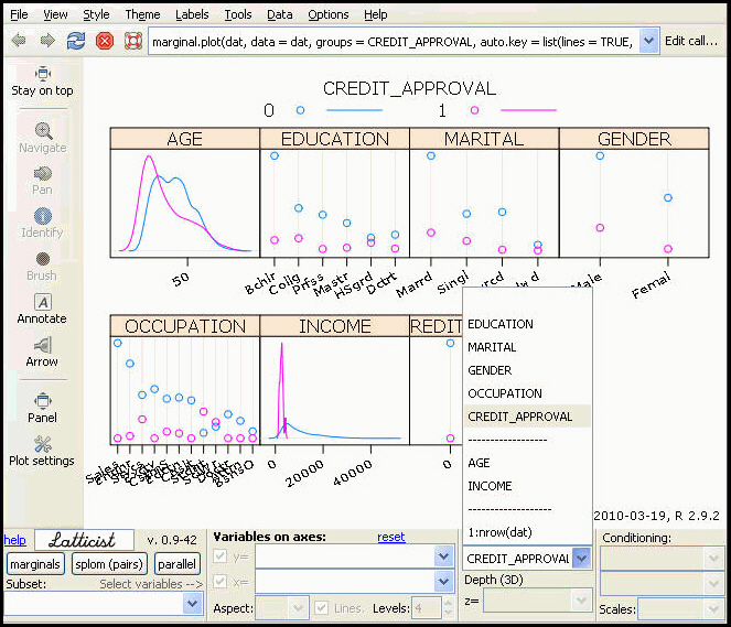
To remove any variables from the plot, select the plot type button, for example, marginals, and uncheck the variables to be removed.
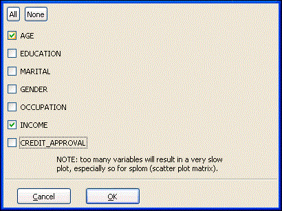
Click OK to display only the selected variables.
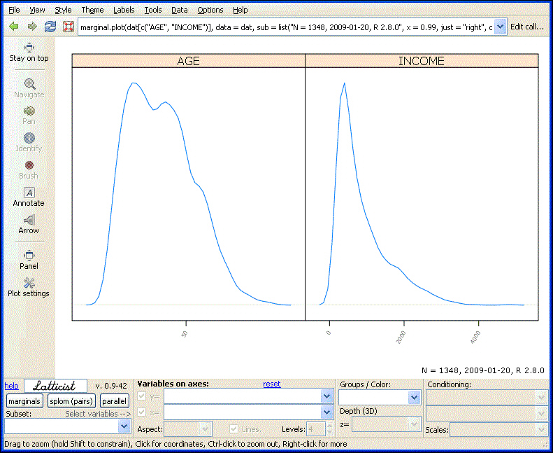
To display a scatter matrix plot, select splom (pairs). Conditioning will display a separate scatter matrix for each value in the variable selected in the Condition drop-down list, as shown in the following image.
GGobi
Runs the R package GGobi for interactive data visualization. This section will not cover all the functions of the GGobi package but will show you how to initialize and interact with the data.
Displaying a Matrix Scatter Plot. A matrix scatter plot is a display of all two-by-two scatter plots for all variables in a single panel. It allows you to quickly assess all relationships in a data set.
To generate the matrix scatter plot shown here, select Display from the toolbar menu on the GGobi floating panel and select New Scatterplot Matrix.
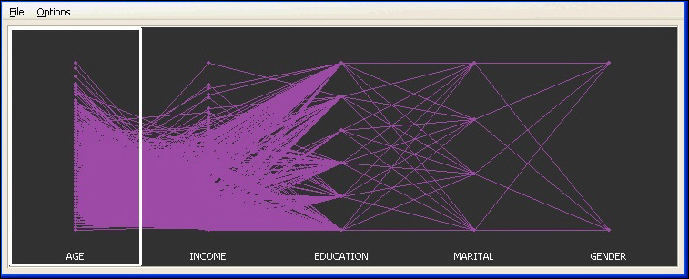
GGobi Parallel Coordinates Chart. A parallel coordinates chart, also known as a profile plot, is a useful way to compare several sets of observations as a combination of different factors. It is useful to detect patterns in the data.
To generate the parallel coordinates chart shown below, select Display from the toolbar menu on the GGobi floating panel and select New Parallel Coordinates Display.
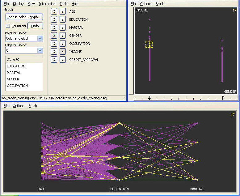
GGobi Interactions. From the toolbar menu, you can select Interactions and specify the type, for example, Brush. The brush allows you to select points on the graph and the selection will propagate to all other GGobi graphs. You can see the relationship of the selected items and all other items.
For more information on GGobi, see http://www.ggobi.org/.
Correlation
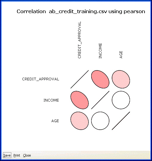
Correlation indicates the strength and the direction of the relationship between two variables. Correlations should be interpreted carefully, as they depend on the context. In simple terms, a correlation coefficient closer to 0 indicates no relationship, and a coefficient closer to 1 indicates a strong relationship. Positive correlation indicates that as one variable increases, so does the other. Negative correlation indicates that as one variable increases, the other decreases. Correlations are displayed in a table and a graph, storing the pairwise correlations between all numeric variables.
The following image displays the correlations in a table within the RStat output window.
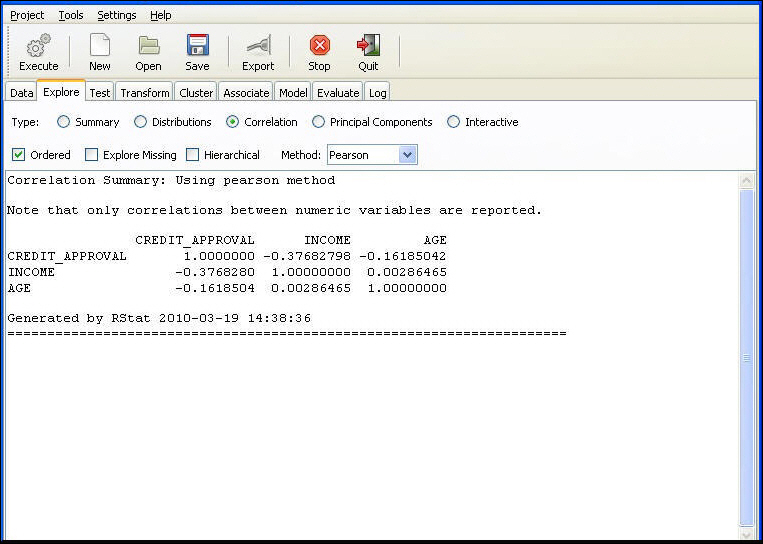
Chart Displaying the Correlations. The color and the shape of the circles indicate the strength of the correlation. For example, Income and Age have a correlation near 0, which is represented by a full white circle. Credit_Approval and Income have a correlation of -0.38, which is represented by a pink ellipse. The dispersion of the data becomes more narrow and closer to a straight line, that is, the perfect linear relationship.
Explore Missing. Click to display the correlation between missing values. If the file does not contain missing values, those correlations will not be displayed and a dialog with a warning message will be displayed.
Ordered. Select the check box to display the variables ordered by the strength of the correlations.
Method. Select the method for the computation of the correlation coefficient.
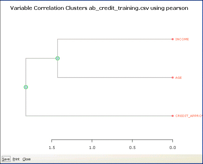
Hierarchical
A correlation between the numeric data is calculated, and then a hierarchical cluster is generated based on the correlations. The hierarchical cluster is then visualized through a dendrogram to give an idea of the groupings of the numeric variables. The length of the lines in the dendrogram provide a visual indication of the degree of correlation. Shorter lines indicate more tightly correlated variables. Once you have identified the groups of variables that are correlated, you may want to reduce the number of variables that you are including in your modeling. For instance, you can compare the Credit_Approval and Income on the dendrogram with the correlations from the prior section, and see that shorter lines correspond to higher correlations.
You can use any of the three methods, Pearson, Kendall, or Spearman, to calculate the correlation coefficients.
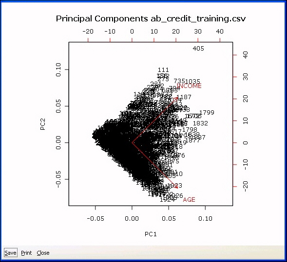
Principal Components
Principal components analysis is used for variable reduction, that is, to analyze the numeric variables in the data set and indicate whether a smaller set of new uncorrelated variables can be generated and used for modeling. The potential new variables are called principal components, and usually the first two account for most of the variation in the target variable. Hence, only the components that account for most of the variation can be used for modeling. RStat does not actually generate the new PC variables. Instead, it is used to analyze which of the input variables contribute most to the components. This information helps decide which variables to include in or exclude from the analysis.
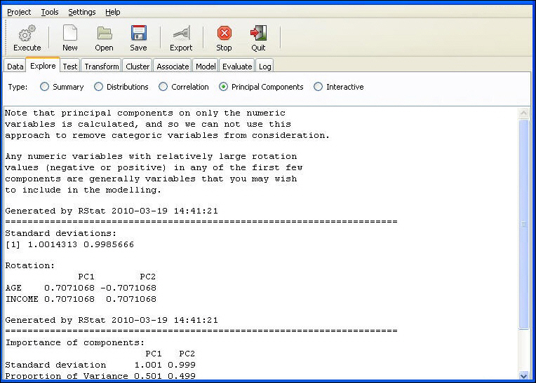
The two following images are displayed to exhibit the relationships between the principal components. The following bar chart presents the relative comparison of how much of the variation in the data is accounted for by each of the principal components. The first will account for the most, then the second, and so on.

The plot chart plots the principal component 1 against the principal component 2 (for example, the two principal components that account for most of the variation), also displaying the strength of the component variables.
| WebFOCUS |